Examples of excellent work in category 1 – custom media
This document shows examples of custom media awarded at the 8th and 9th ICMA. The examples come from the following countries: Luxembourg, Spain, Finland, Netherlands and Germany.
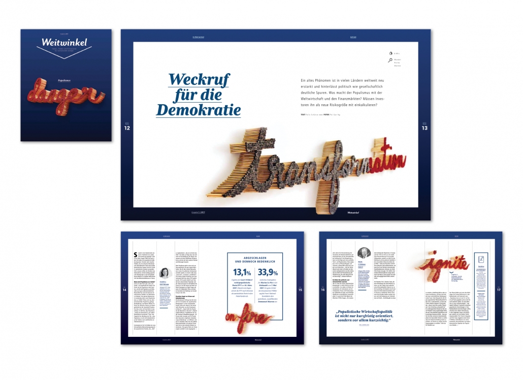
Weitwinkel, Profilwerkstatt GmbH, D, Gold Award 8. ICMA
Category 1.1. Customer Magazines B2B Print
“Weitwinkel” – wide angle – is the B2B magazine of Union Investment. In the example shown here, the visualization of populism with matchsticks is very apt. The cover and the story inside harmonize very well. The visualization is varied inside and the color of the front page is picked up.
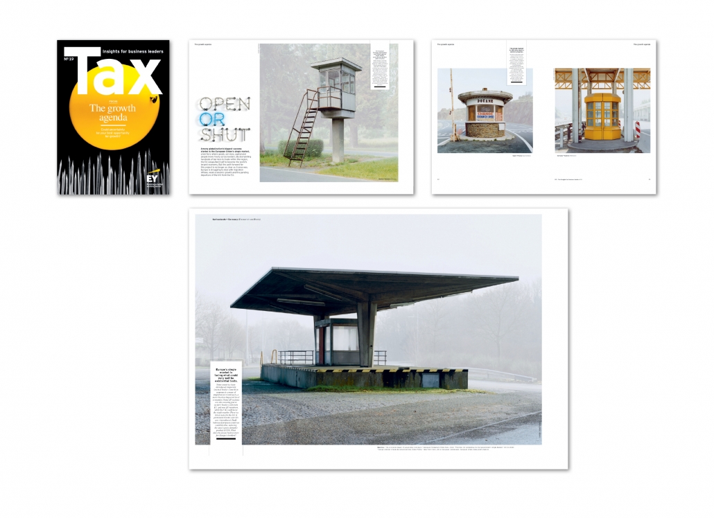
Tax, C3 Creative Code and Content GmbH, D, Gold Award 9. ICMA
Category 1.1. Customer Magazines B2B Print
The jury comments on “Tax”: “The complex basic topic of taxes is presented and communicated in an outstanding way, both visually and in terms of content. The visual language is surprisingly reduced and clear”.
Statement by Reinhard Sorger, Creative Director Publishing, Publicis Pixelpark, Erlangen: Business leaders have one thing in common: little time, an overkill of information and latent pressure to make decisions. That‘s why this illustrious circle is constantly on the lookout for professional communication at eye level and sympathetic enrichment, without sacrificing a bit of good entertainment. TAX meets these expectations excellently. Relaxing expert discussions, specialist topics peppered with journalistic finesse. An independent, contemporary and aesthetic look, credible in content and varied in dramaturgy, multi-faceted in presentation, TAX invites you to read and view original picture series.
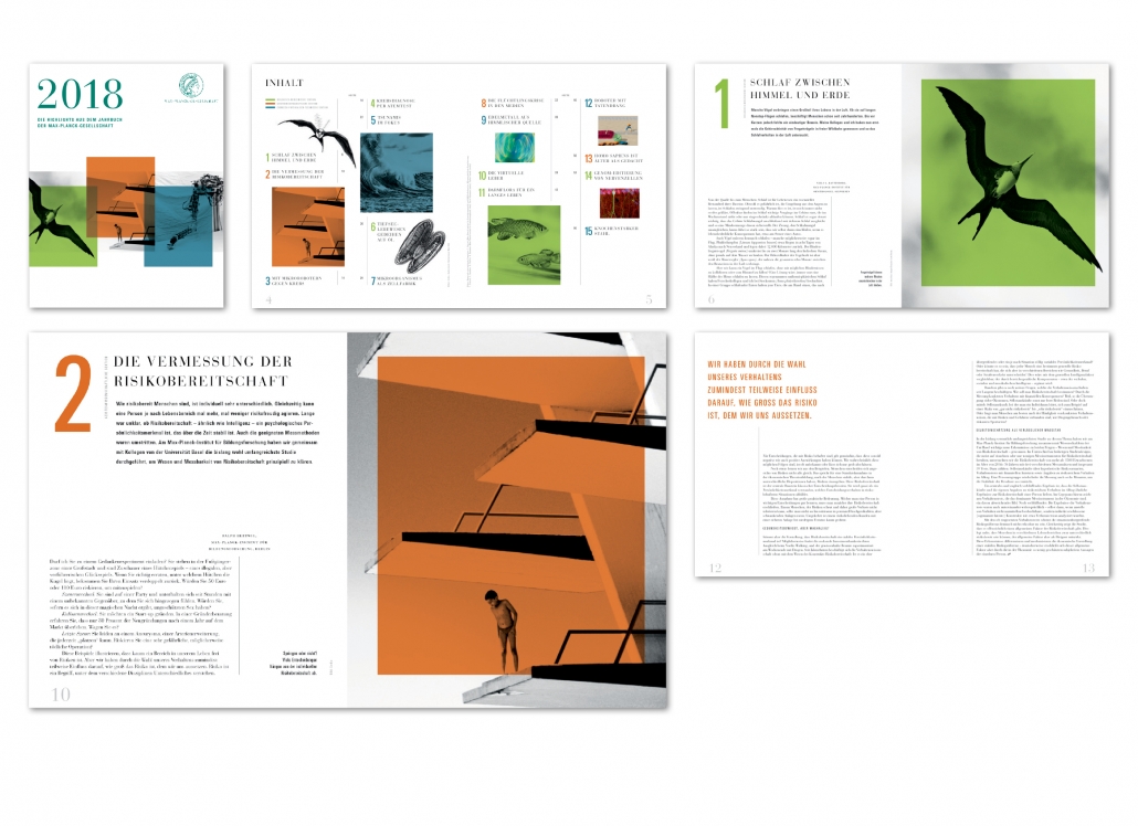
Highlights aus dem Jahrbuch der Max-Planck-Gesellschaft, Territory Content to Results GmbH, D, Silver Award 9. ICMA
Category 1.1. Customer Magazines B2B Print
Jury statement: “The brochure is designed in the style of a ‘calendar digest’ with clearly prepared essays. The layout also invites readers to read about topics that present complex research
results. Outstanding visual language! The magazine is very well structured by numbers. The basic grid is very varied. Different column widths are possible. Sometimes marginal columns are used. Typography: A classi-cistic antiqua is used for headings and basic text. Prefixes, intermediate lines, quotations and picture texts are set from a sans serif font. Paper: A natural paper is used which, in combination with the white space on the pages, creates a very valuable character.
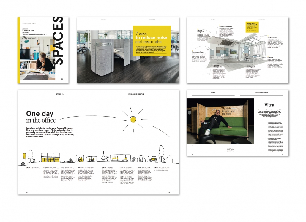
Spaces, Maison Moderne, LUX, Silber Award 9. ICMA
Category 1.1. Customer Magazines B2B Print
Jury statement: „Very successful implemen-tation of layout and image presentation in the form of a ‚Maga log ‘– a combination of magazine and cata-logue. The images of the products are com-pact and attractively combined. Outstanding concept!”
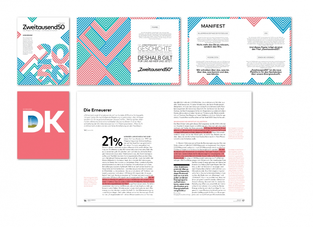
Zweitausend50, Ressourcenmangel an der Panke, D, Silver Award 8. ICMA
Category 1.2. Customer Magazines B2C Print
“Zweitausend50” – Two Thousand 50 – is a magazine of energy and water management. It has a handy format: 23.5 x 18 cm. From the jury statement: “Very stylish! The magazine has a consistent style from start to finish. Very modern with sophisticated typography. Very good use of color.”
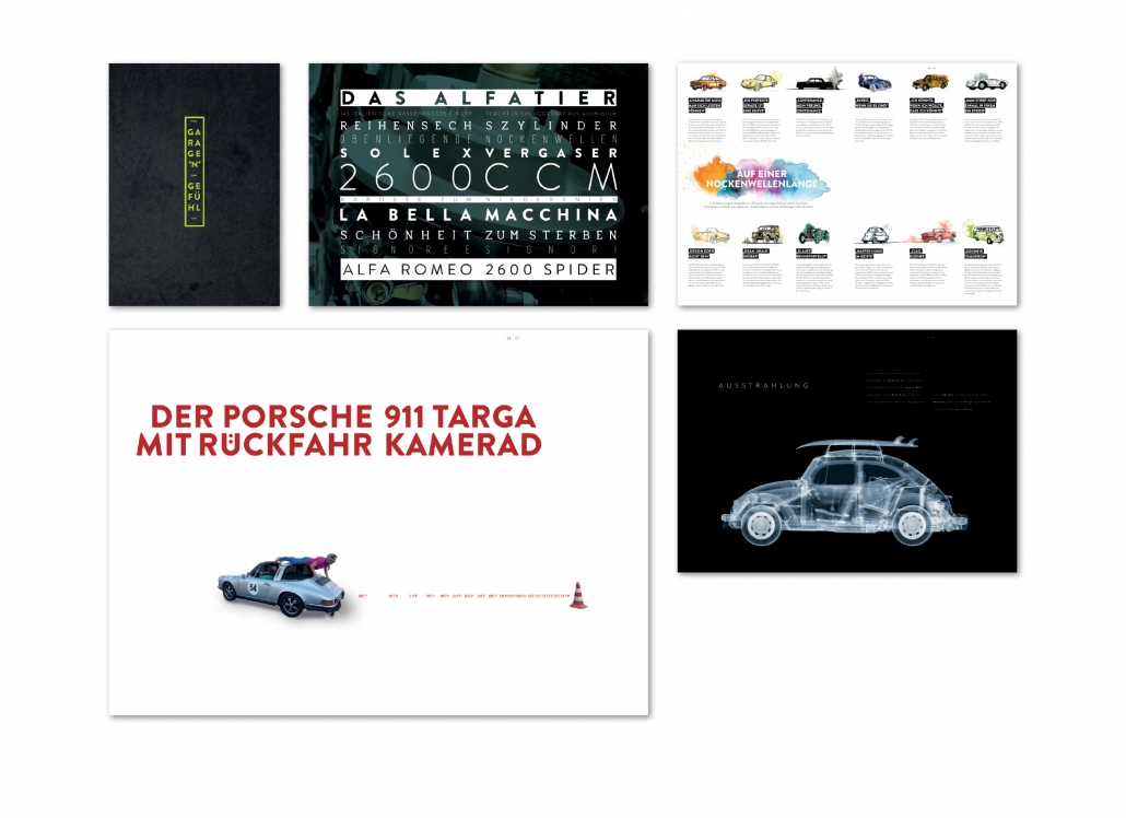
Garagengefühl, Change Communication GmbH, D, Gold Award 8. ICMA
Category 1.2. Customer Magazines B2C Print
“Garagengefühl” – garage feeling – is the magazine of the “Klassik Garage Kronberg”. It is published in DIN A 3 format and has a circulation of only 1,000 copies. The jury said: “The design changes with each chapter, but it‘s always a premium style. The format and the choice of paper are unmistakable”.
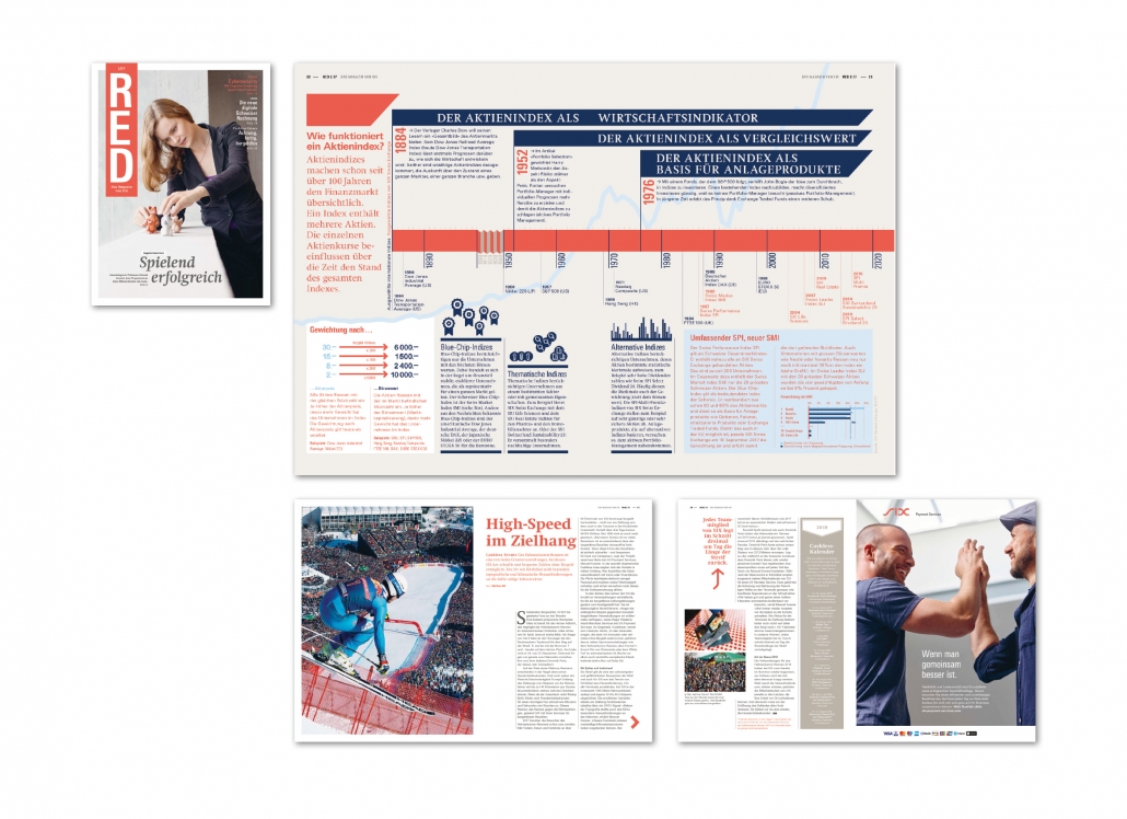
RED, Das Magazin von SIX, SIX, CH, Bronze Award, 9. ICMA
Category 1.2. Customer Magazines B2C Print
“Red” is the magazine of the Six Company. This company operates the Infrastructure for the Swiss financial centre and the Swiss banks. Keywords are payment transactions, financial information and cyber-security. The jury praised the unusual, vertically arranged logo and the successful combination of texts, photos and infographics.
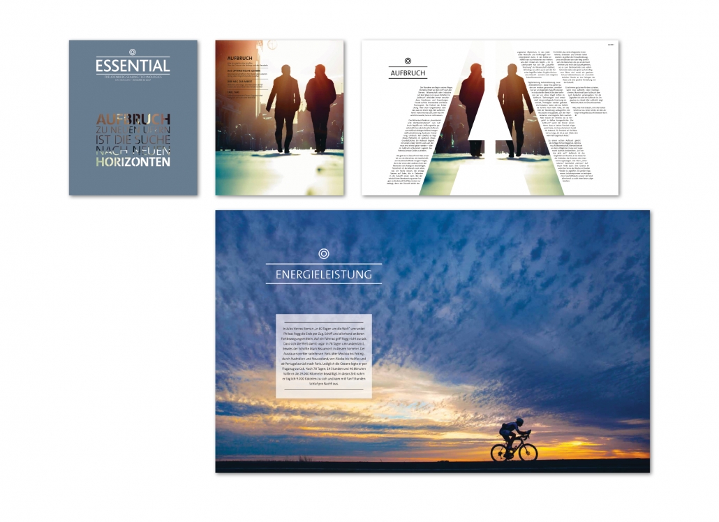
Essential · Freudenberg, Profilwerkstatt GmbH, D, Gold Award 9. ICMA
Category 1.2. Customer Magazines B2C Print
Jury statement: “Clear concept, successful invitation to read, calm yet concise layout. Very balanced ratio of text and image. Format, paper, print – impressive due to its simplicity”. New articles always start on a double page. The headings are highlighted by capitals and lines. Infographics and small pictograms fit very well into the overall layout.
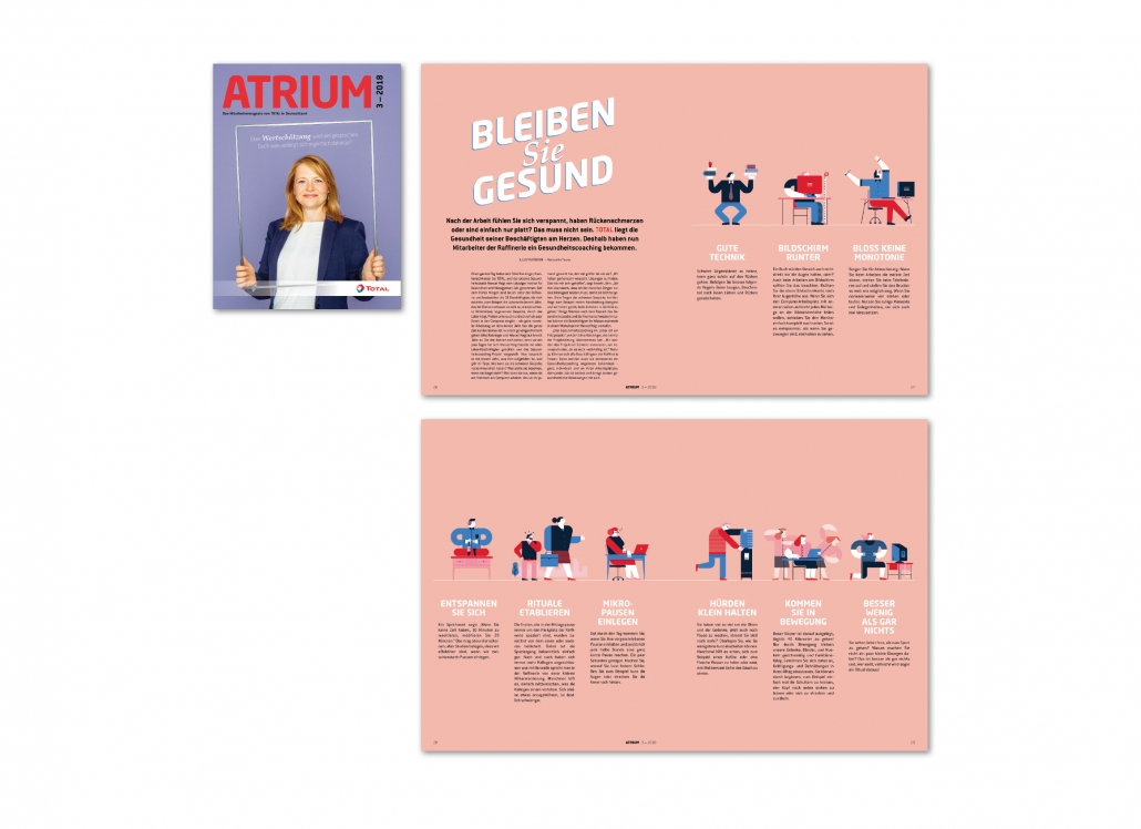
Atrium, Total Deutschland, muehlhausmoers corporate communications GmbH, D, Gold Award 9. ICMA
Category 1.3. Employee Media Print
Jury statement: „Atrium is modern, clear, reader-friendly and very carefully designed. Photos, infographics and illustrations are used to visualize topics. The design elements are very well coordinated and result in a varied appearance“.
A four-page article with health tips is divided into nine segments. Each has a small lovingly designed illustration. They are designed in a reduced colour scheme: In addition to black and white, there is only blue and red. The pink background sets these pages apart from the others in this issue.
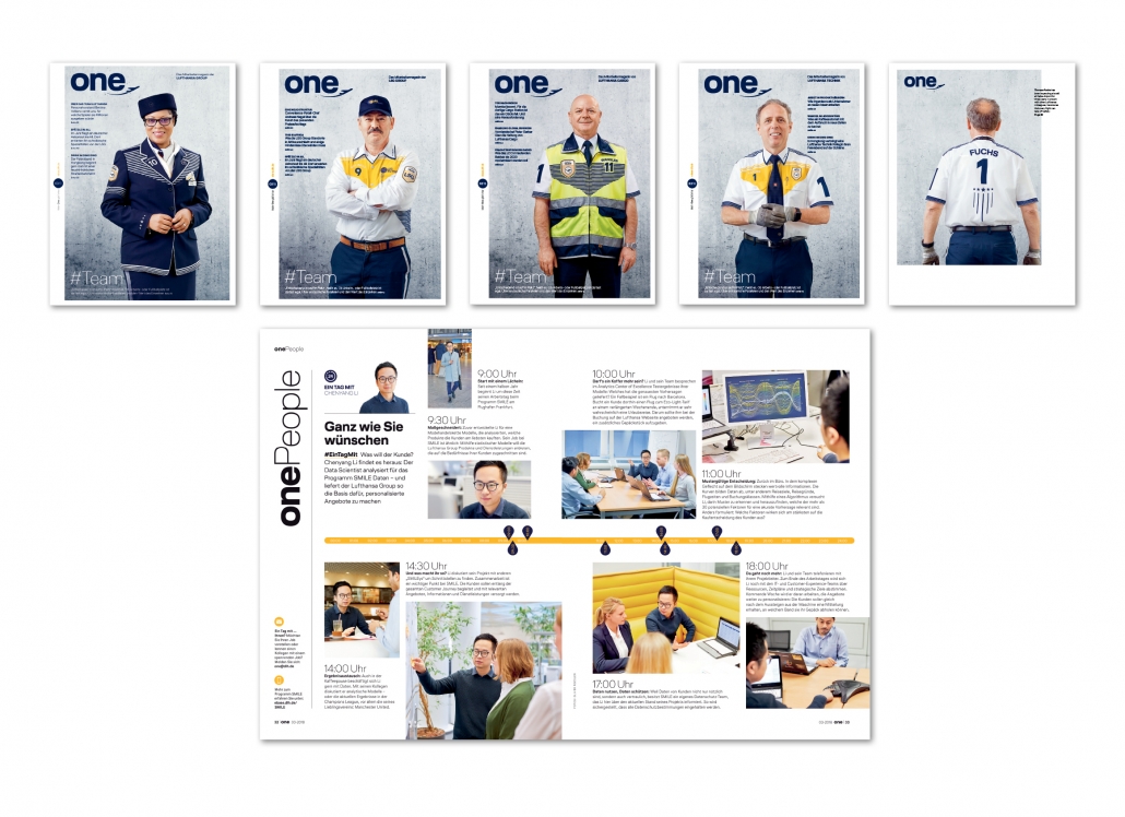
One · Lufthansa Group, Axel Springer Corporate Solutions GmbH & Co. KG, D, Gold Award 9. ICMA
Category 1.3. Employee Media Print
Jury statement: „Creatively and formally well imple-mented special edition on records and teamwork.” The cover is available in four versions. Each cover features a different member of a team at Dallas-Fort Worth Airport. The cover story is also dedicated to the topic of teamwork. In the category “one People“ you can accompany an employee in his or her work. The yellow timeline in the middle indicates the times at which his work is reported. In addition, the text blocks are provided with times.
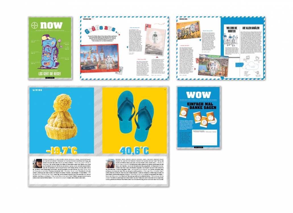
now · Bayer, Territory Content to Results GmbH, D, Silber Award 9. ICMA
Category 1.3. Employee Media Print
The international employee magazine measures 24 x 17 cm. It is printed on uncoated paper. The jury says: “Handy, untypical format, diverse, varied.” Typography: The serif font “Aachen” is used for the name and some headlines. Most headlines are sans serif, the basic font is serif.
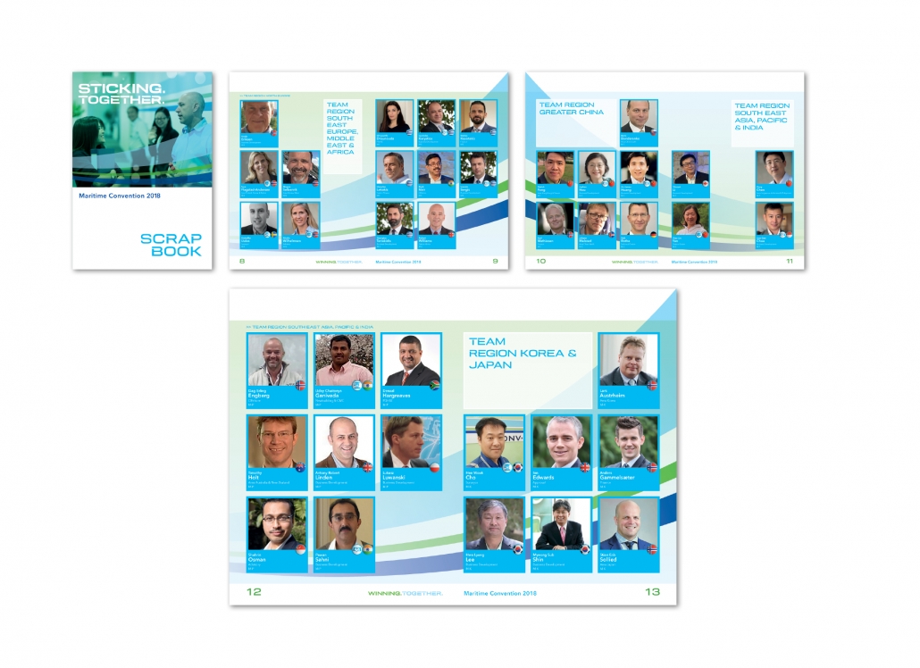
Sticking. Together. printprojekt Peter Lindemann & Hanns-Stefan Grosch GbR, D, Bronze Award 9. ICMA
Category 1.3. Employee Media Print
On the occasion of an executive meeting, a sticker and a sticker album in the style of the well-known Panini albums were prepared for each of those present. Each participant received 120 stickers from himself. The aim was to get in contact with each of the participants as much as possible and to exchange the stickers. This was an ideal opportunity to get in touch with each other beyond the borders of countries and departments.
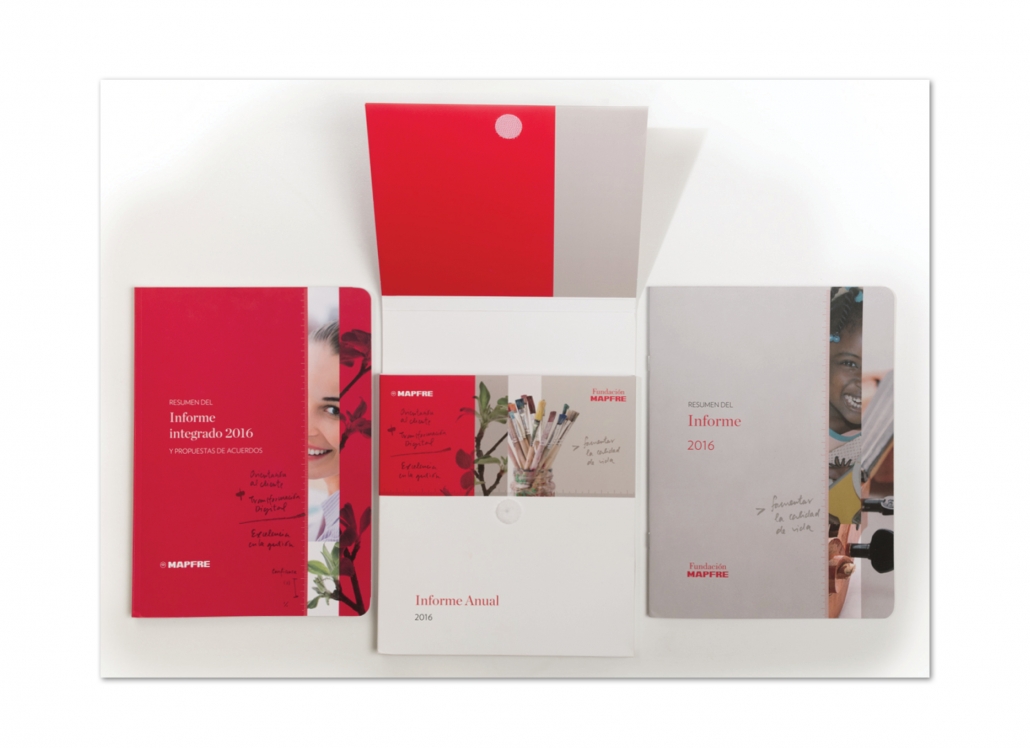
Mapfre, TAU Diseño, ES, Silver Award 8. ICMA
Category 1.4. Annual Reports Print
“Mapfre” is one of the largest insurance companies in Spain. In this annual report, the economic data of the insurance company was combined with information from the field of corporate social responsibility for the first time. Jury Statement: “Fresh, lively layout with a successful choice of colors and sophisticated typography. The handy format is reminiscent of an exercise book.” Everything is put together in a Velcro pocket slipcase.
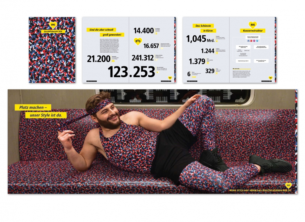
BVG Lagebericht & Jahresabschluss 2016, Die Botschaft Communication GmbH, D, Gold Award 8. ICMA
Category 1.4. Annual Reports Print
The BVG Annual Report – Berlin public transport – fits perfectly into the strategy of bringing the spirit of the company to life. The report looks cheeky, self-confident, Berlin like. From the jury statement: This report is an explosion of creativity, a compelling set of facts, outstanding, wonderful and self-ironic.
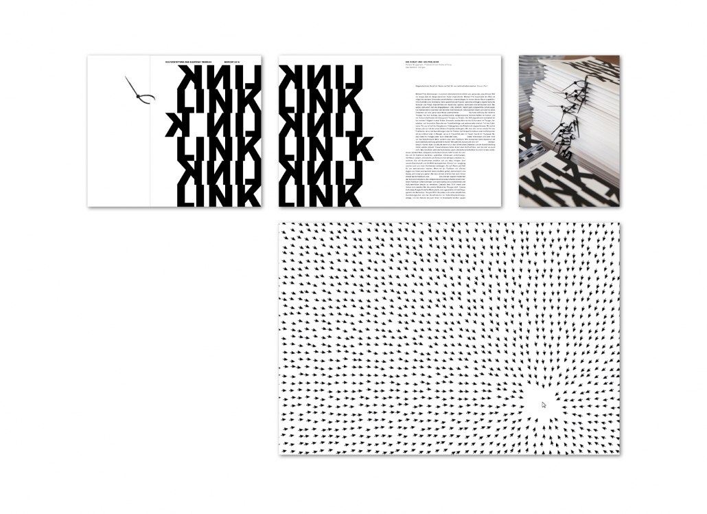
Link · Kulturstiftung des Kantons Turgau, Bericht 2016, Susanna Entress, Urs Stuber, CH, Silver Award 8. ICMA
Category 1.4. Annual Reports Print
“Link” is the name of the annual report of the Cultural Foundation of the Canton of Thurgau, Switzerland. The envelope is relatively thick and the binding is made only by a black plastic tape that was placed in the middle. The jury says: “Very creative, artistically unusual form of presentation”.
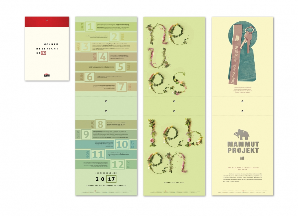
WIRO Wohnfühlbericht 2017, Polarwerk GmbH, D, Bronze Award 9. ICMA
Category 1.4. Annual Reports Print
Jury statement: “The annual report of the municipal housing company Wiro from Rostock has an original layout, because it is published as a “Wohnfühlbericht” – home feeling report – in calendar form. The image section is an exciting portrait format that offers innovative design possibilities. The annual report with the figures is in landscape format. Some table pages can be
opened here. The text is compact, to the point.” Image part: A matt paper and pastel shades are used. Each page offers new design variations.
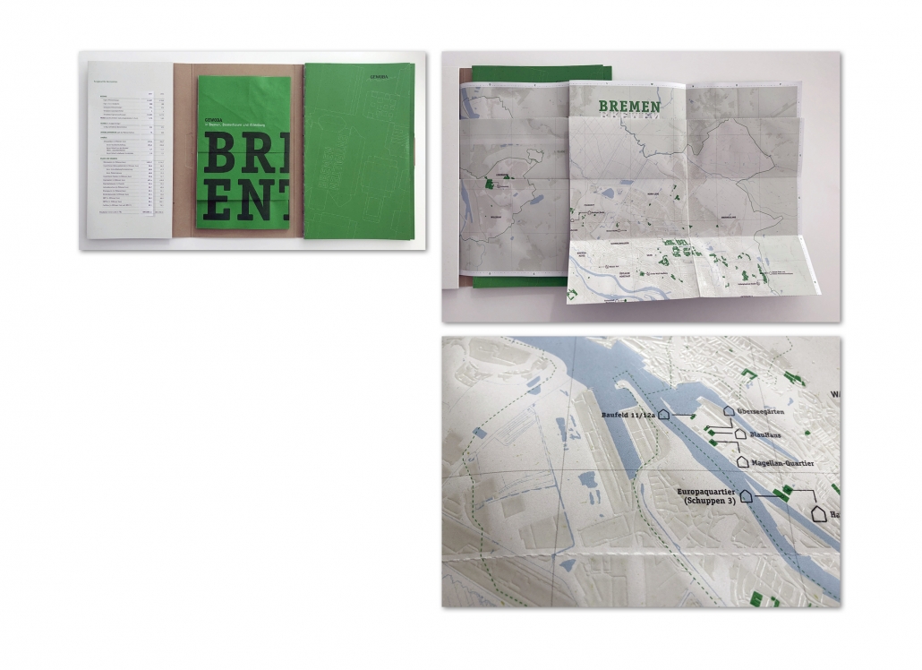
GEWOBA, Polarwerk GmbH, D, Award of Excellence 9. ICMA
Category 1.4. Annual Reports Print
The annual report of the Bremen housing cooperative GEWOBA has a narrow, handy format of 17.5 x 29.7 cm. The bookbinding process is very complex, as the report has a Swiss brochure and thread binding. A special highlight is the city map: It was printed in white lacquer. The GEWOBA objects were marked green.
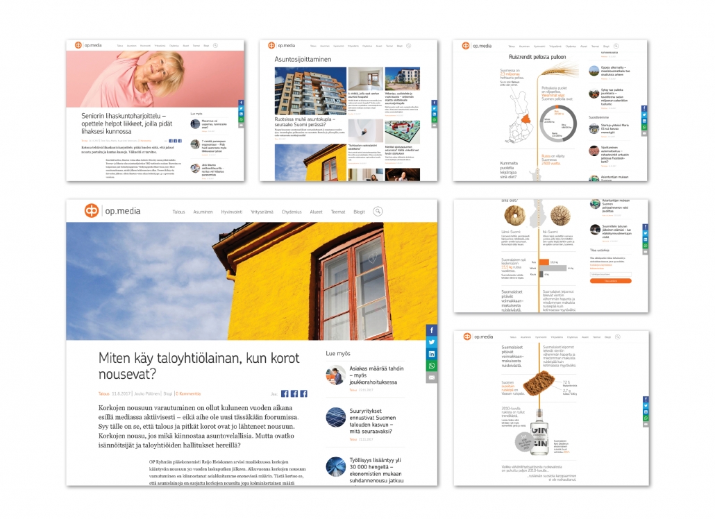
OP Media https://op.media/ A-lehdet Oy, FIN, Gold Award 8. ICMA
Category 1.8. Customer Magazines B2C Online
Website: https://op.media OP Financial Group ist die größte Finanz-Service-Firma in Finnland. Die Website hat das Ziel zu informieren, zu erziehen und zu unterhalten. Die Navigation ist sehr übersichtlich. Videos und Infografiken gehören zum Stil dieser Website.
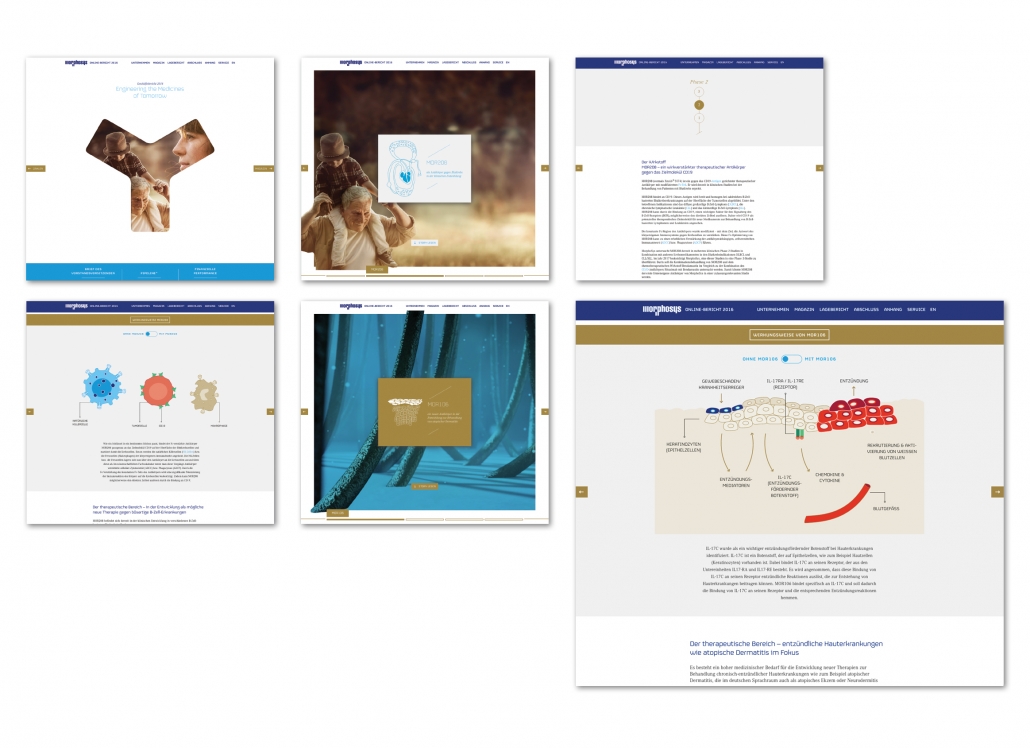
MorphoSys AG, Online Geschäftsbericht 2016, 3st Kommunikation GmbH, D, Silver Award 8. ICMA
Category 1.10. Annual Reports Online
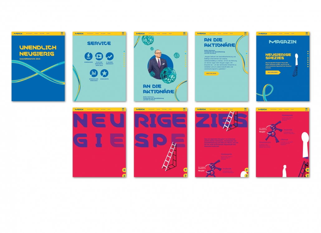
Merck KGaAOnline Geschäftsbericht 2016 Unendlich neugierig, 3st Kommunikation GmbH, D, Bronze Award 8. ICMA
Category 1.10. Annual Reports Online
Merck continues the innovative design path of the previous year with both the Print and Online Annual Reports. Strong colors, animated infographics and striking design are the keywords. http://gb2016.merck.de/
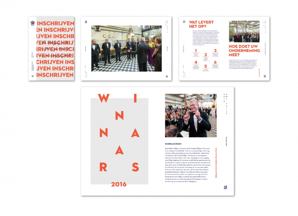
Inschrijven, Koning Willem 1 Stichting Studio Piraat, NL, Gold Award 8. ICMA
Category 1.5. Image Brochures
The invitation for a prize for sustainable entrepreneurship is designed very expressively. The prize is awarded by the “Koning Willem I Stichting”. Therefore, the color of the royal house – orange – is obvious. This radiant color is accompanied by a royal blue. The typography of the headlines is playful because the words are cut up or the letters are spread across the page like a game. The page numbers are also placed very large as game elements and placed vertically.
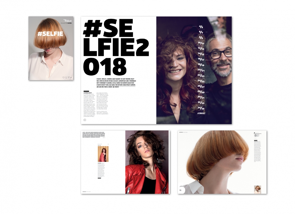
#Selfie · Befurt Kollektion 2018, Attacke Werbeagentur GmbH, D, Silver Award 9. ICMA
Category 1.5. Image Brochures
Hairdresser Befurt develops its own look collection every year. Typical icons of the social media world around Instagram and Snapchat are used as design elements. The alternation of super close up shots and portraits creates a special tension. A special highlight: the brochure is DIN A 3 large. Jury statement: “Excellent title and content selection for the topic of hair as part of look and image. Photos and layout including social media icons underline the intention to be at the pulse of time. This image brochure is a statement to stand out from the crowd of hairdressers.”
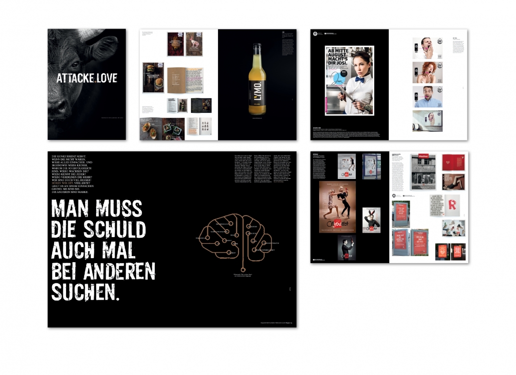
Attacke Love, Attacke Werbeagentur GmbH, D, Bronze Award 9. ICMA
Category 1.5. Image Brochures
The agency has published an image brochure for itself. The presentation is like the name of the agency – Attacke – already suggests: very powerful. The magazine is in the format DIN A 3 and has many black sides with a rough sans serif typeface in upper case letters. In the preamble it says among other things: “We are the golden wood hammer and the wedding cake with Chili filling. We are the karaoke evening at the opera and the lipstick from Edding.” Jury statement: “Strong communication through the black-and-white photo concept. Good use of the large format. Good variety of large and small pages. Stylish design, strong communication through black pages, especially on the cover.”
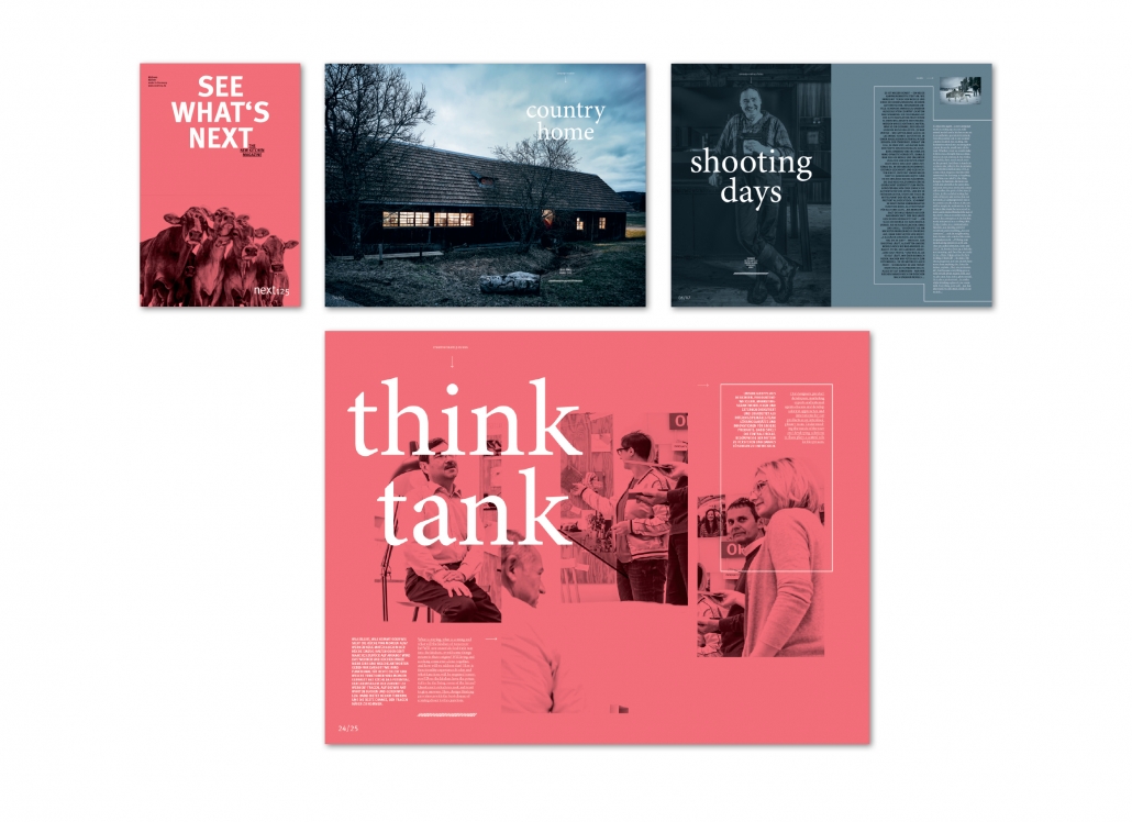
See what‘s next, next125, Hörger & Partner, D, Gold Award 9. ICMA
Category 1.5. Image Brochures
The kitchen manufacturer next combines premium kitchens and regionality in its print catalogue. That‘s why cows from the Allgäu region are shown in modern kitchens. The brochure is bright
red on the outside and in the middle of the magazine. In the middle is a narrow-format insert entitled “news”. The open pages are square. Altogether an exciting game with paper and format. Jury statement: “An image brochure of the finest. The publication bridges the gap between product catalogue and image brochure very well. The large format DIN A 3 is used excellently. The design is both contemporary and classic due to the reduction.”
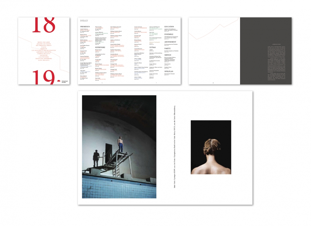
Jahresbroschüre 2018/19, Semperoper Dresden Sächsische Staatsoper, Semperoper Dresden, D, Bronze Award 9. ICMA
Category 1.6. Print-Catalogues
The photos of the annual brochure were taken by Andreas Mühe. He has lived and worked as a freelance artist and photographer in Berlin since 2001. Typography: Some texts are set very large and sometimes vertical. In these cases the font is grey. The page layout is varied, as it can have one, two or three columns, depending on requirements. Jury statement: “Good design that combines a stringent concept with elegant fonts. Outstanding photography.”
