We took a look back at the first decade of the ICMA Award. Here is a summary.
Press release
Best of Decade: The Bundled Creativity of a Decade
Under the title “Best of Decade”, we have compiled the best works from the Custom Media category from the first ten years of the competition. Covering the period from 2010 to 2020, the result is an encyclopaedia of contemporary graphic design. The bundled creativity of a decade is spread out before us. You can look back once more, but at the same time you can also look forward: If you know what the past looked like, you can learn a lot from it for the future.
Looking over the best works of the decade, what is the overall impression?
Custom media publications are timeless. You can easily place works from the first and the tenth competition next to each other. There is no discernible gradient, no general trend reversal. It is good that the custom media industry focuses on continuity. None of the publications looks outdated. This speaks for the fact that the creators are always up to date and focus strongly on readability, clarity and distinctiveness. The custom media industry does not rush after current trends, it relies on serious presentation without useless decoration.
Would a publication from the first ICMA Award still have a chance in the current competition?
In most cases, the answer is yes. The typography, the handling of images, the page layout were already at a high level in the first competition. Typography: There are new fonts, but they follow on from previous traditions. Photography: The concept of what constitutes a good photo has not changed significantly. Layout: The rules on navigation, white space and hierarchy of topics have not changed in the past decade.
Jury member Meike Quentin, CEO of the agency das Amt, summarises: “It is interesting to see the development in corporate publishing between 2010 and 2020 based on the award-winning publications of the respective year. My impression: In the early years, the content was still very much about presenting ‘everything so beautifully wholesome, successful, colourful and prosperous here’. It was about a performance show along classic corporate values – growth, performance, plus a bit of sustainability. In the more recent years, on the other hand, there has been a clear trend towards purpose, responsibility, diversity and also positive nostalgia.”
What innovations were there during the decade?
Paper: You can‘t see it from the examples: There has been a change from glossy to matt paper and from matt paper to thicker uncoated paper. The new feel is more emotional, more friendly. Publications seem more approachable, less distant.
Layout: Headlines and images are more strongly interlocked. At the fourth ICMA Award, we see for the first time that headlines are blocked and placed on top of pictures. The trend continues to this day.
Typography Online: Typography became finer, more individual. Corporate fonts can now be embedded in websites. This is now standard and was new ten years ago.
Page Layout Online: With the advent of smartphones, websites became adaptive. Today, corporate websites can be consumed on a smartphone just as they can on a screen. Approximately 50 percent of website use is via smartphone.
Isn‘t there a broad trend away from print and towards online and social media?
In general: You try to reach employees and customers on all channels. That‘s why there are still printed publications. Especially when you want to highlight the company‘s qualities and provide in-depth information, you still use print. However, B2B and B2C publications published in several languages are increasingly being moved to the web. This also helps to reduce the enormous costs of worldwide mailing.
Employee media: Here there is undoubtedly a trend towards intranet solutions that do not require a printed employee medium. In particular, there are fewer employee newspapers than ten years ago.
Image brochures: There are still many image brochures submitted to the competition. Print works. Printed material is considered less ephemeral than the web.
Print catalogues: High-quality brand-name articles such as kitchens, furniture, watches can still be found in print catalogues. But those who want to attract special attention will also be able to create more surprise in print than on the web. The format, the choice of paper, the look and feel – print still surpasses the web.
Contact:
Norbert Küpper
International Editorial Design & Research Forum
Gutenbergstr. 4
40670 Meerbusch
Germany
Phone +49 2159 911615
Email nkuepper@icma-award.com
www.icma-award.com
Employee Media
At the 1st ICMA Awards, about 40 per cent of employee media was in newspaper format, 50 per cent in magazine format and only 10 per cent online. Today, many employee media are online and the newspaper format is in sharp decline. However, there are still many employee magazines in print.
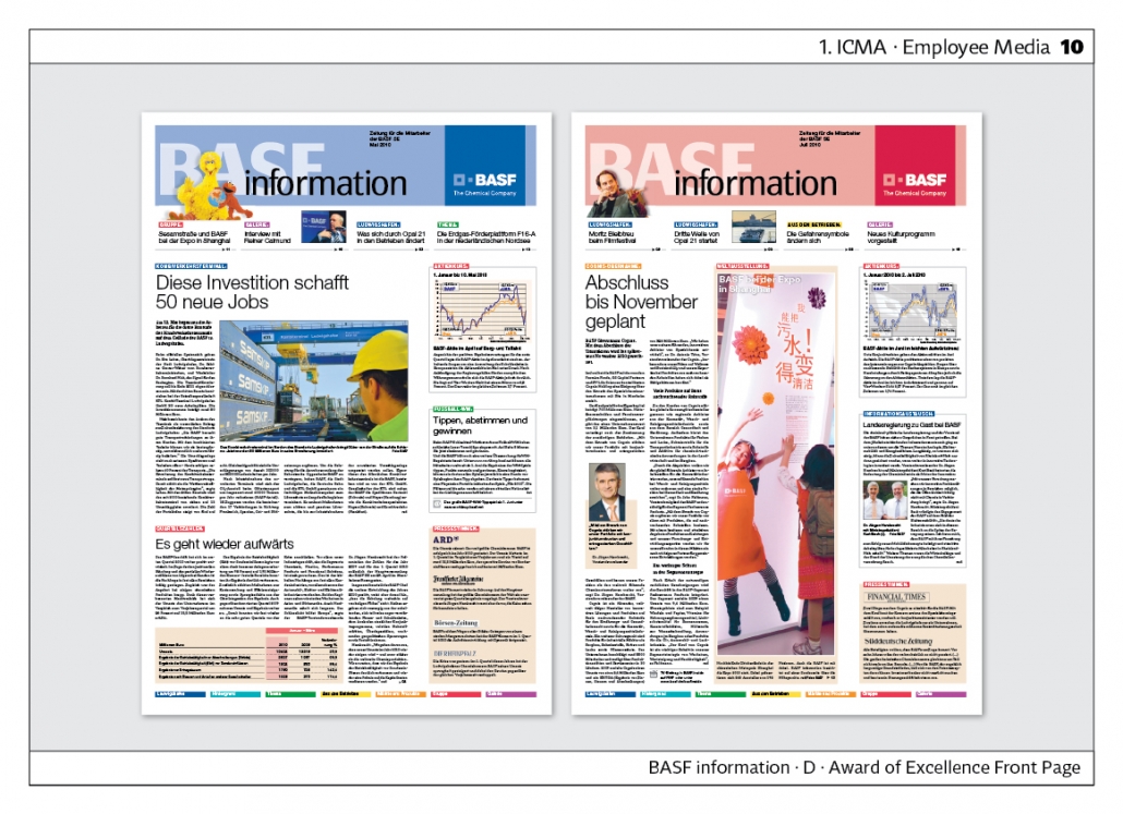
“BASF-Information“ is still published in newspaper format – Rhenish or Berlin format – and thus appears particularly serious and informative. In terms of picture editing, picture formats and visual storytelling, this newspaper sets standards.
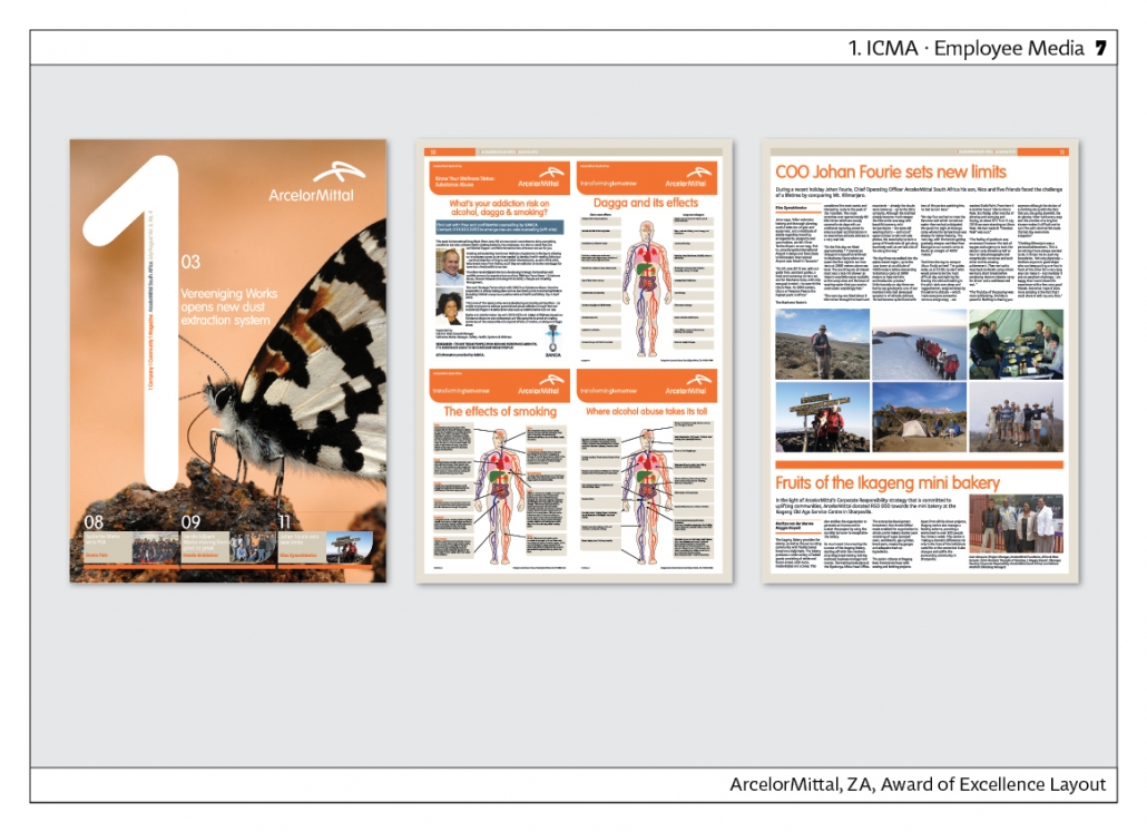
The newspaper “ArcelorMittal“ from South Africa is also very unusually designed, because it uses a full-page picture on the front page already in the first competition.The inside section is completely left-justified. Format: DIN A 3.
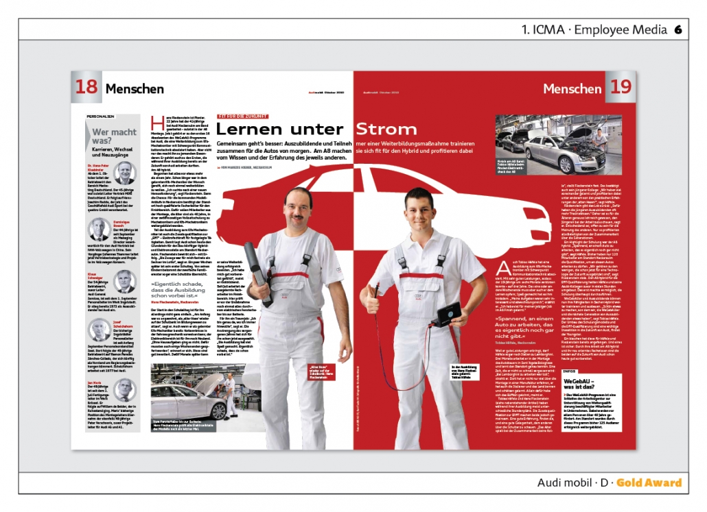
“Audi mobil“ appeared in tabloid format at the 2nd ICMA and impressed the jury with its relaxed layout. The layout and photography show the working world and the employees in a particularly authentic way. Agency: C3.
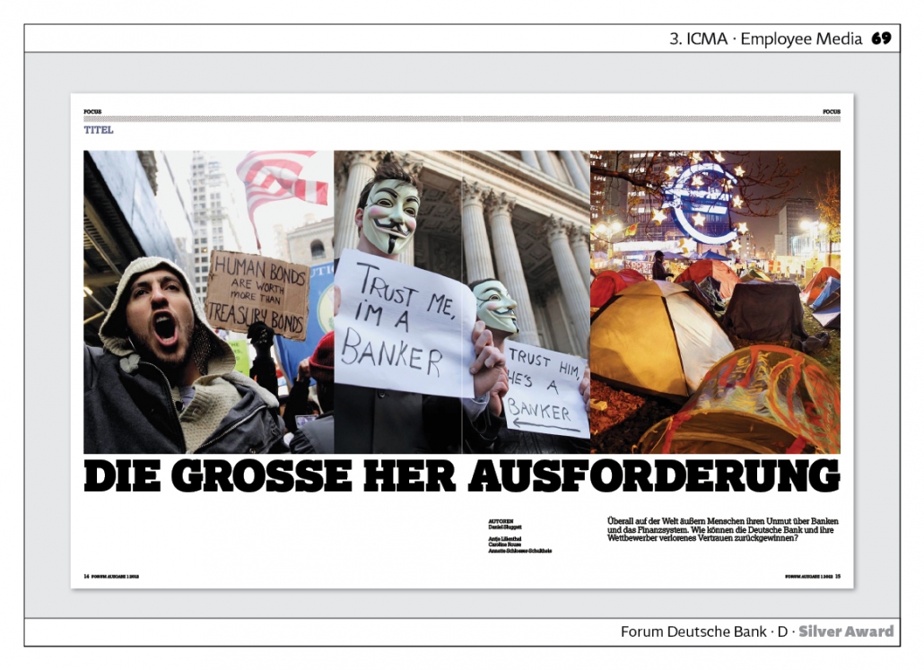
The magazine “Forum Deutsche Bank“ reaches a completely different target group. The cover story “Under Pressure” is particularly strong, showing how people all over the world express their displeasure with the financial system.
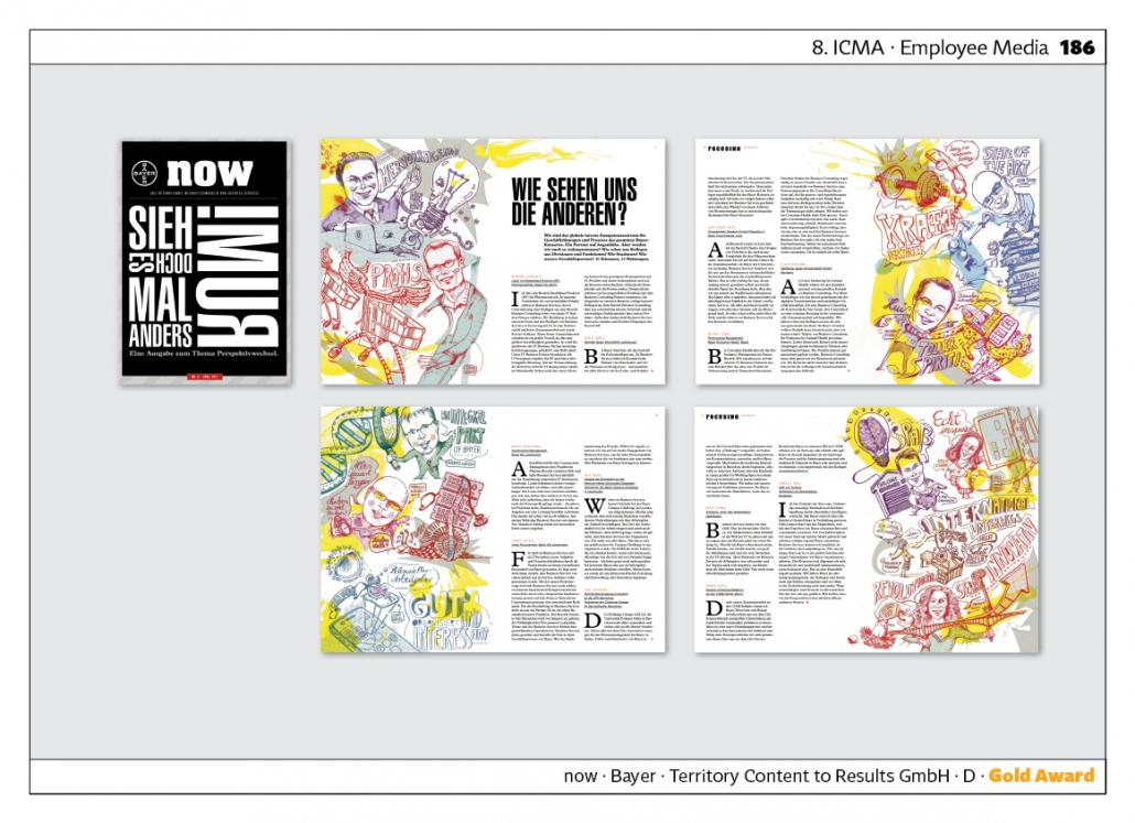
Bayer‘s “Now“ is very innovative because the magazine is published in DIN A 5 format and is thus very convenient. The contents are very loosened up. A wide variety of graphic styles are used. Awarded at the 7th, 8th and 9th competition. Agency: Territory Content to Results.
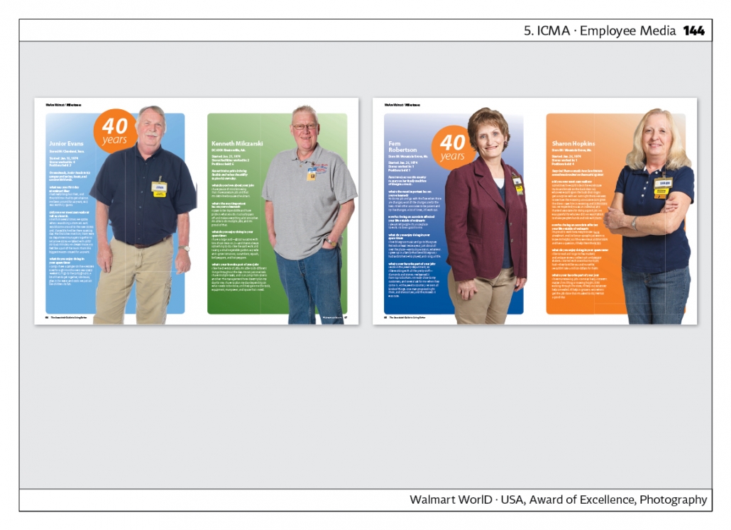
“Walmart World”, USA, presents individual employees under the title „We are Walmart“. Some of them are celebrating 40 years with the company. Even today, individual employees are seldom put in such the limelight.
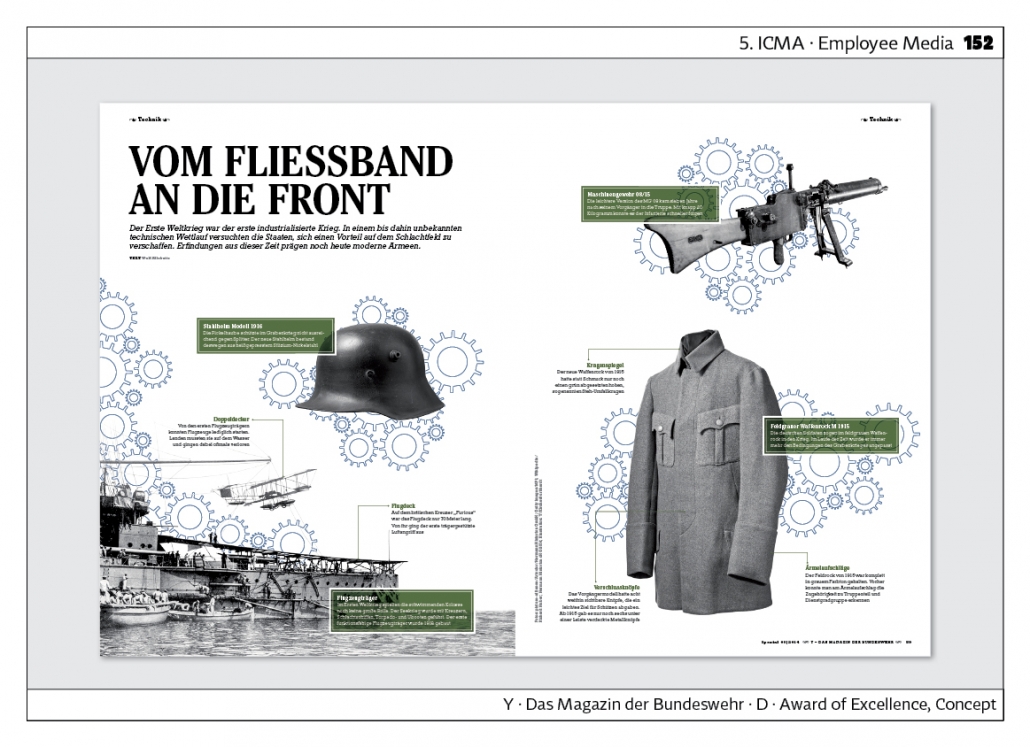
“Y – Das Magazin der Bundeswehr“ (Germany) is strongly geared to a young target group. The visual language is very modern. The issue „Europe in Bloodlust“ is particularly impressive. Here, the First World War is presented in many aspects, using maps, infographics and visual storytelling.
Custom Media B2B
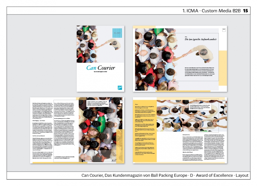
The “Can Courier”, which won the first ICMA award, has a relaxed design with a lot of white space. This is already clear on the front page, because the lower part only shows the name on a white surface. The inside pages are double-columned, the text is left-justified. In the cover story shown here, the shots from above are a special highlight. The photograph on the cover is taken up again on the inside.
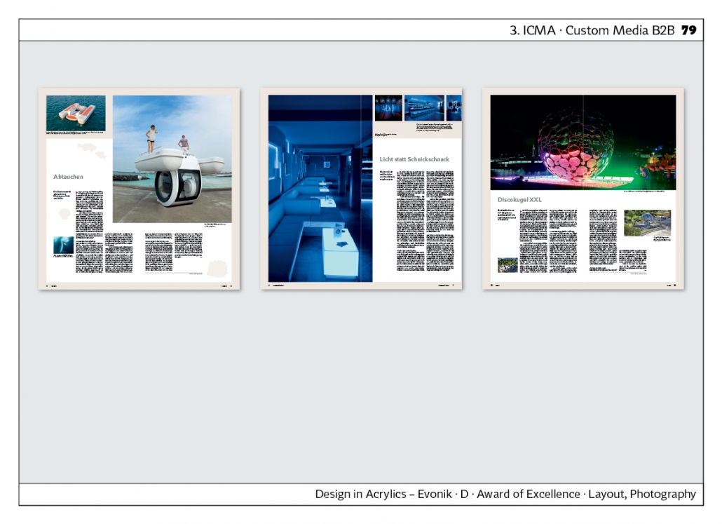
“Design in Acrylics” by Evonik has a very interesting vertical format. This creates tension. The open booklet is square and it is always paginated over the binding. The inside pages have a light grey frame.
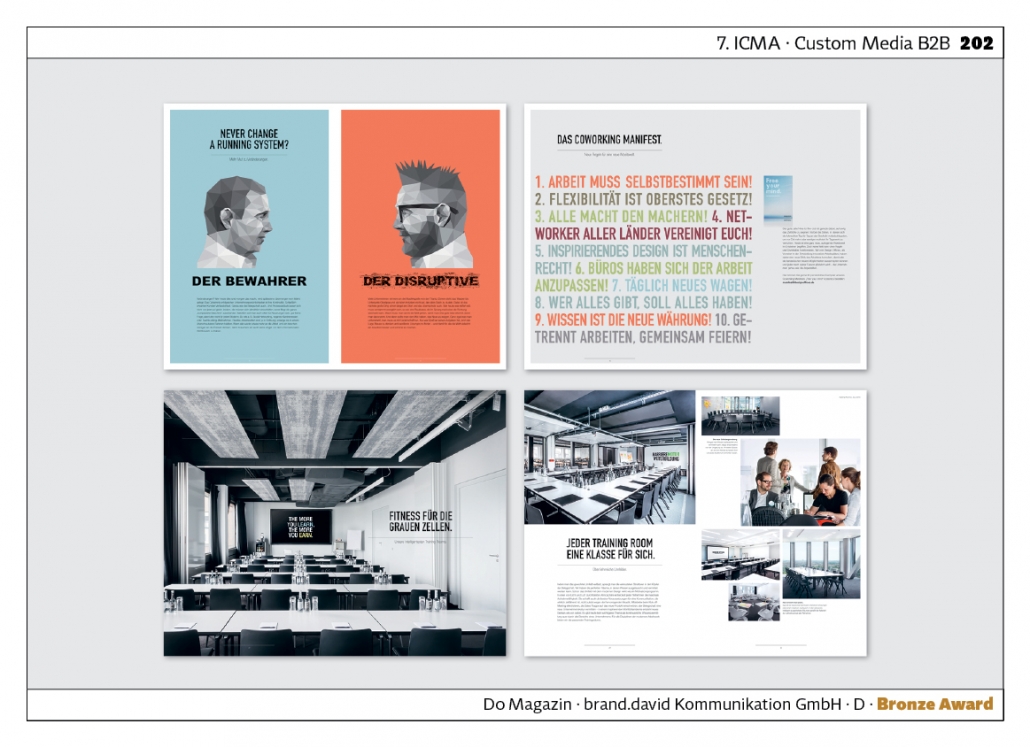
The “DO Magazine” is DIN A 3 in size and often has pictures that fill the entire double page. Text is often placed on translucent areas. Very varied layout with distinctive covers. Agency: brand.david Kommunikation.
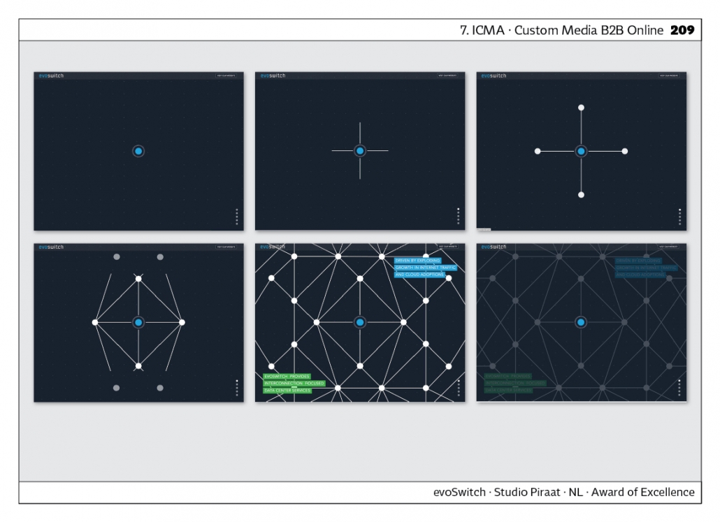
“evoSwitch” is a website for a data centre. That‘s why the website looks very technical. By scrolling, one sets an animated infographic in motion. It is interesting that the user determines the speed. Small text blocks contain details about the company. Agency: Studio Piraat, Netherlands.
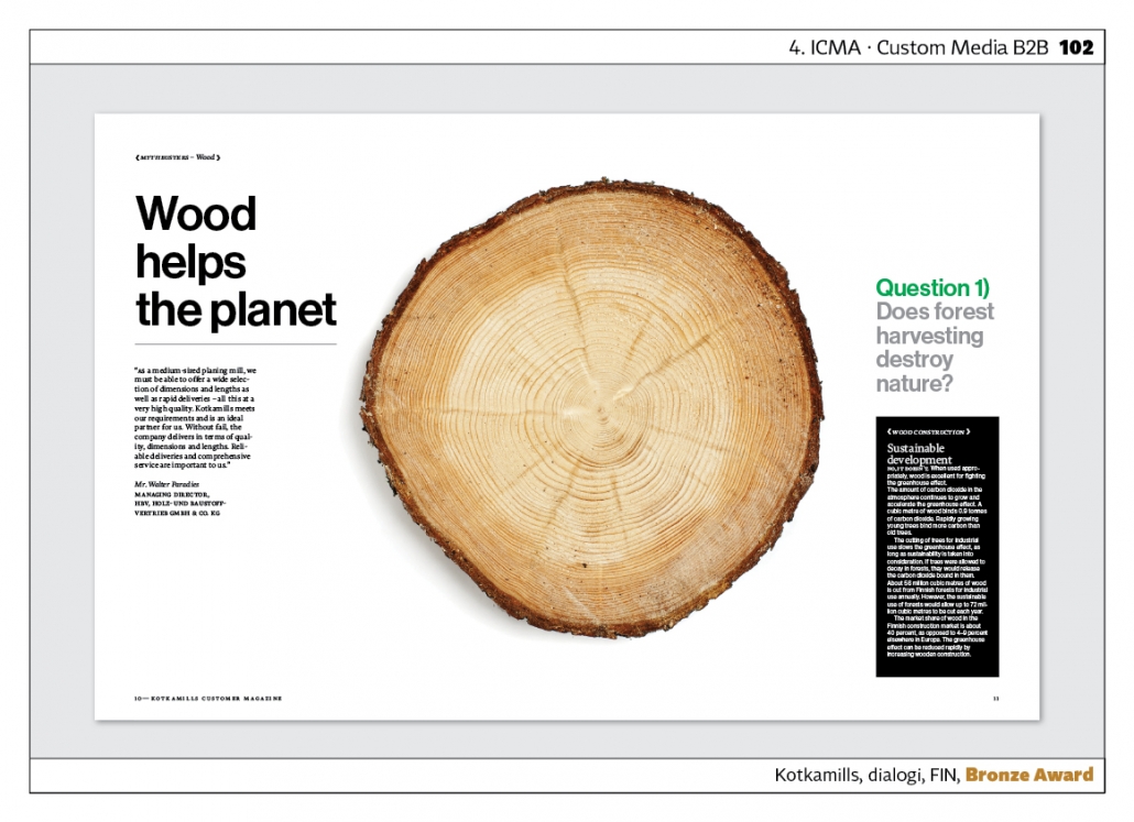
“Kotkamills” is the customer magazine of a paper mill. Very heavy paper is used to make the world of paper haptically tangible. The inside shows a tree slice. This is accompanied by the question: “Is forest harvesting destroying nature?” One does not avoid critical questions. The Helvetica typeface used here, in combination with the white space, creates a very modern impression. Agency: A-lehdet Content Studio, Finland.
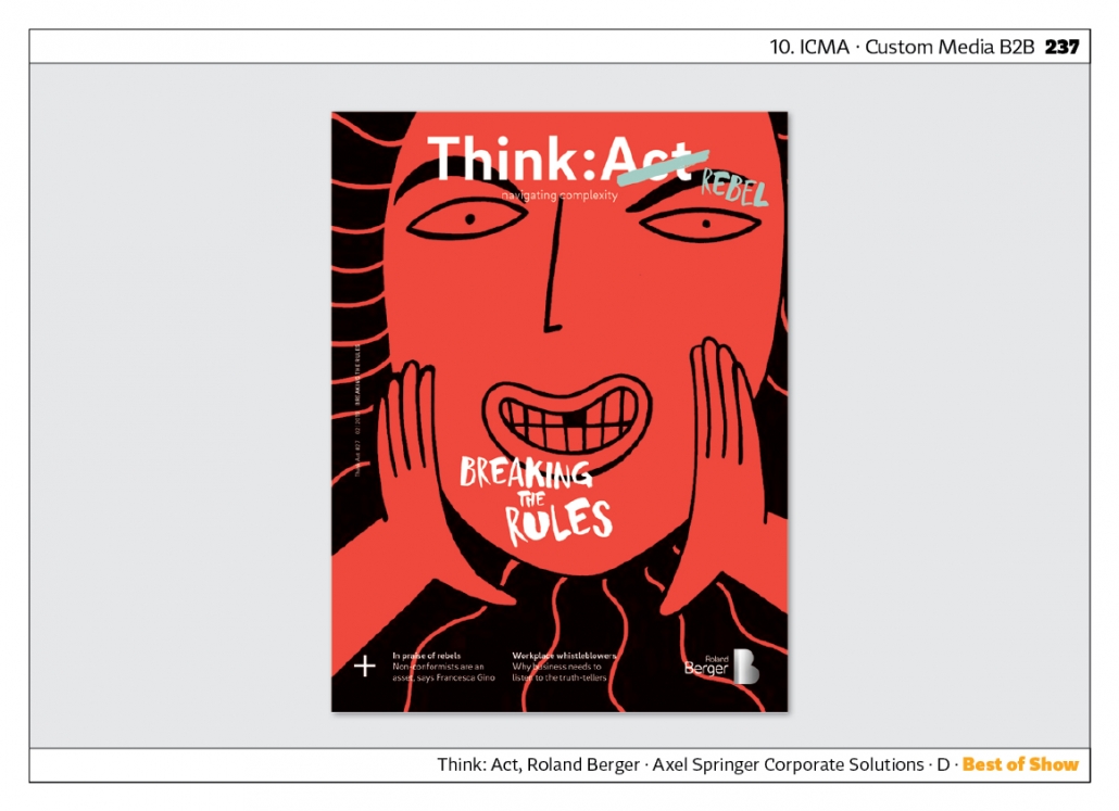
“Think: Act” by Roland Berger has won awards since the fifth competition. In the tenth competition, the theme was “Breaking the Rules”. The cover was red and also on inside pages the headlines were handwritten. Very good visualisation of the theme. Agency: Axel Springer Corporate Solutions.
Custom Media B2C
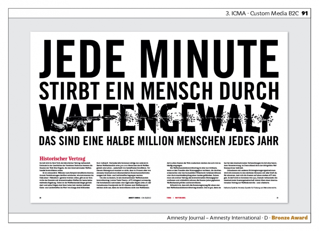
The “Amnesty Journal” is a constant winner of ICMA awards. The cover story on gun control from the third competition is particularly spectacular. The typography of the headline is shot through. Perfect visualisation. Agency: Schrenkwerk.
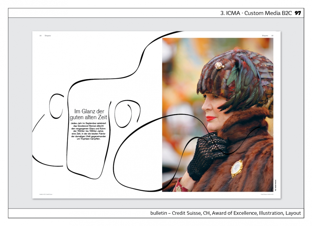
Credit Suisse‘s “Bulletin” won the third competition with an issue on the theme of elegance. The headline “In the glamour of the good old days” is accompanied by a photo of fashion from the 1920s and the drawn silhouette of a car from that time.
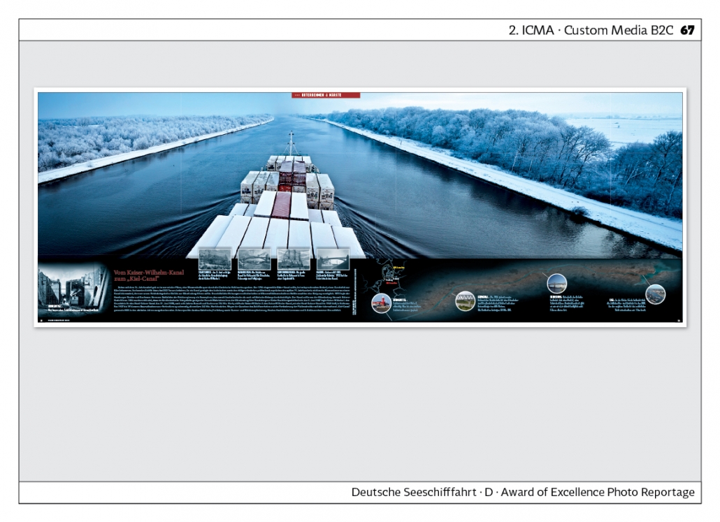
The magazine “Deutsche Seeschifffahrt” already won awards in the first competitions. It is published by the German Shipowners‘ Association. A photo reportage on a winter passage through the Kiel Canal is particularly spectacular.
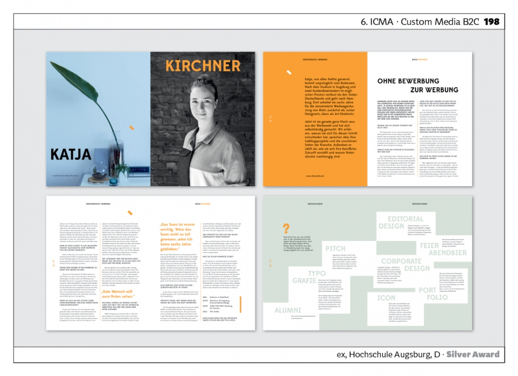
The magazine “EX” of the Augsburg University of Applied Sciences participated in the 6th ICMA Award with a women‘s special. The inside pages are designed with pastel and orange tones. Very generous layout.
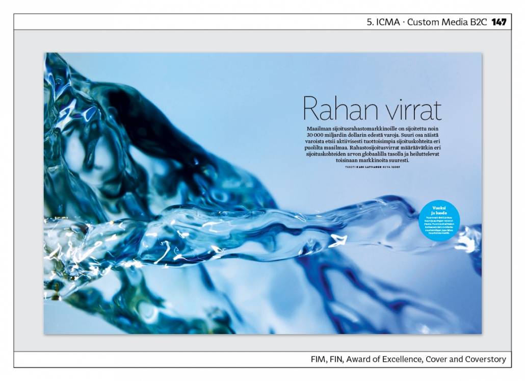
The magazine “FIM”, published in Finland, starts the cover story on the topic of water in a spectacular way: it is zoomed in close and only very little text is placed on the double page. Agency: A-lehdet Content Studio, Finland.
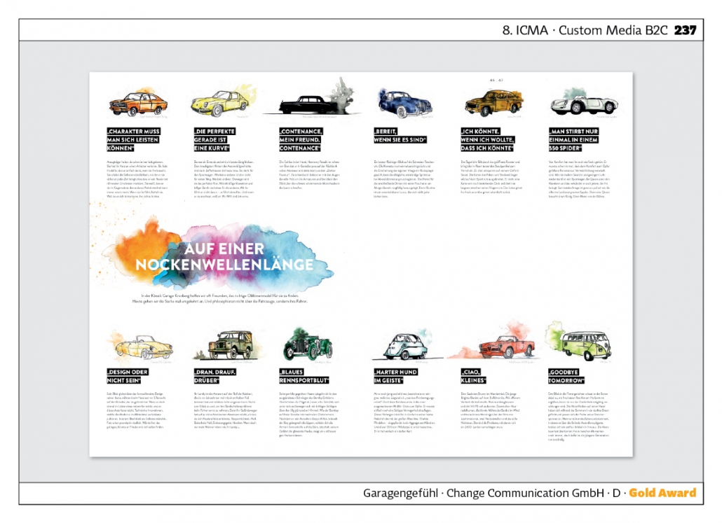
“Garagengefühl“ – “Garage Feeling” is published in DIN A 3 format. Each double-page spread is a world of its own in terms of design. For example, the page showing memorable passenger cars from past decades is very successful. Very good combination of illustration and typography. Agency: Change Kommunikation.
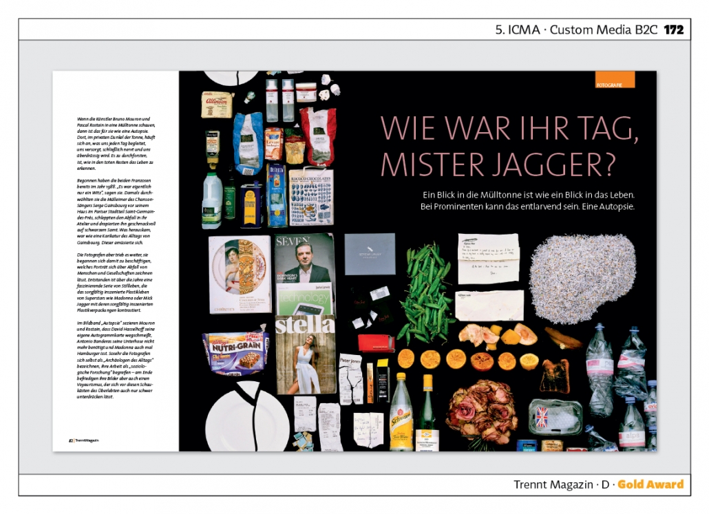
The “Trennt Magazin” of the Berliner Stadtreinigungsbetriebe shows waste separation in its most creative forms. In the fifth competition, for example, one looks into the dustbins of celebrities and lays the waste side by side, finely sorted. This reveals a lot about lifestyle. Agency: Peperoni.
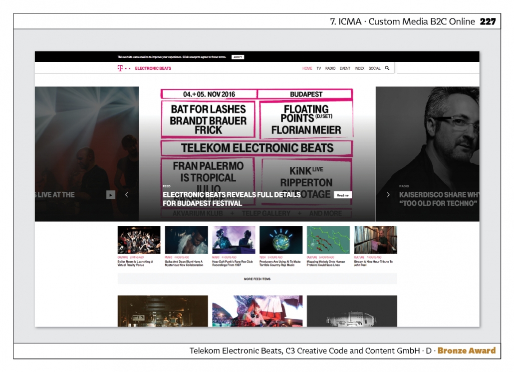
According to Wikipedia, Telekom‘s “Electronic Beats” website is “a marketing programme of Deutsche Telekom that specialises mainly in music, especially electronic dance music, but also takes up lifestyle, art and fashion topics. Link zur Website. Agency: C3.
Image Brochures
One might assume that image brochures will be replaced by web presences in the Internet age. However, this assumption is wrong. Advertising agencies in particular present their best work or their corporate philosophy in image brochures. Goethe‘s sentence: “What you have in black and white, you can safely take home” obviously still applies.
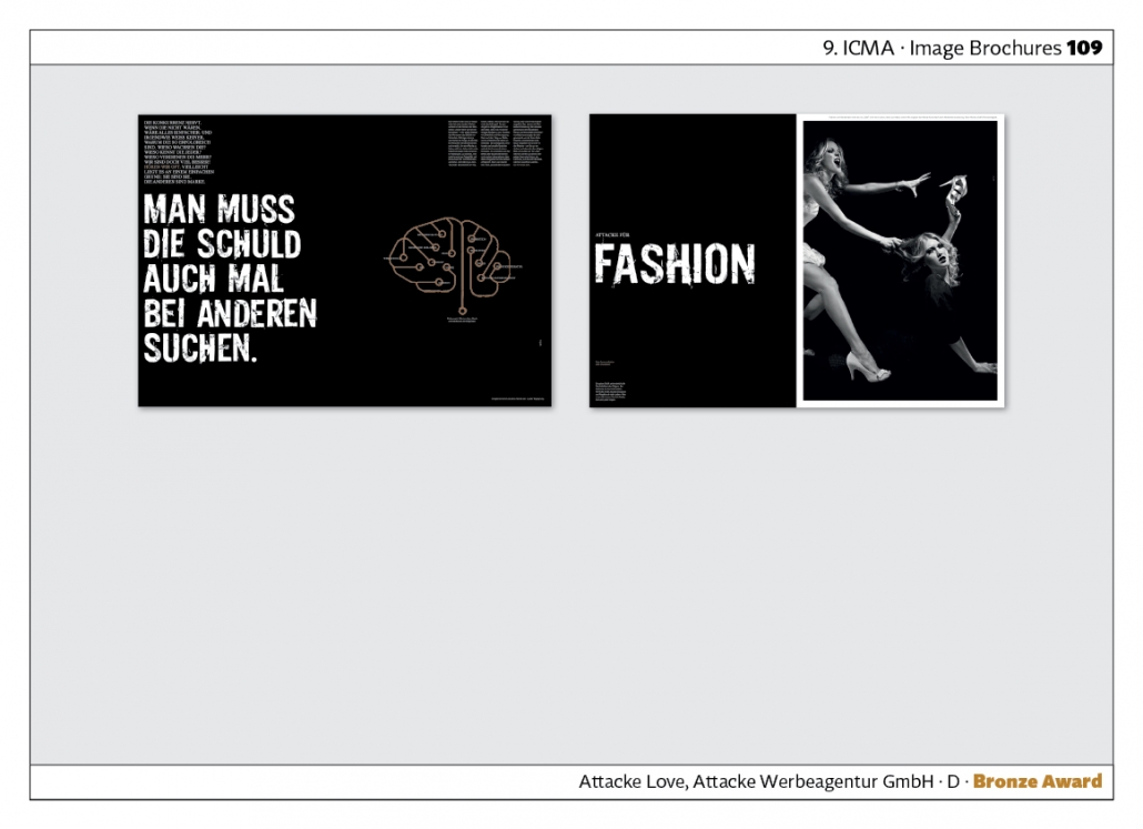
“Attacke Love” is an image brochure by the Ulm-based advertising agency Attacke. The typography and black and white have a dramatic effect. A variety of projects are presented. The agency also shows that good texts are produced. Agency: Attacke Werbeagentur GmbH.
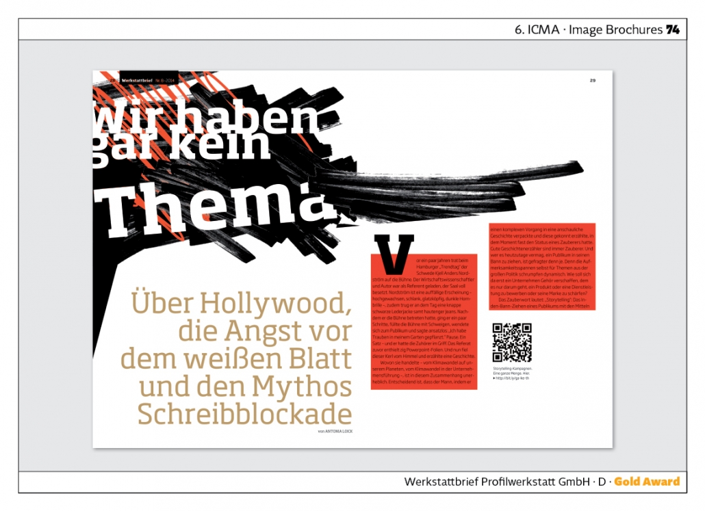
The “Werkstattbrief” gives an insight into the agency‘s everyday work. Headlines include: “Target group? Oh God: everyone!” or “We don‘t have a theme at all”. The design makes it clear that the approach to seemingly abstract topics is relaxed and easy-going. Agency: Profilwerkstatt.
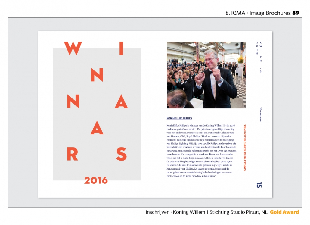
“Inschrijven” is a small brochure by the Koning Willem 1 Stichting. It is the announcement for a competition. The use of headlines is particularly striking: the capital letters are symmetrically distributed over an entire page. Agency: Studio Piraat, Netherlands.
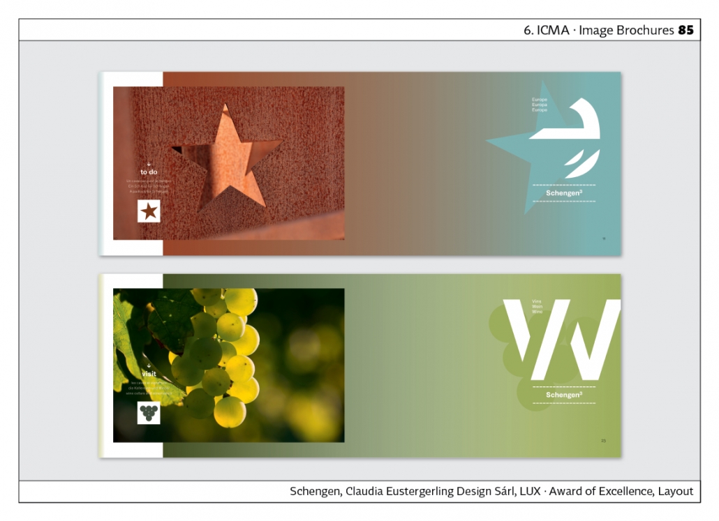
“Schengen” is the title of brochures for the city of Schengen in Luxembourg. The city is lovingly portrayed in atmospherically well-chosen photos. Agency: Claudia Eustergerling Sárl, Luxembourg.
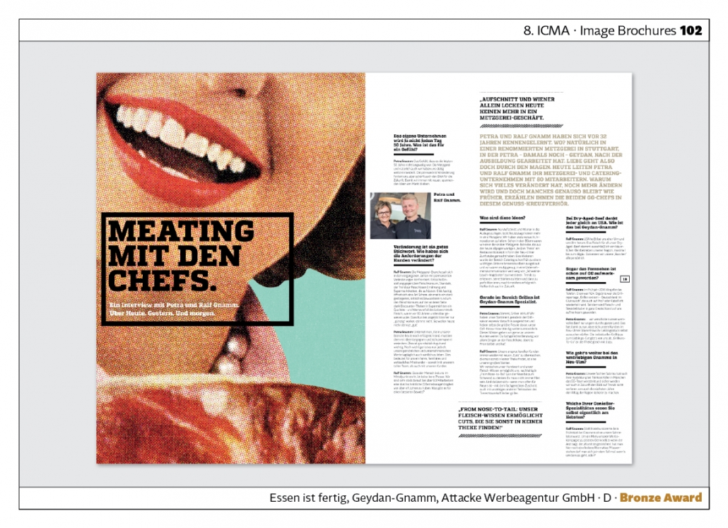
“Essen ist fertig” was created for the 50th anniversary of the Geydan-Gnamm company. The heavily rasterised photos show the atmosphere of the founding phase in the sixties. Agency: Attacke Werbeagentur GmbH.
Print Catalogues
Of course, there are many online catalogues where you can view, select and order products. But especially for high quality branded goods, there are still print catalogues. You can look at the goods at your leisure, compare and choose.
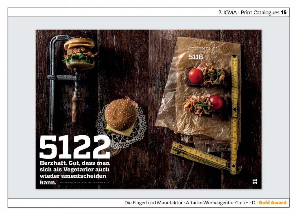
“The Fingerfood Manufacture” of the butchery and catering company Geydan-Gnamm oscillates between an image brochure and a catalogue. One learns a lot about the company‘s philosophy and is introduced to the products gradually as the brochure progresses. While in normal catalogues the order numbers are completely unimportant, they are emphasised here. The serif font here definitely stands for “hearty”! Agency: Attacke Werbeagentur GmbH.
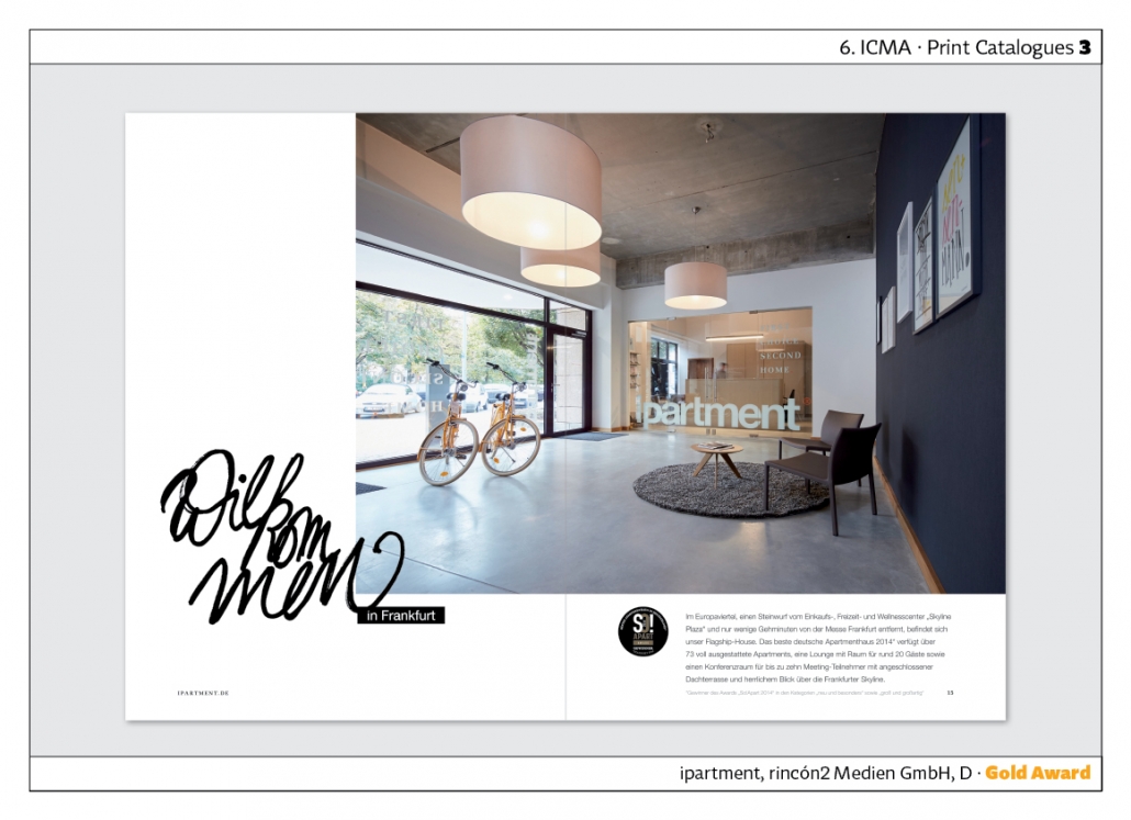
“ipartment” is a catalogue for a flat house in Frankfurt. Handwritten headlines are used on the cover and inside pages. This signals individuality and personal closeness. In addition to image pages, the catalogue also shows the flats with floor plans and prices. Suitable catalogue for high-priced offers. Agency: rincón2 Medien.
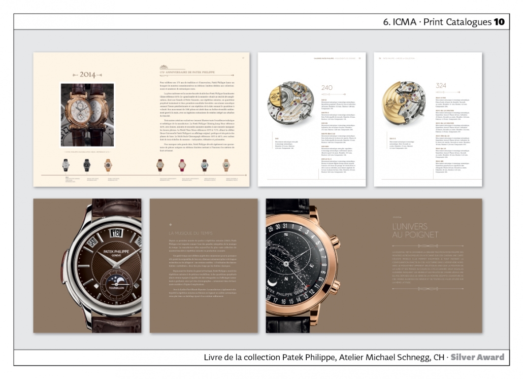
The “Livre de la collection Patek Philippe” features watches from the Swiss watch manufacturer Patek Philippe. The jury was particularly impressed by the photographs of the watches and the details, which were handled very well typographically. Agency: Atelier Micheal Schnegg.
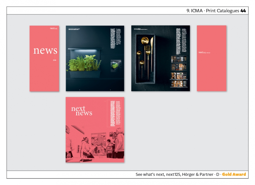
“See what‘s next” is a kitchen magazine for the company “next125”. Its image brochures and catalogues regularly win ICMA awards. At the 9th ICMA, a red edition in DIN A3 format won the award. A smaller brochure entitled “next news” is inserted into this cataologue. It has a narrow portrait format, which when opened up forms a square. Agency: Hörger & Partner.
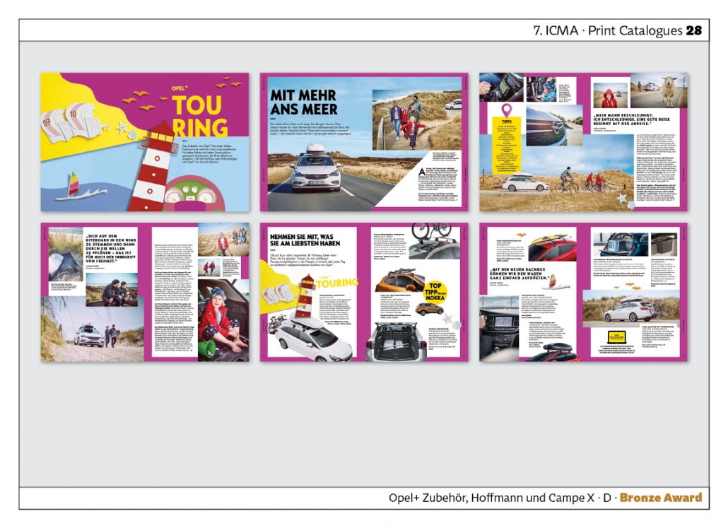
“Opel+” is an accessories catalogue of the Opel company. Accessories are presumably at the very end of a production chain in car manufacturing, and also when it comes to sales, the first thing is to sell the vehicle itself. It‘s very good that Opel is sticking to its guns when it comes to accessories and has made a particularly light, relaxed and leisure-oriented catalogue for the end customer. Agency: Hoffmann und Campe X.
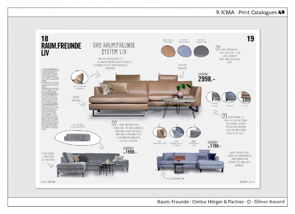
„Raum. Freunde.“ – “Space. Friends.” – is the catalogue of the furniture manufacturer Contur. On some pages, the products are shown as in an image brochure. But there are also catalogue pages with price details, where detailed information is placed in handwritten typography. Agency: Hörger & Partner.
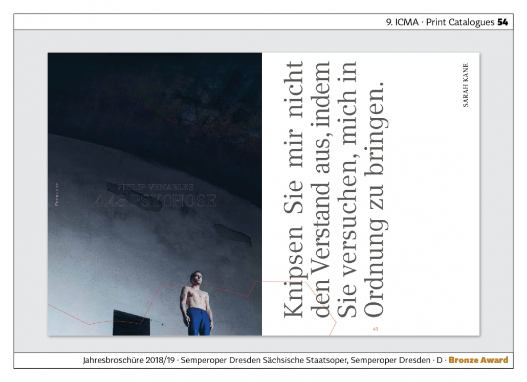
The “Annual Brochure” of the Semperoper Dresden is intended to reflect the high artistic level of the opera. At the same time, however, it also shows great modernity and innovation. This is done through the visual language and the typography.
Annual Reports
Annual reports serve to shape and guide the image of the company. While the figures section is clear and factual, the image section can use the whole range of design options: Photography, illustration, colour. In print, format, choice of paper and print finishing play a major role. In the online section, animated infographics and videos can also be used.
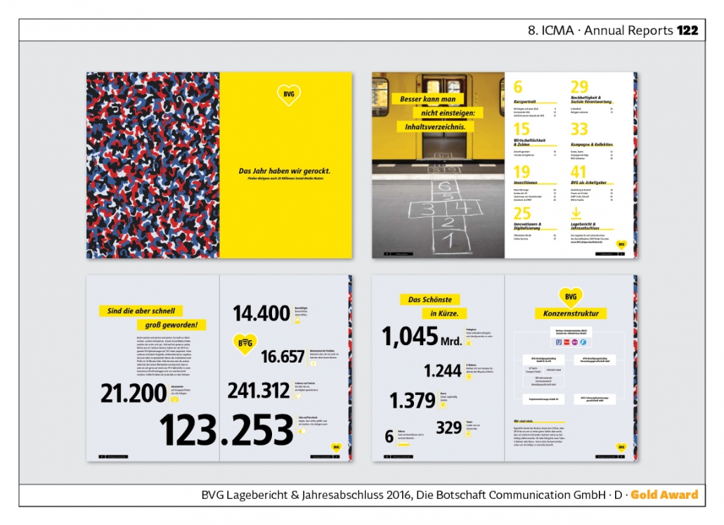
The “BVG Annual Report 2016” is very striking. For example, the pattern of upholstery in trams and buses is picked up in the design. Under the title “We rocked the year”, user figures in social media but also passenger numbers and the number of buses, underground trains, trams and ferries are presented. Agency: Die Botschaft Communication GmbH.
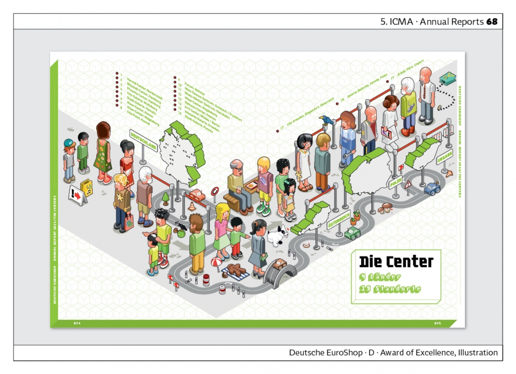
“Deutsche Euroshop” operates shopping centres in various cities. The motto of the business report was: “Life is not only online.” The report is characterised by colourful 3-D illustrations. The shopping world is presented in a playful way.
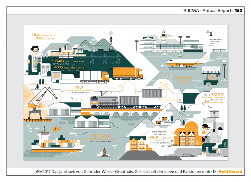
„60/2017“ is the yearbook of Gebrüder Weiss, a transport and logistics company. An exciting double page spread combines illustrations and facts about the company. Orange runs through the entire publication. Agency: Groothuis. Company of ideas and passions.
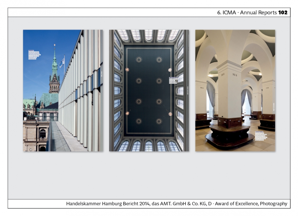
The „Bericht 2014“ – “Report 2014” – of the Hamburg Chamber of Commerce shows how timeless publications have been in the past decade. Although the report is now several years old, it could easily be reissued. Its design is up to date. Very well done architectural photographs characterise this report. Agency: the AMT.
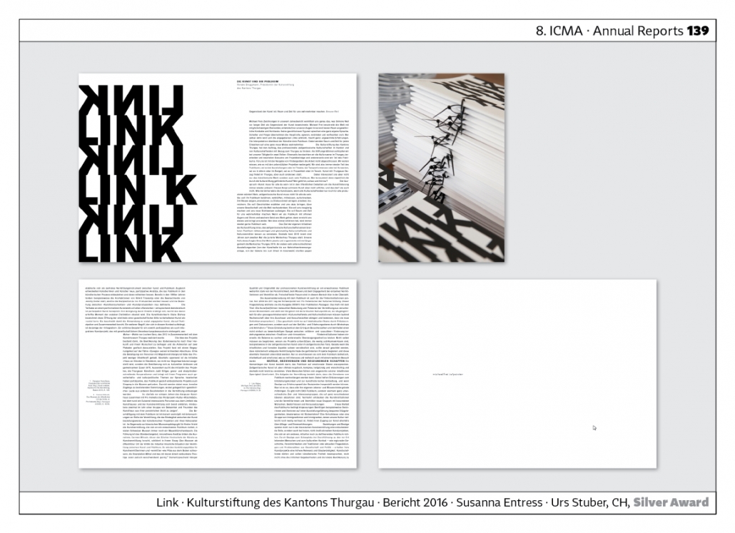
The report “Link. Kulturstiftung des Kantons Thurgau” is avant-garde in design, as the pages are not stapled but only held together with a thin black plastic band. The text is arranged in blocks with different column widths. Agency: Susanne Entress and Urs Stuber.
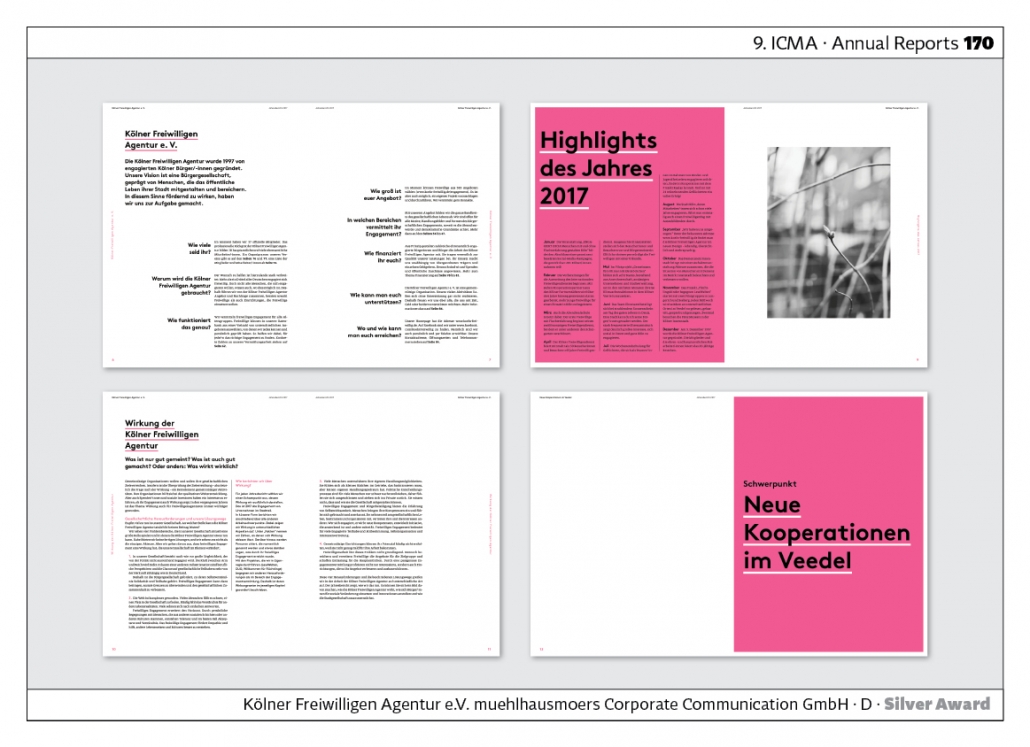
The “Jahresbericht der Kölner Freiwilligen Agentur e.V.” – “Annual Report of the Cologne Volunteer Agency e.V.” – wins an award at the ICMA Awards almost every year. The example from the 9th competition shows how coloured pages are used to structure the booklet, which incidentally is about DIN A 5 in size. Facts about the voluntary agency are not presented in a closed text but in a clear question-answer format. Marginal columns are used to explain details.Agency: muehlhausmoers corporate communication gmbh. Agency: muehlhausmoers corporate communication gmbh.
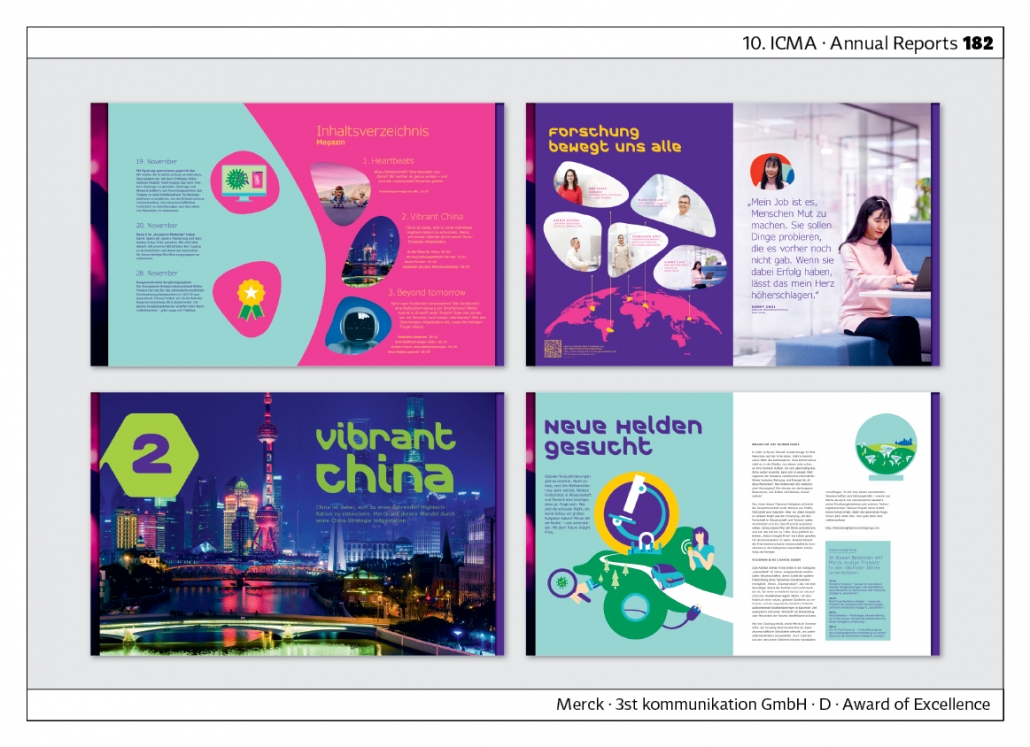
„Unendlich neugierig“ – “Infinitely curious” – is the title of Merck‘s annual report. It shows amorphous shapes and unusual colours in the image section. The typography of the headlines is also amorphous. The result is a completely new corporate design that sets the company apart from all other companies. The annual report is embedded in the corporate design. Agency: 3st kommunikation GmbH.
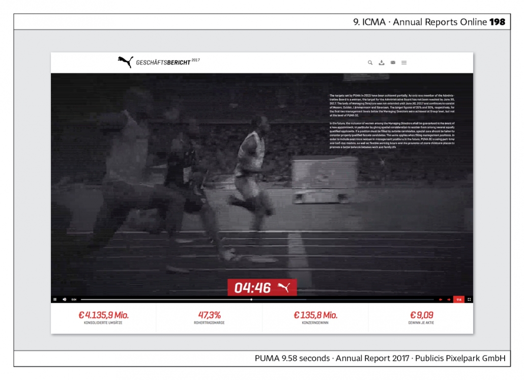
„PUMA 9.58 seconds“ is Puma‘s online annual report. It has won awards all over the world, including the ICMA Award. The Puma website says: “The film“9.58 Seconds” is the central element over which the contents of the current annual report were visually laid. The film consists of 240 individual images in which the 250 pages of the annual report are embedded. The user can interactively navigate back and forth, stop and read as Usain Bolt runs towards his victory and world record. Jump-off markers make it possible to go directly from the film to the corresponding topics on the microsite.” Agency: Publicis Pixelpark GmbH.
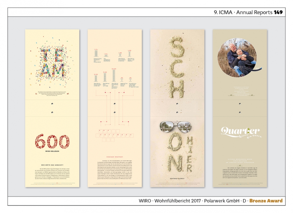
The “WIRO Wohnfühlbericht” is the annual report of a housing company in Rostock, Germany. It is laid out in portrait format in the image section. The pages are folded upwards to create extremely narrow vertical formats with a background in various pastel shades. Important events in the course of the year are presented. Example: The company has 600 employees. Agency: Polarwerk GmbH.
Concept · Innovation
This category is about concepts and innovations in terms of content or design. Here are a few examples:
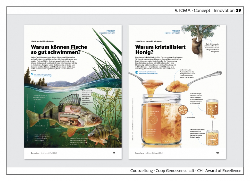
The “Coopzeitung” starts a series under the title “Hesch gwüsst?” in which readers ask questions that are answered by the editorial team. Examples: “Why can fish swim so well?” or “Why does honey crystallise?”
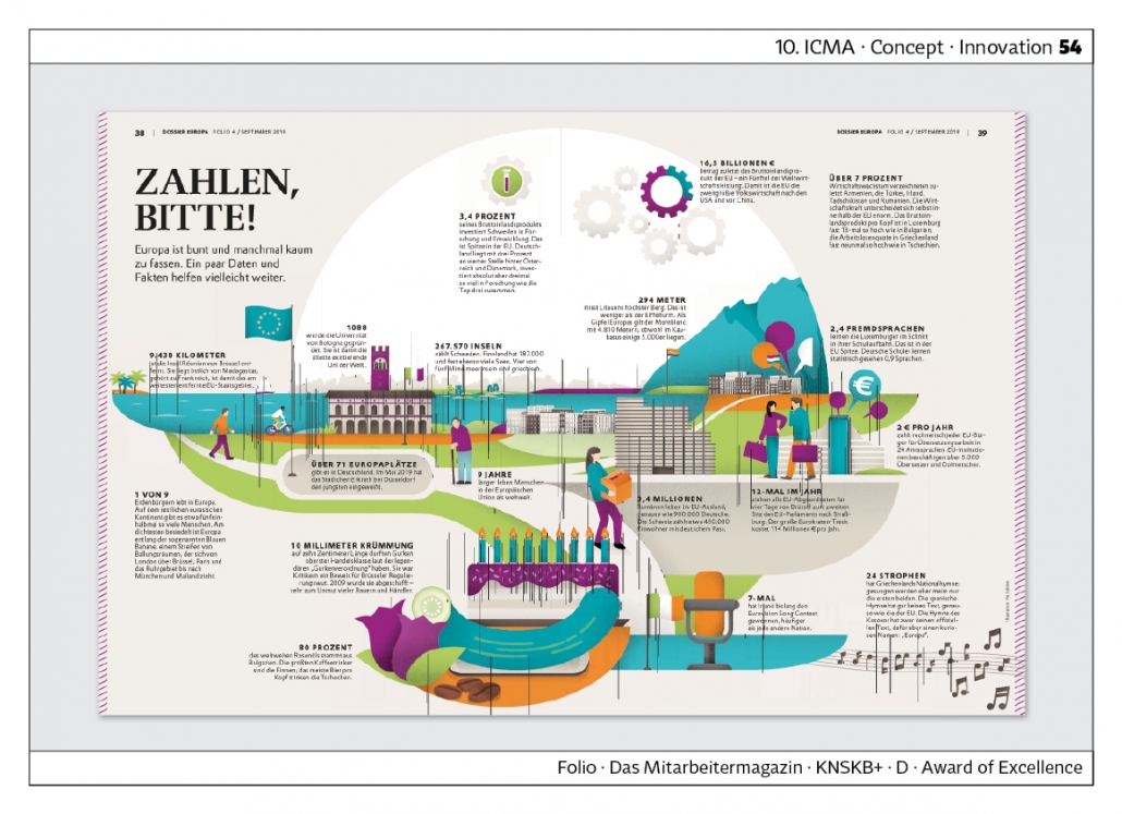
“Folio“, Evonik‘s employee magazine compiles facts and figures on the subject in a dossier on Europe. Examples: “People live 9 years longer in the European Union than worldwide.” 3.4 million Romanians live abroad in the EU, as do 900,000 Germans.” “On average, Luxembourgers learn 2.4 foreign languages during their school career. This is top in the Eu.” Agency: KNSKB+
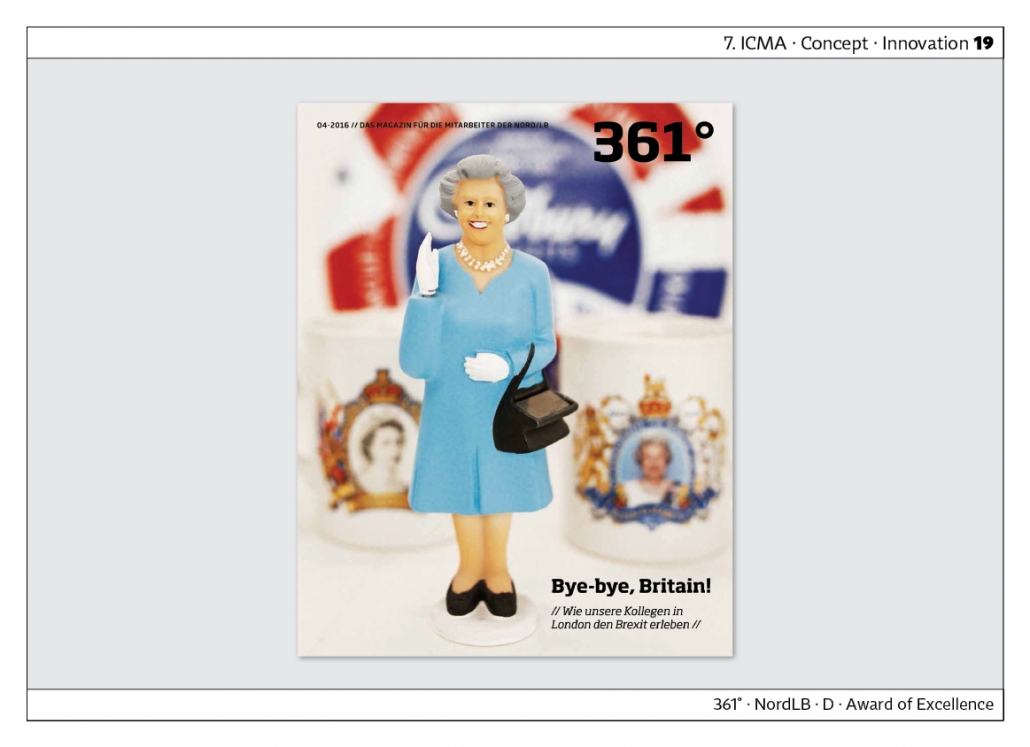
„361˚“, the staff magazine of NordLB does an 11-page cover story on Brexit: “How our colleagues in London are experiencing Brexit”.
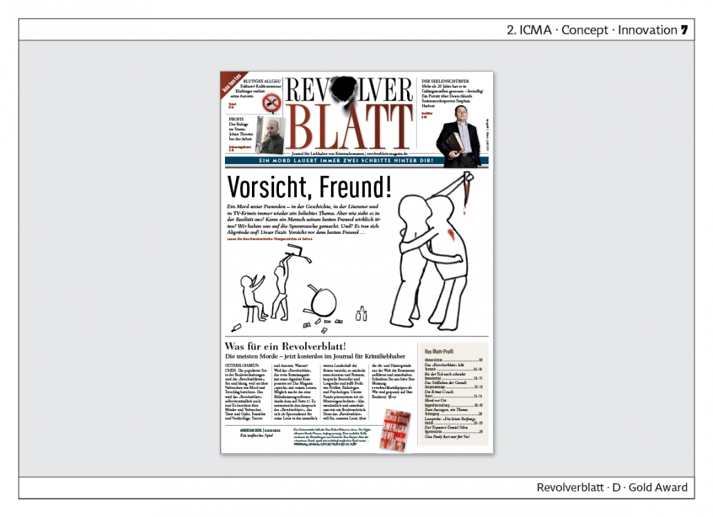
The “Revolverblatt” from the Piper publishing house has already won the 2nd ICMA Award. “Journal for lovers of crime novels” is the subtitle. In the meantime, the trend has intensified: there are more and more crime novels. Among other things, regional crime novels are trending, for example from the Eifel or East Frisia. Under the heading “True Crime” there are magazines, podcasts and TV series. Real criminal cases from the past are rehashed there. The “Revolverblatt” was undoubtedly ahead of its time. Agency: Medienfabrik Gütersloh.
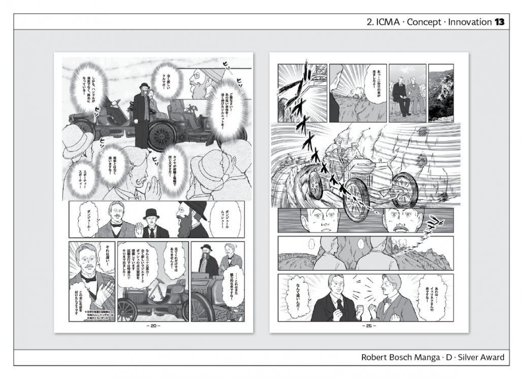
The “Robert Bosch Manga” presents the history of the company in the form of a manga. The booklet is produced in Japanese. Agency: KircherBurkhardt Berlin
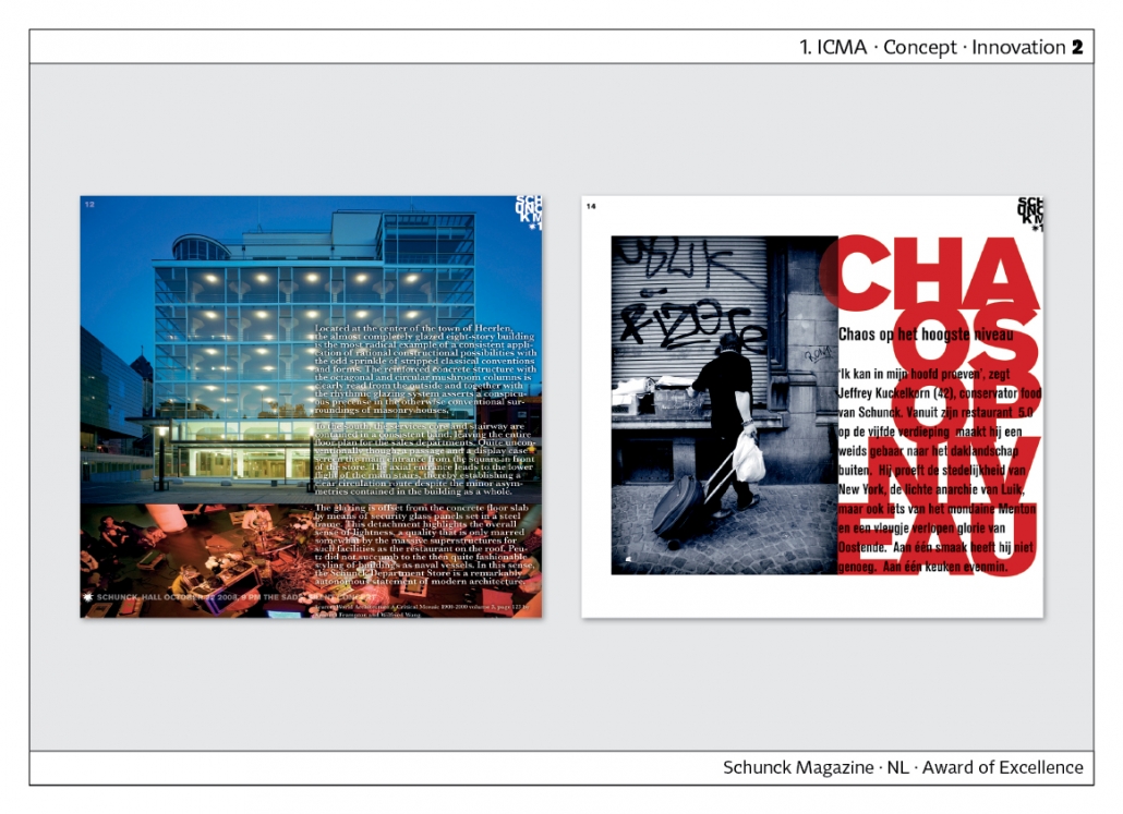
“Schunck” is a magazine for a museum of modern and contemporary art in Heerlen, the Netherlands. It also includes an architectural institute, a library and a music and dance school. The magazine shows the explosive power of creativity that is lived out in such an institution. Schunck Magazine has already won the 1st ICMA Award.
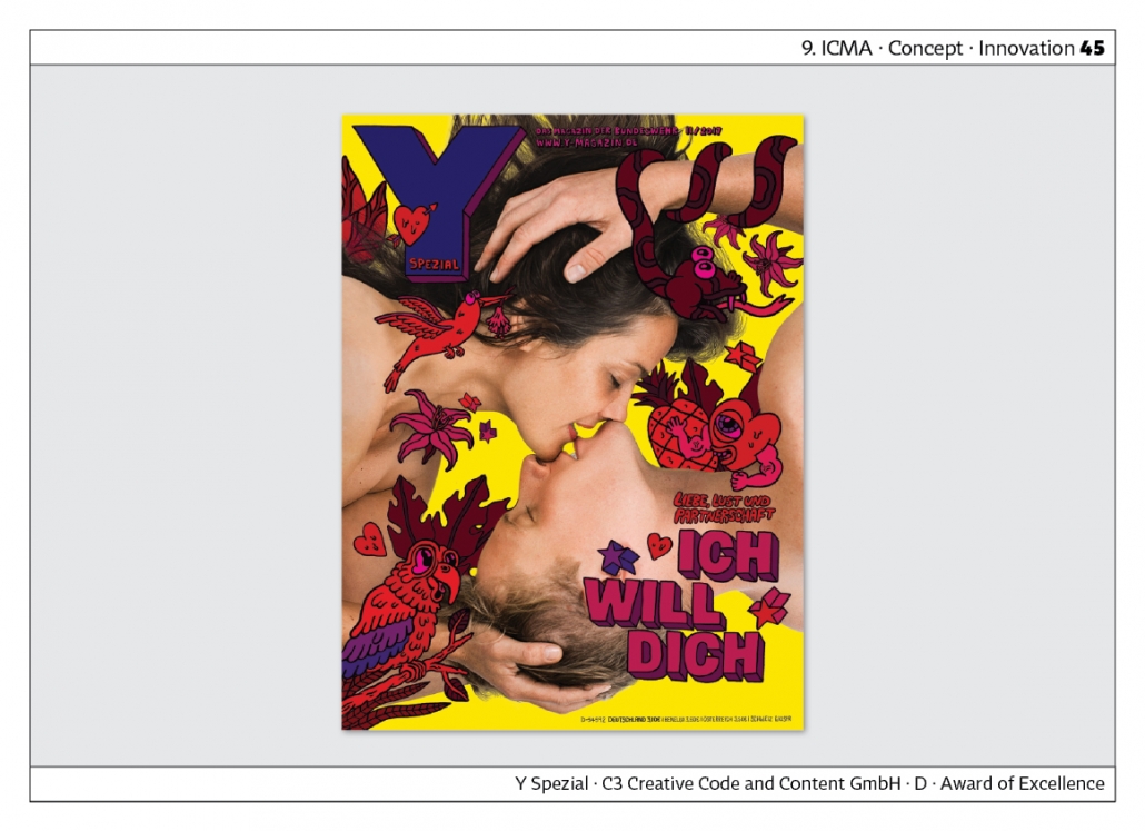
“Y – Das Magazin der Bundeswehr” made a special: love, lust and partnership are the topics. A magazine full of innovative ideas and concepts. Agency: C3.
Cover and Coverstory
Most custom media magazines have them: cover and cover story. It is ideal if the motif of the front page is taken up inside. The cover story gives each custom media its unmistakable style. That is why it is useful to create a separate category for it.
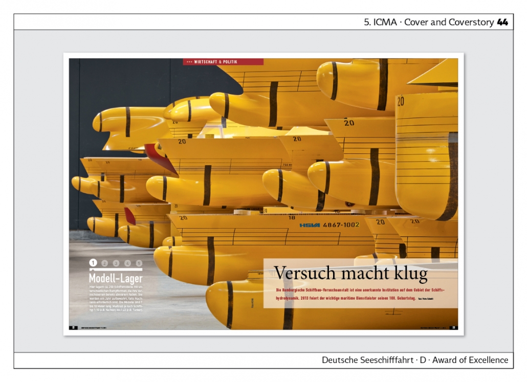
“Deutsche Seeschifffahrt” is the magazine of the German Shipowners‘ Association. The double page spread at the start of the photo reportage shows a ship model depot. The special feature: the reportage is marked with numbers from one to five. Each page explains which part of the reportage follows on that page. Agency: printprojekt Peter Lindemann & Hanns-Stefan Grosch GbR.
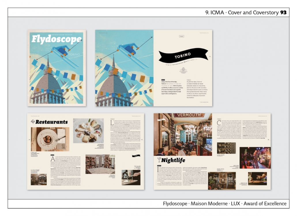 “Flydoscope” is the magazine of Luxair – Luxembourg Airlines. The front pages are always illustrated. A different destination is presented each time. In this example it is Turin. The illustration is repeated inside, followed by tips on restaurants, nightlife, etc. Agency: Maison Moderne, Luxembourg.
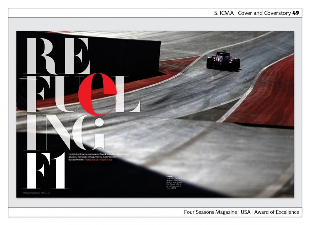
“Four Seasons Magazine” shows a detail of a Formula One race as the front page of the cover story. Very successful combination of photo and headline. Wonderful picture editing.
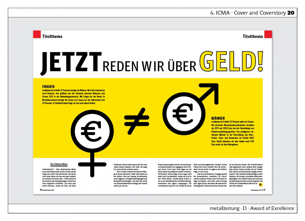 The “Metallzeitung” shows how you can create a cover story without a photo. Back in 2013, it was about the difference in pay between men and women. “Women earn 22 per cent less than men” it says in the lead.
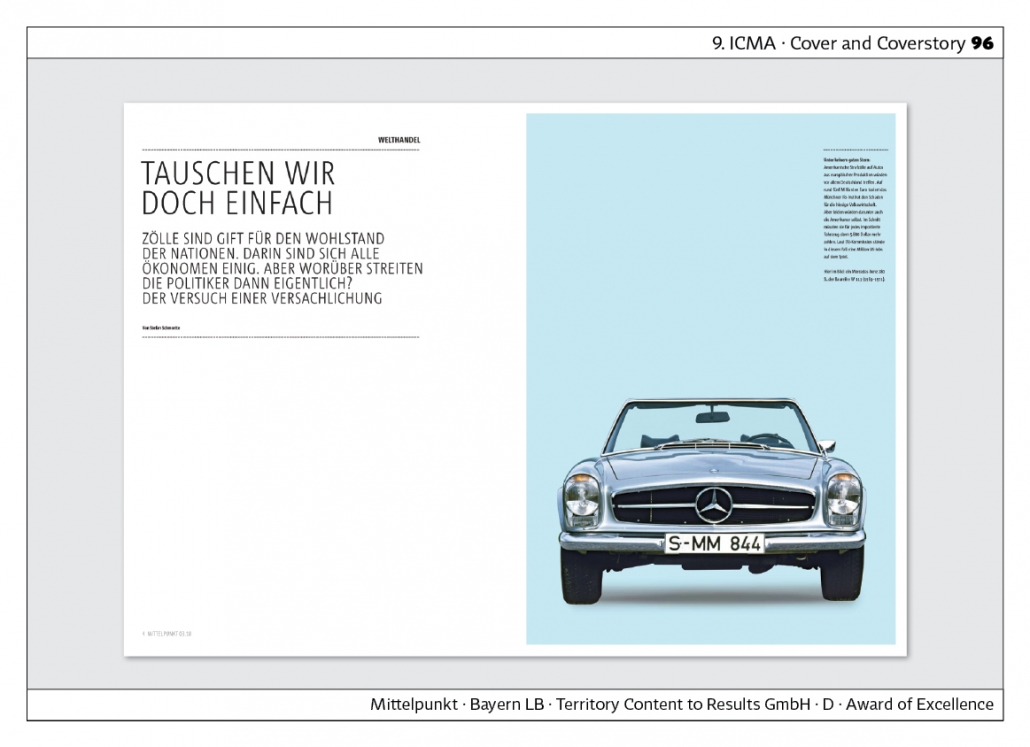
In this issue, Bayern LB‘s magazine “Mittelpunkt” is dedicated to the topic of customs duties. The impression is factual, sober. The start page of the cover story has a lot of white space. (Byern LB = Bacarian State Bank) Agency: Territory Content to Results GmbH.
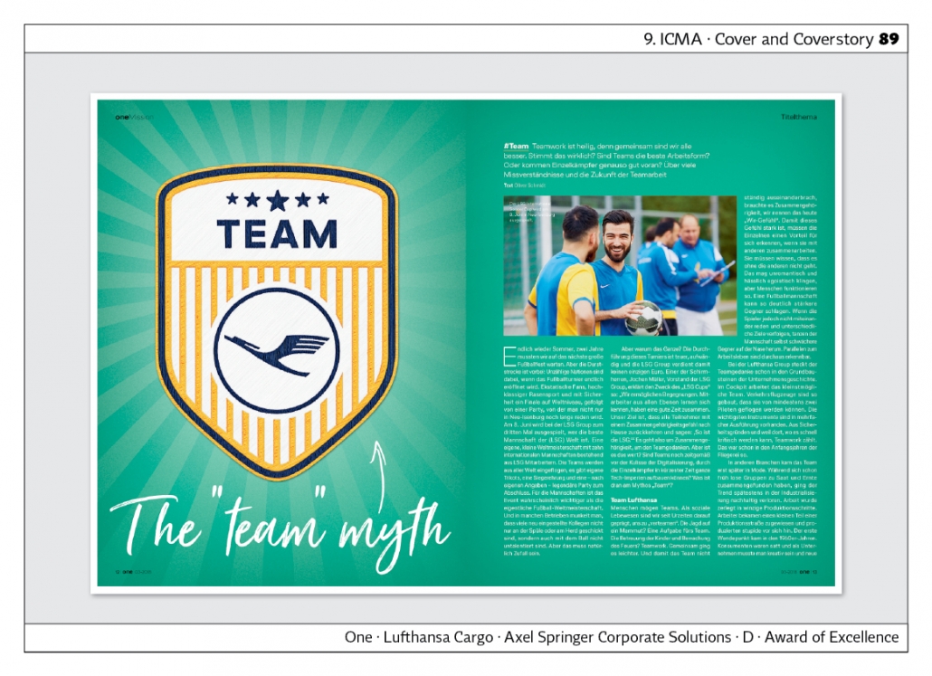
“One”, the magazine of Lufthansa Cargo, dedicates the cover story to the myth of the “team”. Various Lufthansa teams are presented and compared with football teams, among others. Agency: Axel Springer Corporate Solutions.
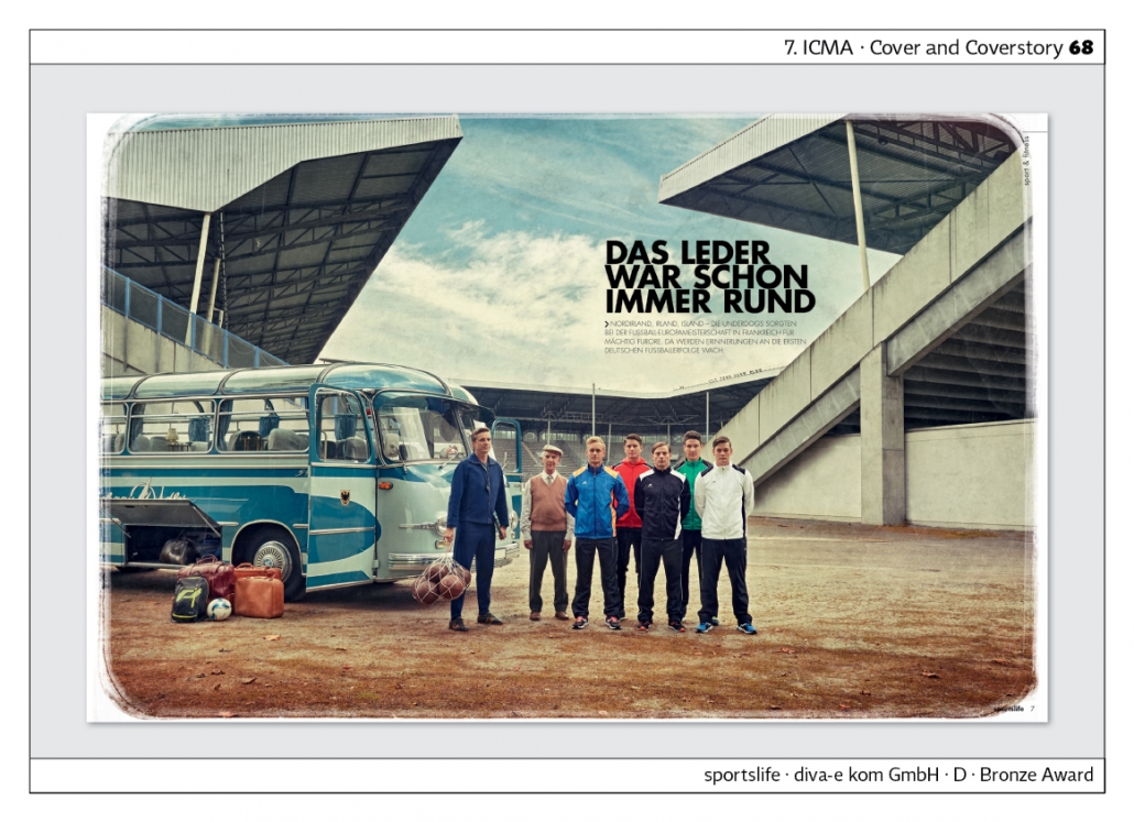
„Sportslife“ ist das Magazin der Firma Intersports. Thema dieser Ausgabe ist die Frage: War früher alles besser?“ Zur Visualisierung werden Szenen der fünfziger Jahre nachgestellt. Das gelingt durch die verwendeten Accessoires und die Farben, die an alte Postkarten erinnern. Agentur: diva-e-kom GmbH.
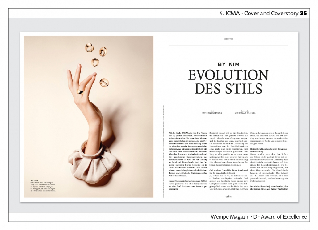
“Wempe Magazine” dedicates the cover story to the jewellery brand “By Kim”. The photos that set the scene for the jewellery are particularly spectacular. Typography and font choice are restrained to match the photographs.
Typography · Layout
Next to photography, typography and layout have the greatest influence on magazine design. Here are a few examples that show the trend towards a loose arrangement of headlines.
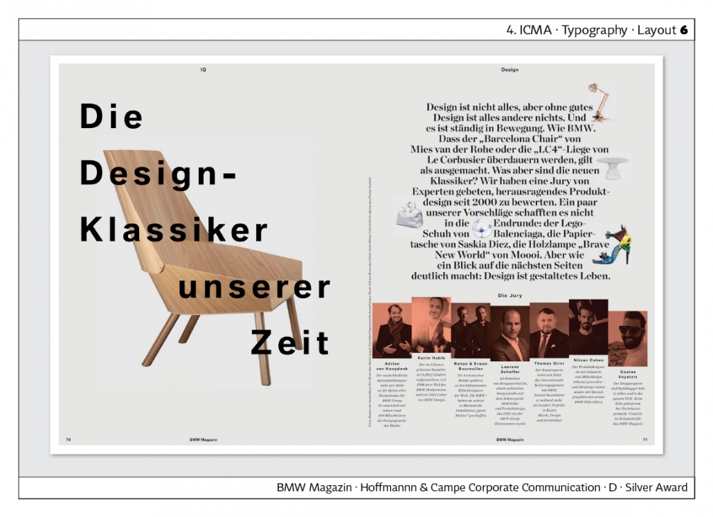
The “BMW Magazin” already shows at the 4th ICMA Award that headlines can be locked and placed on a photo. This way of working can be seen even more often today. The white border around the page is also part of the trend of the time. Agency: Hoffmann & Campe X
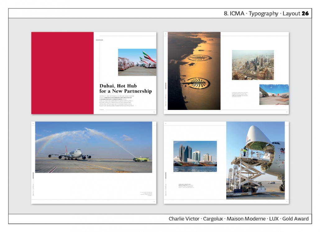
The magazine “Charlie Victor” by Cargolux Luxembourg shows the positive effect of the strong subdivision of the publication by inserting red pages. The photos on the double pages are very well laid out, as some run off the side or top of the page. Agency: Maison Moderne, Luxembourg.
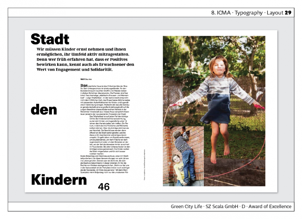
“Green City Life” is the magazine of the “Green City” association in Munich. In this example, the headline is spread across the top, middle and bottom of the page. The body copy is partially shifted. The page number is remarkably large and is used as a design element. Agency: SZ Scala GmbH.
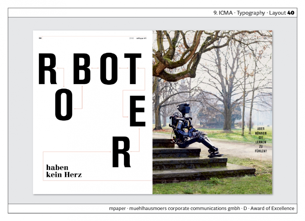
“mPaper” visualises the topic of the article with the headline design: robots. The use of type becomes more experimental. Agency: muehlhausmoers corporate communications.
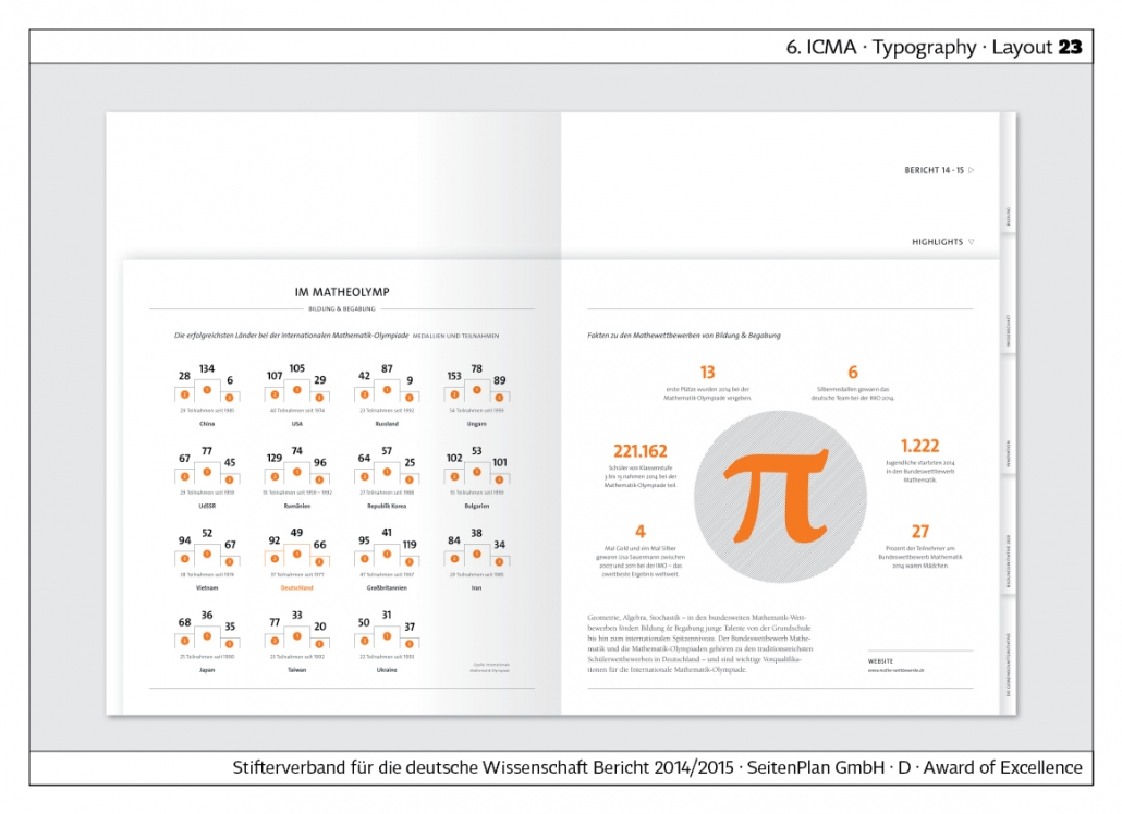
“We create knowledge” is the annual report of the Stifterverband für die Deutsche Wissenschaft – Donors‘ Association for the Promotion of Sciences and Humanities in Germany. Typographically, the pages with the small infographics are particularly detailed, because a continuous look has to be achieved here. Agency: SeitenPlan.
Photography
There is no doubt that photography plays a major role in custom media. Photographs are perceived first and they remain in the memory for a long time. They shape the overall image of a publication, be it in print or online. Therefore, it is only logical that we have a separate category for photographs at the ICMA Awards.
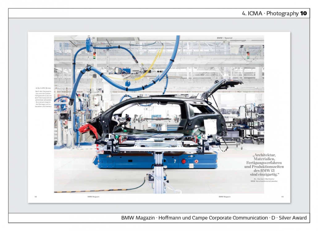
“BMW Magazine” Shows the cool and clinically clean atmosphere on a modern assembly line. A typical example of the genre of industrial photography. Agency: Hoffmann und Campe X.
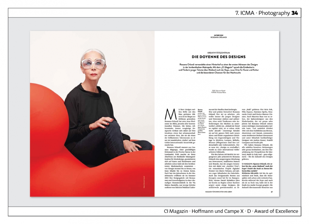
“CI Magazine” writes: “Rossana Orlandi, with her distinctive white glasses, is always on the lookout for new design talent.” The photo was taken by Giovanni Gastel.The colour contrast, the overall composition: this is what outstanding portrait photography looks like. Agency: Hoffmann und Campe X.
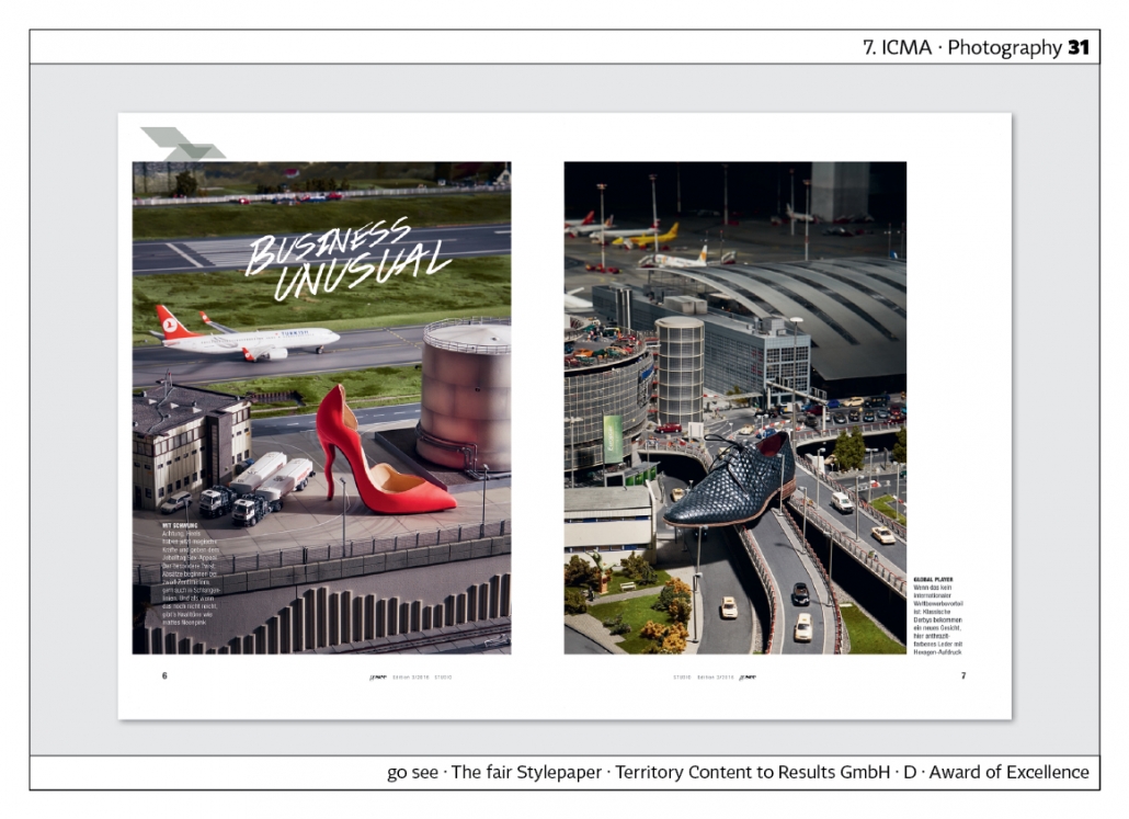
“go see · The fair Stylepaper” places shoes in landscapes, creating a new, surreal reality. Agency: Territory.
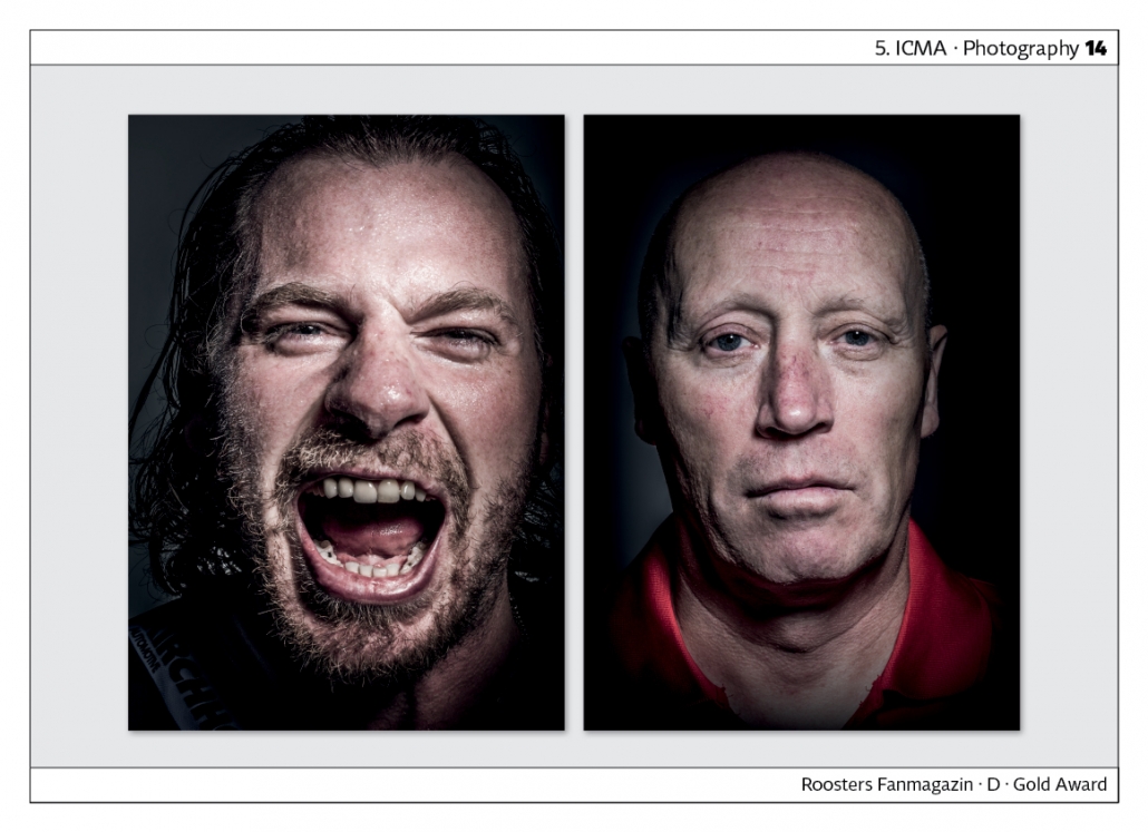
The “Roosters Fan Magazine” captivates with mystical photographs based on light-dark contrasts. The Iserlohn Roosters are an ice hockey club. Agency: Tölle-Studios.
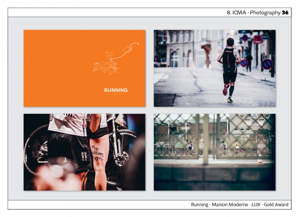
The magazine “Running” documented a marathon run in Luxembourg. The photos are full-page and uncommented. To structure the magazine, coloured double pages are inserted showing the illustrated part of the route. Agency: Maison Moderne, Luxembourg.
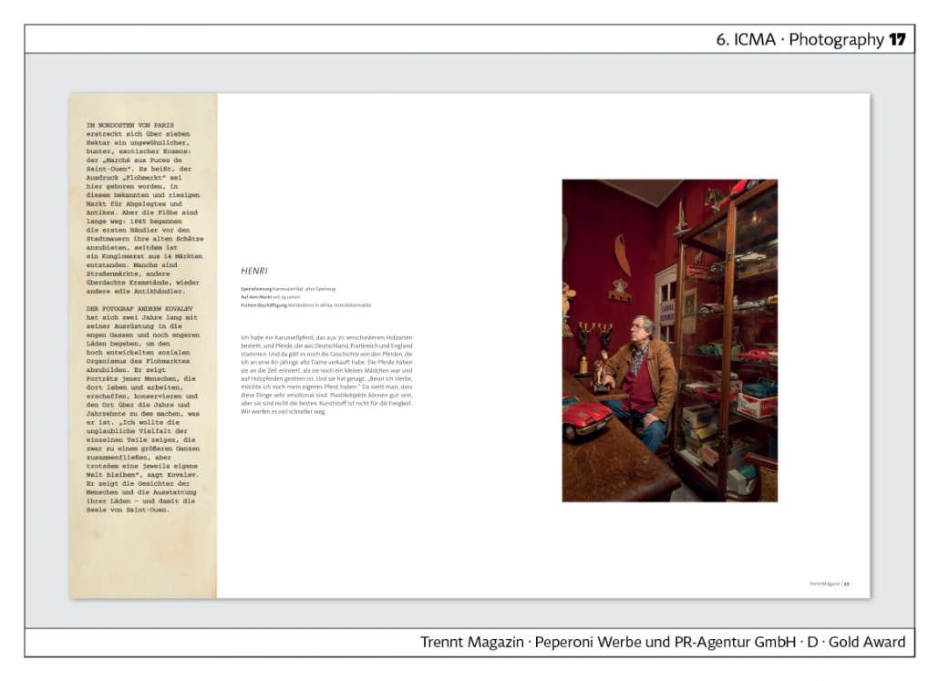
The “Trennt Magazin” of the Berliner Stadtreinigungsbetriebe sets standards for the custom media field when it comes to photo reports. It always deals with the topics of waste avoidance, waste separation, transience, recycling. For example, the “Marché aux Puces de Sint-Ouen”, a huge flea market in Paris, is documented on 16 pages. Works by photographer Andrew Kovalev are shown. Agency: Peperoni Advertising and PR Agency.
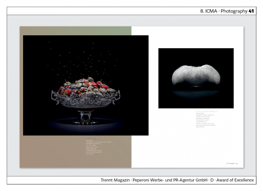
Under the title “Es ist angerichtet”, “Trennt Magazin” also presents photographs by Klaus Pichler. The introduction says: “Raspberries in crystal bowls, cheese on a silver fork, vanilla flavour in a ceramic shell – and over everything hangs the veil of decay.” Agency: Peperoni Advertising and PR Agency.
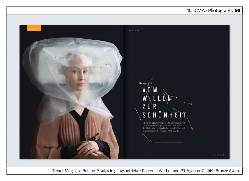
“Trennt Magazin” has published work by photographer Suzanne Jongmans.The introduction to the photo series says: “The artist recycles the splendour of the paintings of old Dutch masters with foam sheeting and plastic covers. This gives the obsolete something eternal.” Agency: Peperoni Advertising and PR Agency.
