
ICMA-Award – International Trends in Print and Online
This interview was published in the magazine CP Monitor, issue 3/2018. The interview was extended by some illustrations. The questions were asked by CP Monitor’s editor-in-chief, Beatrice Monington West.
The ICMA – International Corporate Media Award – is launched for the ninth time. The closing date for entries is 1 October, but there is a deadline of 10 October 2018. We spoke with the initiator Norbert Küpper about the special features of this competition and about trends in the CP industry.
CP Monitor: Eight years ago you launched the ICMA Award. Even then, the field was highly competitive. Why one more award?
Norbert Küpper: Competitions in the field of content marketing are usually limited to one country or one language area. Often one must be also member in an industry organization, in order to be able to participate. My idea at ICMA is the exchange of creative ideas on an international level through an independent competition in which everyone can participate without great effort. The ICMA has always been a global organization. 9,000 printed Call for Entries are sent every year to designers, CP specialists and agencies all over the world. In my experience, designers, art directors and clients are grateful for creative input. This is even better on an international level than just from the direct environment. At the 8th ICMA we had participants from 27 countries. So the concept works.
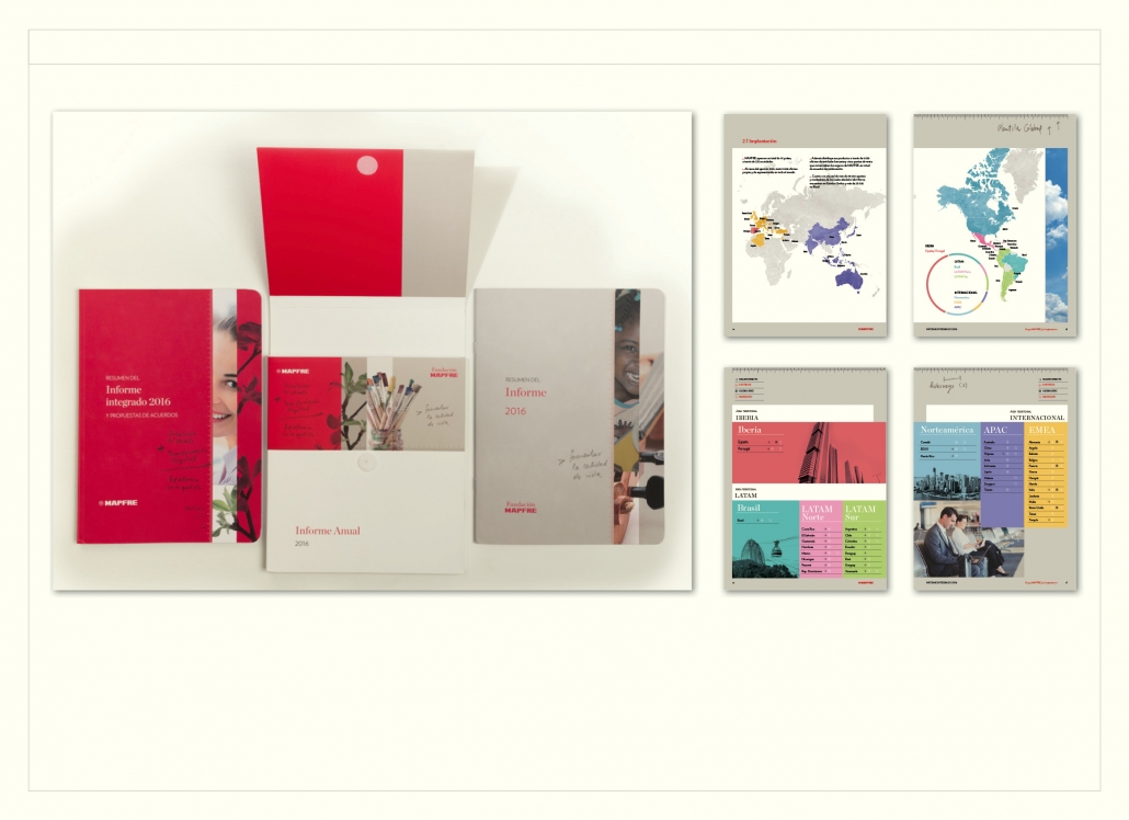 Example of an Annual Report from Spain: Mapfre is one of the largest insurance groups in Spain. For the first time, this annual report combines the insurance company’s economic data with information from the area of corporate social responsibility. Jury statement: “Fresh, lively layout with successful colourfulness and sophisticated typography. The handy format is reminiscent of a exercise book. Everything together is presented in a pocket slipcase with Velcro fastener. The example shows that international input is very stimulating for one’s own work.” Agency: TAU Design, Spain.
CP Monitor: How has the relationship between digital and analogue media generally developed in the submissions?
Norbert Küpper: There is of course a continuous increase in online, cross-media and social media submissions. Despite this trend, print submissions remain at a high level. Print continues to play a major role in B2B and B2C publications. Flicking through a magazine is more relaxed than viewing the same content on a digital device. Print still has advantages here, because photos and texts can be optimally presented in their order and size.
It should be noted that online contains a large number of end devices. More than 50 percent of users of news websites access them, for example, with their smartphone. If you want to prepare a great picture series or photo report optimally for your smartphone, you will therefore tend to switch to a moving image and can ideally run a small feature film with fascinating images and sound.
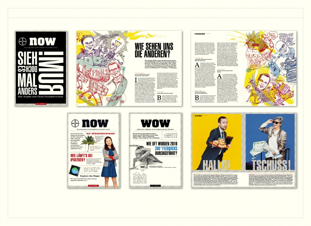 Employee media Print: Bayer’s “Now” magazine is only DIN A 5 in size and is printed on uncoated paper. It was already awarded gold at the ICMA last year. The jury praised the original design and the appealing format. In terms of content and design: “Wow”. Agency: Territory Content to Results, D.
There was a decline in the category for employee media. Here, many have switched to online and it is difficult for some companies to give the jury intranet access. But employee media also include an innovative printed magazine that has already won awards in other competitions: “Now” from Bayer. In DIN A 5 format and very vividly designed. Print is alive! One can only say.
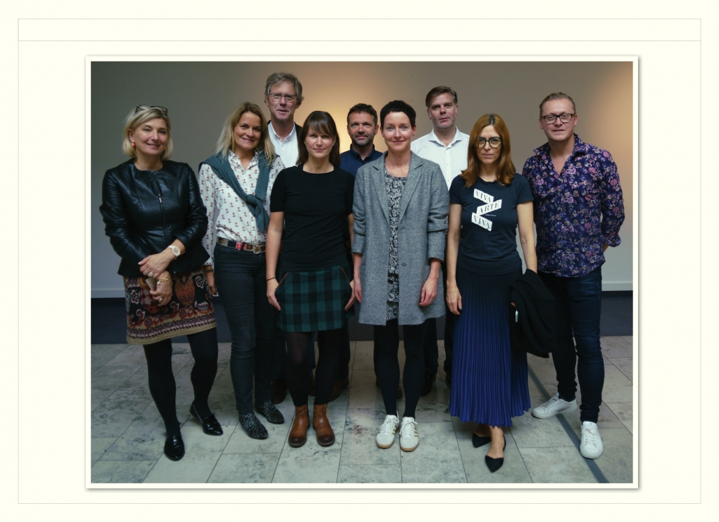 The jury of the 8. ICMA (from left): Katharina Reitan, Media Training, Vienna; Meike Quentin, CEO, Das Amt, Kiel; Eberhard Wolf, Art-Director, Luxemburger Wort; Nadja Zobel, Art-Director, Mareverlag, Berlin; Michael Adams, Editorial-Design, Switzerland; Claudia Eustergerling, Claudia Eustergerling Design, Luxembourg; Christian Baun, Art-Director GreyWorks, Copenhagen; Ilga Tick, Creative Director, Gala, Hamburg; Pim Nap, Creative Director, Studio Piraat, The Hague. Jury members are excluded from the evaluation of their own work.
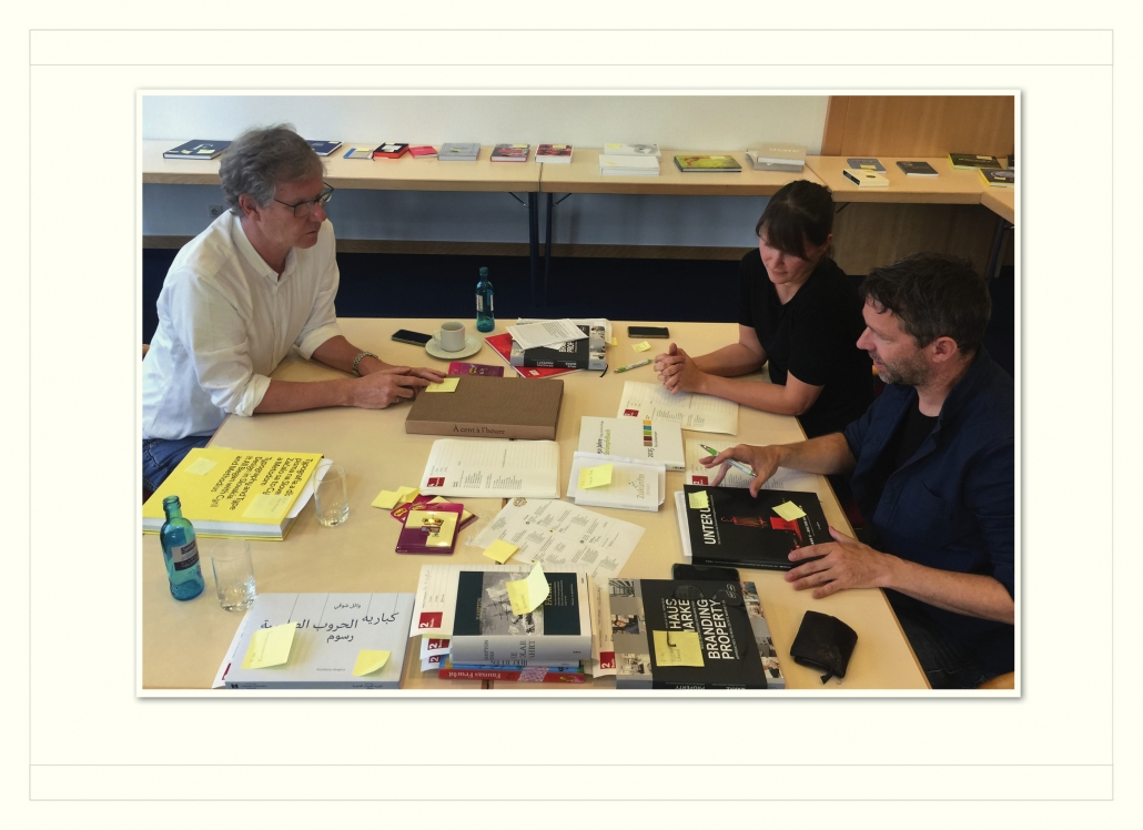 Eberhard Wolf, Nadja Zobel and Michael Adams judging the book category.
CP CP Monitor: What is the composition of your jury and what are the criteria for the selection of jury members?
Norbert Küpper: The jury has nine to twelve members. The proportion of women should be around 50 percent. In the jury are experienced specialists for Custom media and ICMA Award winners from earlier years. The jury should be international. In the last year the jury members came from Denmark, Austria, Switzerland, Luxembourg, the Netherlands and Germany. This year, jury members from Brazil and Finland are expected to be added.
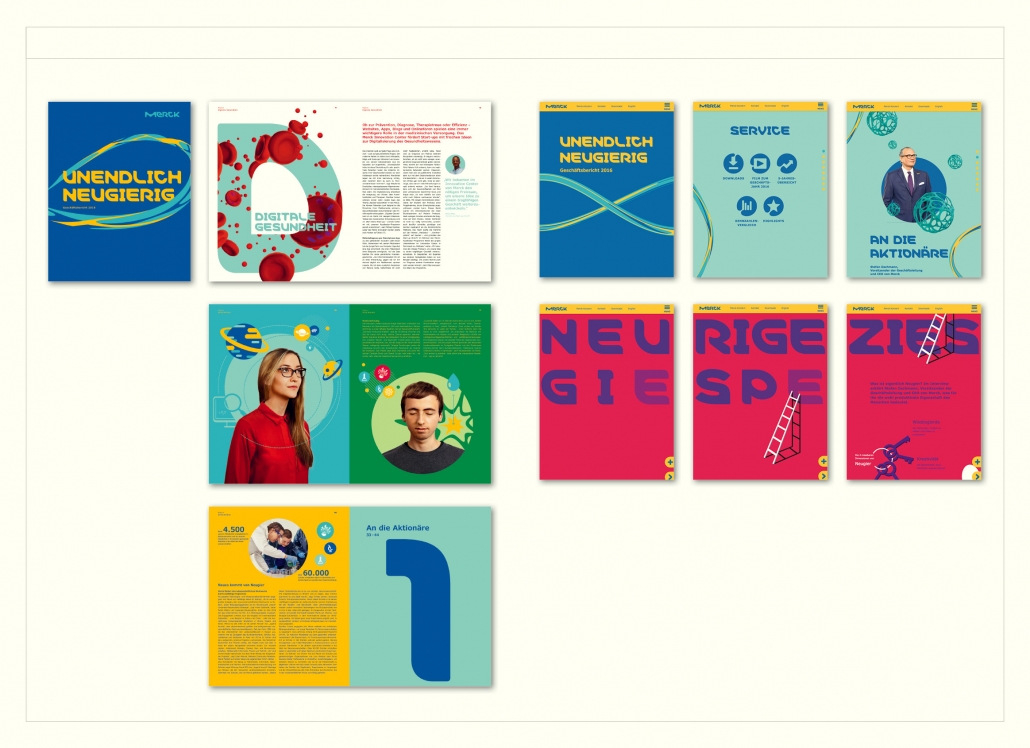 Annual Report Print and Online: With both the Print and Online Annual Reports, Merck is continuing the innovative design path of the previous year. Strong colors, animated graphics and striking design are the key words. The idea of a media-convergent design is implemented very well. http://gb2016.merck.de/ Agency: 3st Kommunikation GmbH.
CP Monitor: You are a trained typesetter, studied design at the Düsseldorf University of Applied Sciences and also taught there for many years. In your opinion, how has typography changed in the digital age, what role does it play today?
Norbert Küpper: The situation has improved considerably in recent years because individual fonts can be integrated into websites. A huge market for the development of corporate fonts has emerged. But even if you don’t want to follow this exclusive path, you can still create an individual look because of the incredible number of new fonts. The keyword is media-convergent design. All fonts, colors and essential layout elements are used in print and online to achieve a distinctive design and make the brand or company recognizable on all channels.
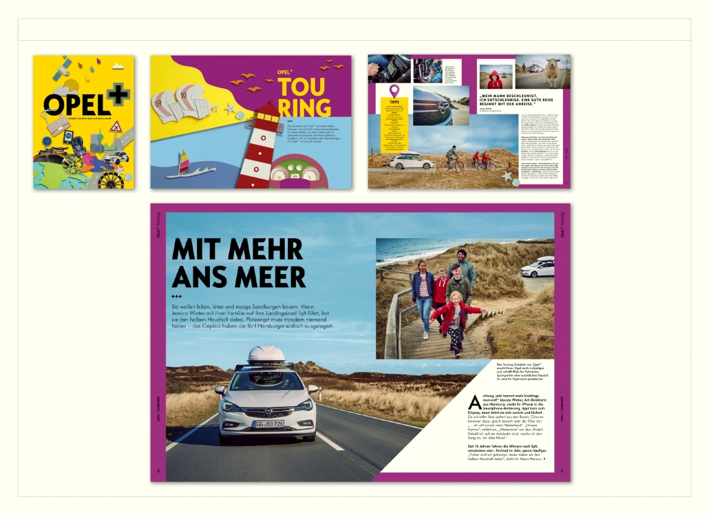 Opel+ is an accessory catalogue in which the practical use of accessories is shown in the form of a photo report. Agency Hoffmann and Campe X, D
CP Monitor: After 68 years, Otto discontinues its mail order catalogue and the BMW Group its customer magazines. How long do you think printed customer media will last?
Norbert Küpper: There is also a contrary trend, for example the magalogue. The catalogue is enriched by journalism and thus becomes a magazine. At the 7th ICMA, a number of print catalogues received awards, including the Manufactum product catalogue, “Live ideas” from furniture manufacturer Contur, supported by Hörger & Partner, “Opel+ Zubehör”, supported by Hoffmann and Campe X. In the magazine segment, the boom in new print start-ups should not be overlooked. I estimate that 200 new magazines will be founded this year in Germany alone. This means that print is far from being the end of the story.
The call for entries for the 9th ICMA can be found here: www.icma-award.com Deadline is 1 October 2018, there is a deadline for late submissions for which an increased participation fee will be charged.
Other national and international prize winners from the 8th ICMA:
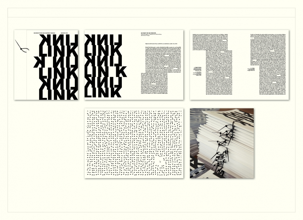 Annual Report Print: “Link” is the name of the annual report of the Cultural Foundation of the Canton of Thurgau. The cover is relatively thick and the binding is done by a black plastic band attached in the middle. The jury says: “Very creative, artistically unusual form of presentation.” Agency: Susanne Entres and Urs Stuber, CH
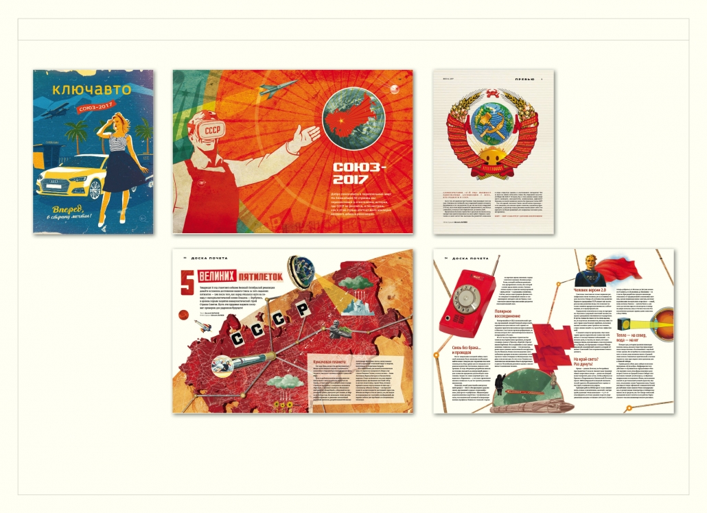 There is also a trend towards retro design in Russia. The fifties are currently in vogue. Keyauto magazine, Newmen agency, RU, Award of Excellence in the illustration category.
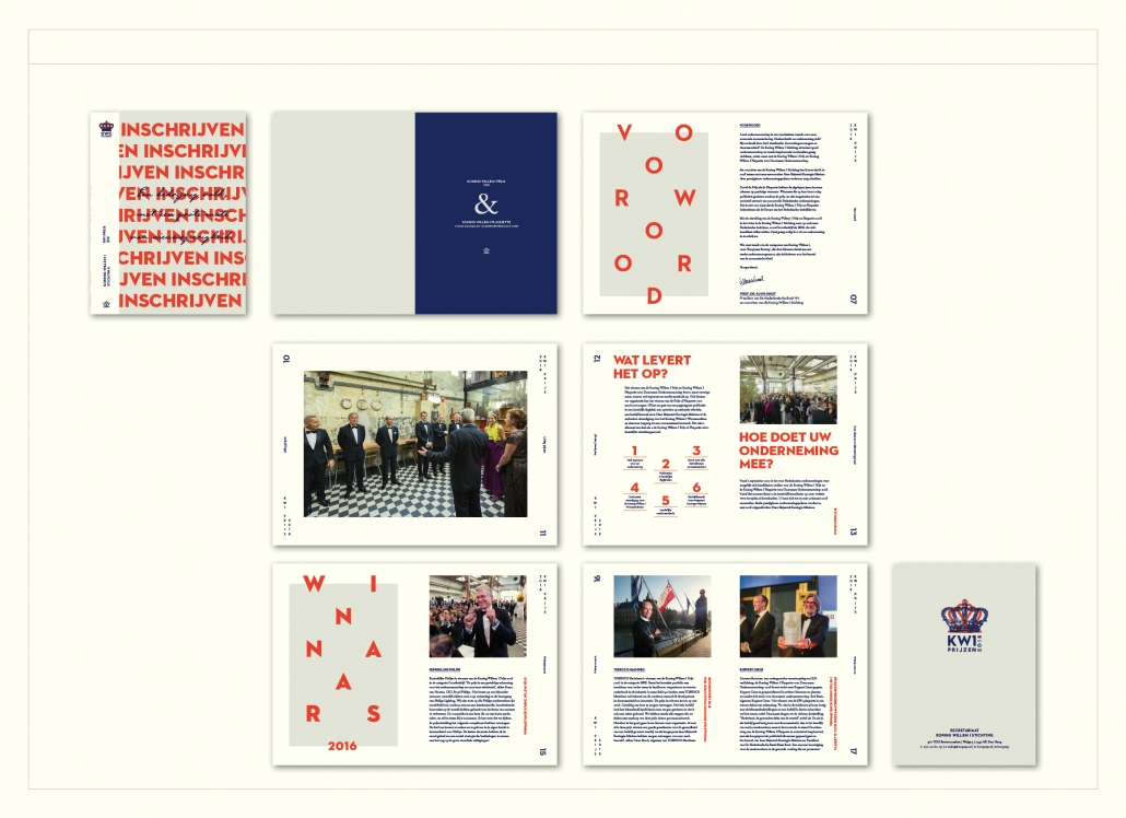 Image Brochure: The invitation to participate in a competition for a prize for sustainable entrepreneurship is very expressive. The prize is announced by the “Koning Willem I Stichting”. Therefore the colour of the royal house – orange – is obvious. This radiant colour is accompanied by a royal blue. The typography of the headlines is playful, because the words are cut up or the letters are spread over the page like in a game. The page numbers are also placed very large as playing elements and placed vertically. Agency: Studio Piraat, NL.

