Examples of awarded logos in the categories Logo New, Logo Redesign and Corproate Identity.
Category 3.1. Logo NEW
studio ilse van klei, Rotterdam, The Netherlands
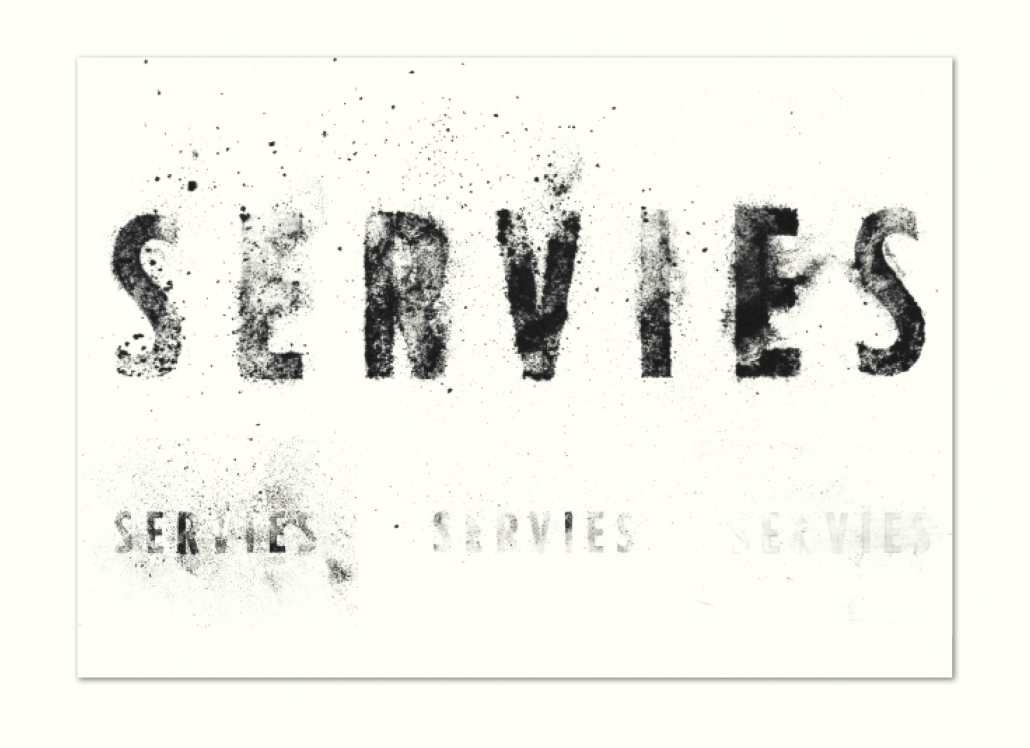
Particulate matter, harvested in Rotterdam, plays the leading role in the ceramic tableware and visual identity of ‘Servies’, an awareness project for better air quality. We used the authentic poisonous powder itself, spreading it in a variety of ways to capture it’s horribly fascinating nature. Staying close to the heart of the matter while stretching the design application to a broader, multi-faceted approach the dynamic logo set enables one to play around and underline, set off in contrast, uplift or downplay the darkness of the message.
Daniel Evans, Webcore Design, South Shields, United Kingdom
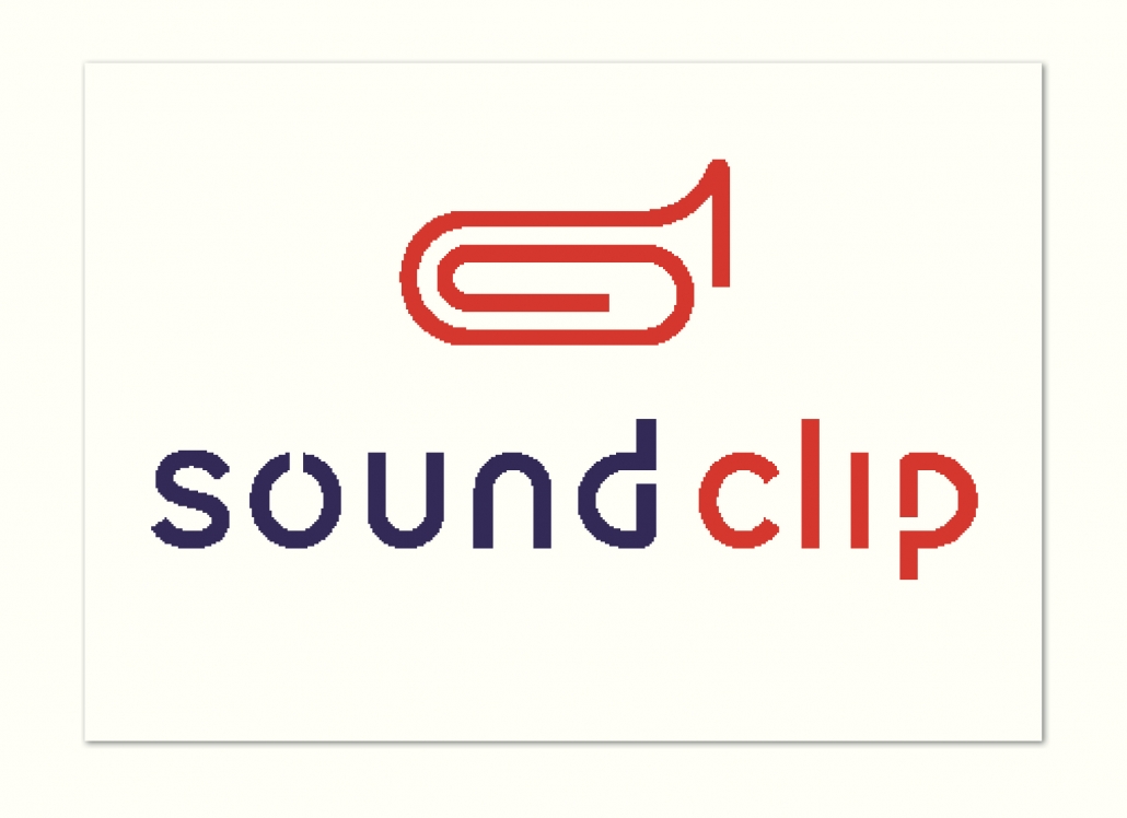
Soundclip is an online platform where music and sound les can be purchased from a vast audio library built from ongoing contributions by talented producers. The website hosts thousands of clips of audio for the user to preview sound les quickly and easily before committing to purchase. The user can also store email addresses of people in their team and send the clip instantly, for everyone to review, via email attachment.
Artsy Kiddo, Seoul, South Korea
Drip is a solid honey extracted from nature used as natura sweetener and a healthier sugar substitute. The client wanted a logo that intuitively shows the main ingedrients (honey) as well as its source (nature). The logo had to capture the brand‘s mood and tone, which are „Refined“ and „Luxury“.
Analee G. Paz, USA
Logo design for ERA, Chef Gabe Erales’ message and brand. The logo system is built around the symbol of the corn — influential to Erales’ work. The goal is to create an homage to his Hispanic roots – supported by the phrase, “sin maiz, no hay pais” (without maize, there is no country).
Analee G. Paz, USA
Design for the bar, Nido (bird’s nest). The logo system is made up of mixed typographic treatments and a modern symbol of a nest built from 4 uneven sticks. These sticks reconfigure into communicative icons and patterns allowing for visual interaction and brand exploration. Located within Golondrina Park (Swallow’s Park) on the border between the United States and Mexico, the aim is to relate to Nido’s bicultural, bilingual clientele in their unique, adaptable, and eclectic personality.
orangedog, Katja Schlüter, Germany
The logo was designed on the occassion of a newly established open air concert organized by the city of Weinstadt. At this event established and still studying musicians are presenting. The typography “STEILLAGE” takes up the mountainous character of the venue and creates a spotlight that illuminates the golden stage represented by a musical note. This symbol indicates the concert and the star represents the open air event as well the rising and established stars of pop music.
Design für Kirchen, Olaf Welling
This year St. Trinitatis celebrates the 275th anniversary of its consecration. The logo devised for this special occasion is characterised by the spire’s weather vane tinted in the patina of weathered copper.
Category 3.2. Logo REDESIGN
mattweis GmbH, Munich, Germany
The conceptional idea for the new design was inspired by neuronal structures and nerve impulses, that have been integrated into the N in a highly abstracted and simplified form. Isolated, the N becomes the universal sign of neurology as a whole, and is used as a striking and visually reinforcing element in the overall appearance of the DGN.
Ontwerpwerk Bernadette Pegtel, The Hague, The Netherlands
The renewed logo for the city Schiedam represents the history of the city. The lion of Henegouwen has been the centre of the coat of arms of Schiedam since 1816. The new municipal logo has taken heraldic guides into account while at the same time giving the logo a modern and durable look. The design of the logo has been modified for optimal legibility and adapted for digital channels. Lines have been softened and the crown and shield have been optimized to give the logo a strong and durable look. The text next to the shield has the same dynamic line as the cotisse.
Category 3.3. Corporate Design
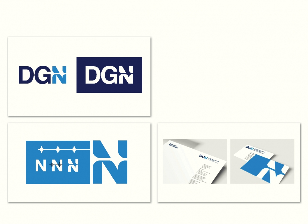
mattweis GmbH, Munich, Germany
The logo is designed as a word and figurative mark with a high degree of autonomy. The fundamental simplicity of the three letters D, G and N provide clarity and self-confidence. A strong visual recognition is created by the high contrast of formal rigidity and organic dynamic structure.
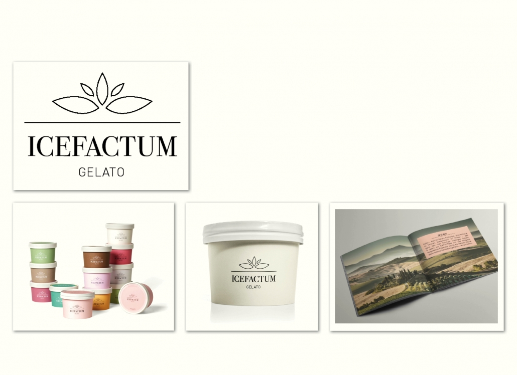
Tölle Studios GmbH, Iserlohn, Germany
Italy – here gelato, the best italian ice cream, is cultural property. Refreshment in summer, savor in winter – fresh, creamy gelato all year round. Only the best ingredients, every ice cream – handmade – that‘s ICEFACTUM. The word-image brand impresses with its minimal and clear lines. The reduction to the pure/essential is philosophy – not only with the ingredients of the ice cream. The logo symbolizes the simple with its subtle elaboration.
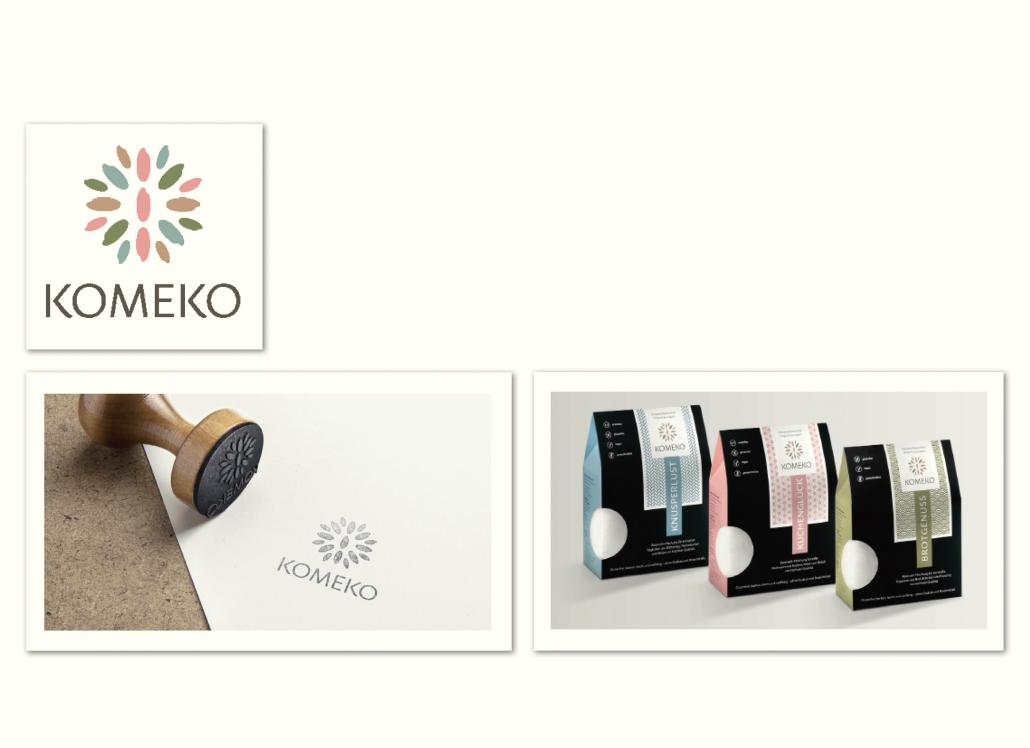
Konzept & Design Ines Wallum, Schondorf, Germany
Komeko – clean, simple and natural products with tradition in premium quality. Rice from Japan is the base of all Komeko products. We want to carry our rice and the Komeko spirit into the world. The logo was created in a simple design language, a selected typography that makes a reference to Japan. The colors are restrained and harmonious.
