Here are the results of the 15th ICMA Award, Part 2, Books.
Hier sind die Ergebnisse des 15. ICMA-Award, Teil 2, Bücher.
2.0. Jury, Statistics, Partner


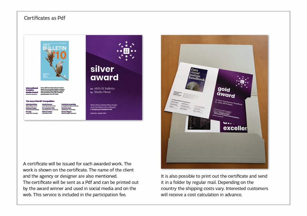
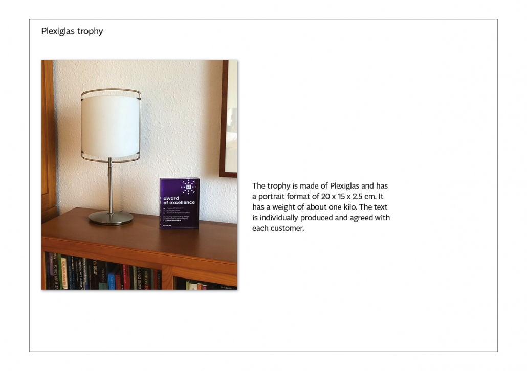
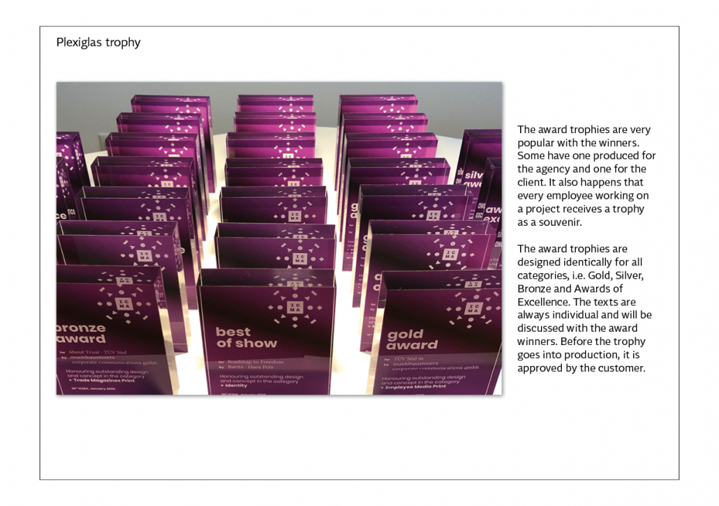
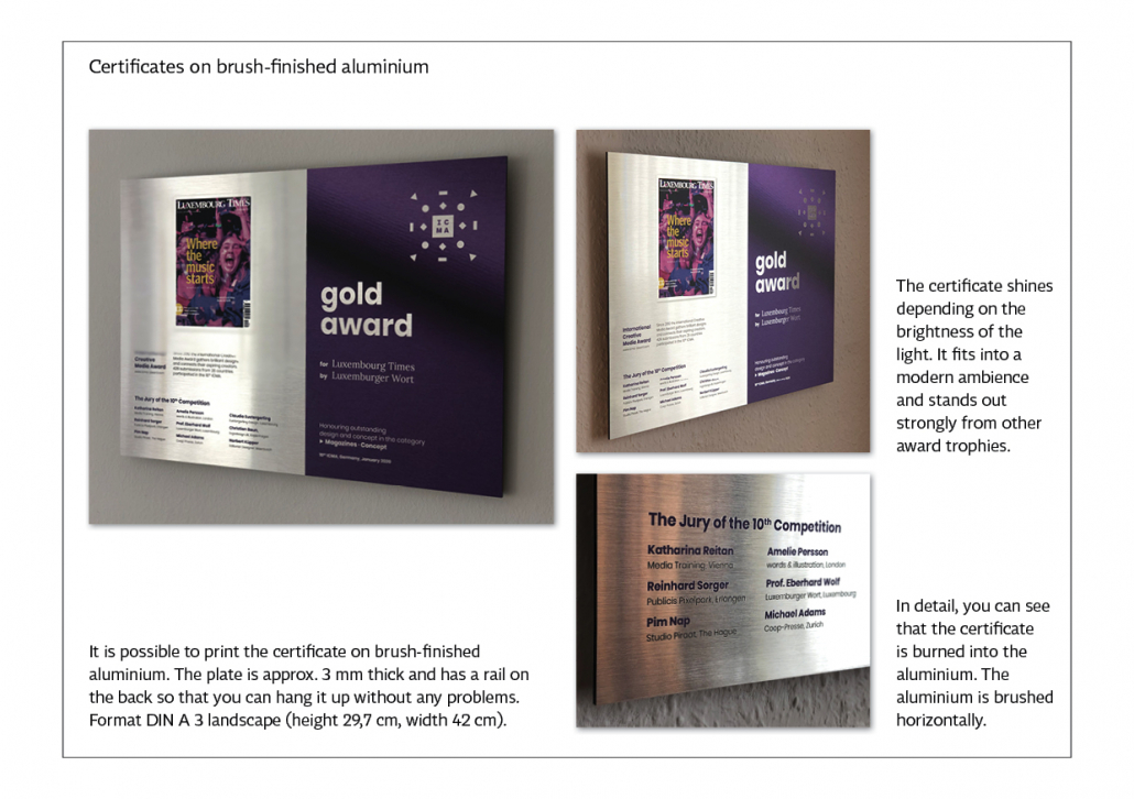
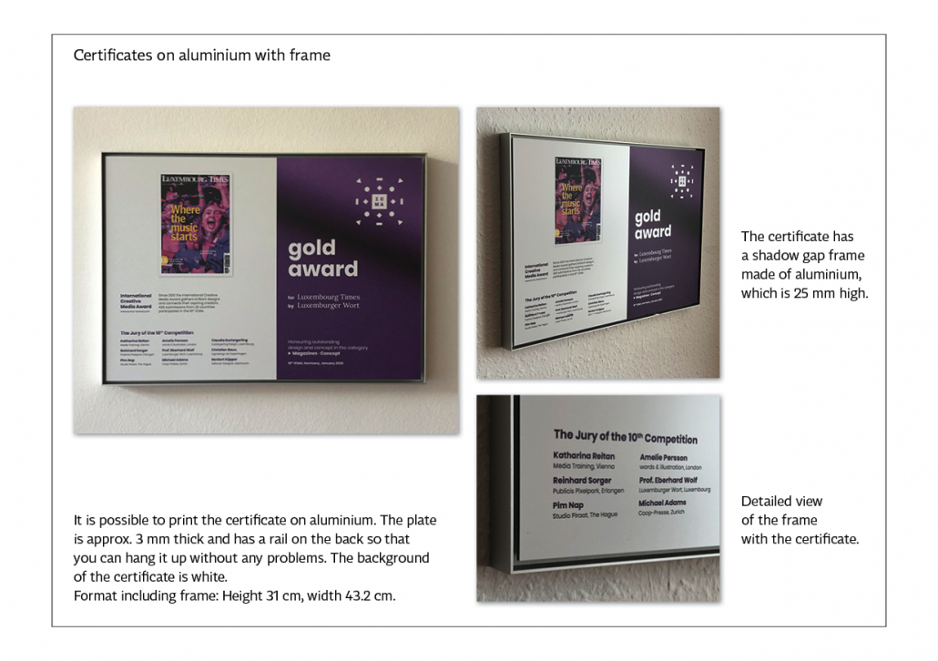
2.0. Certificates, trophies
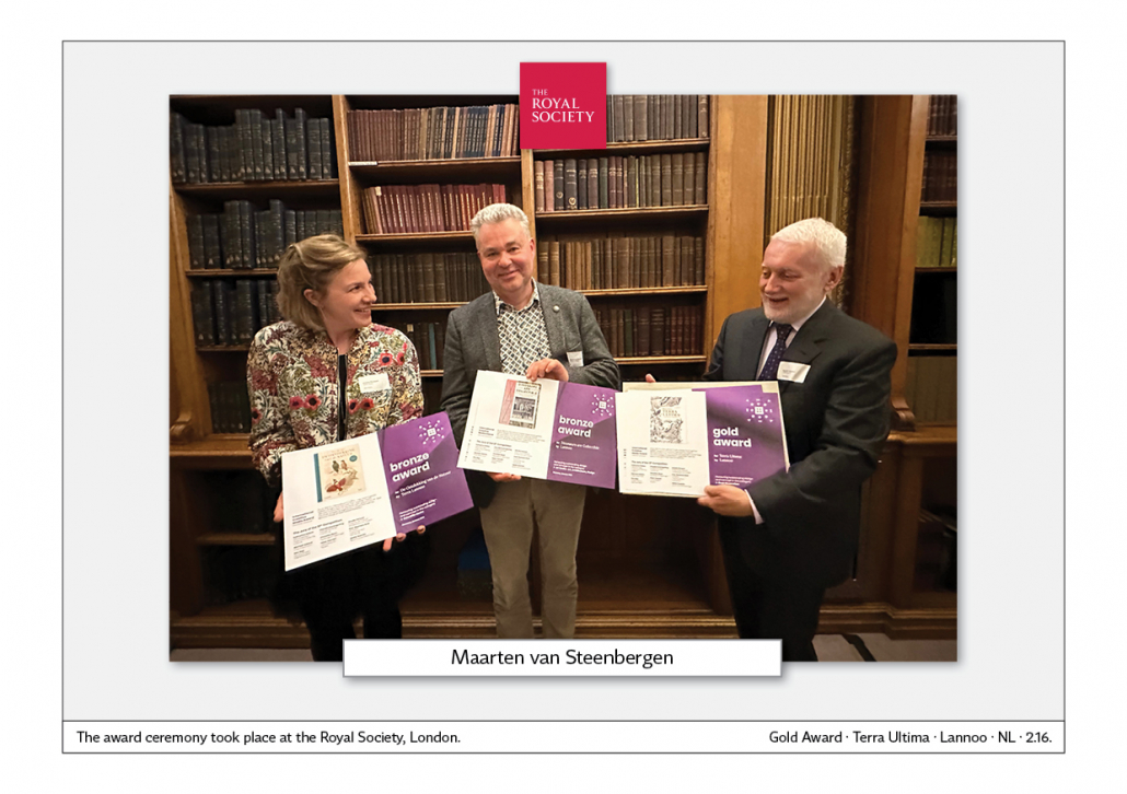
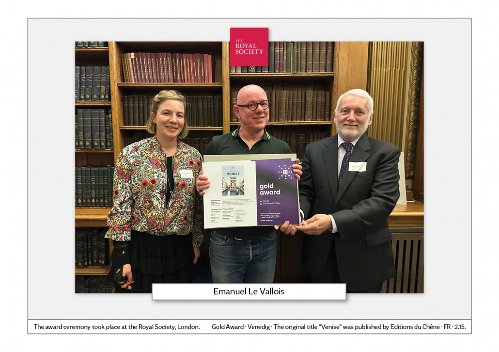
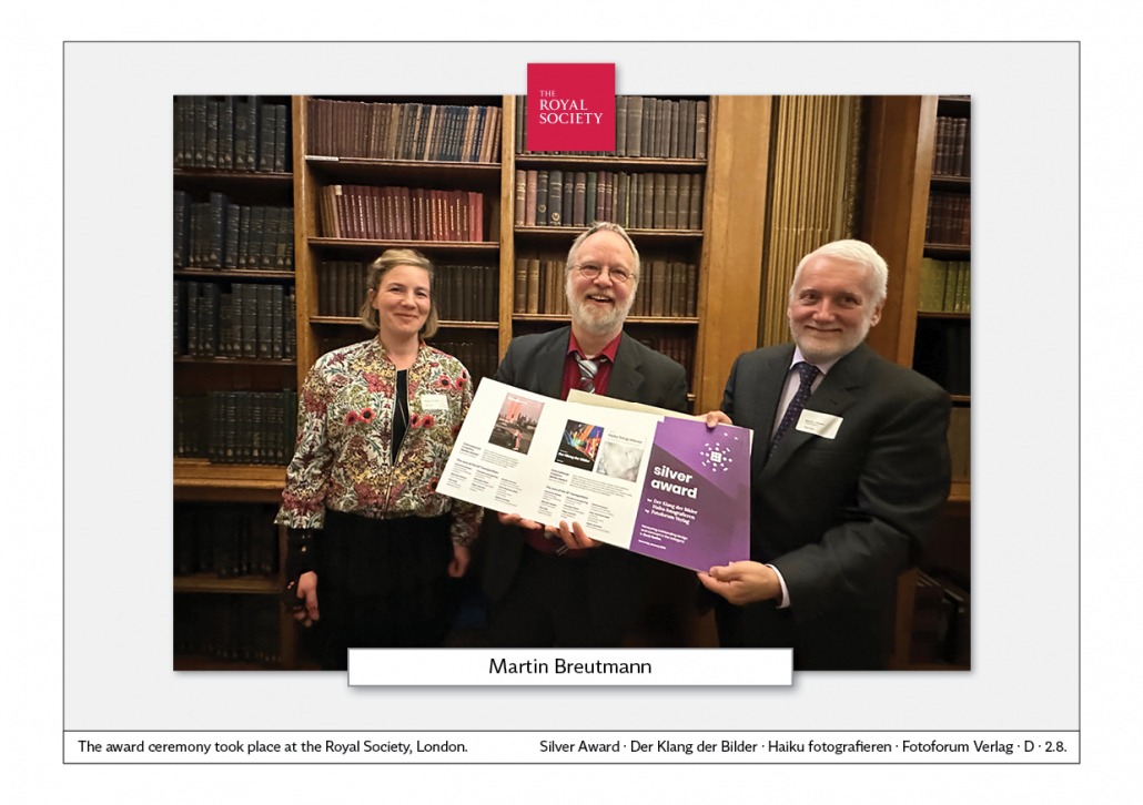
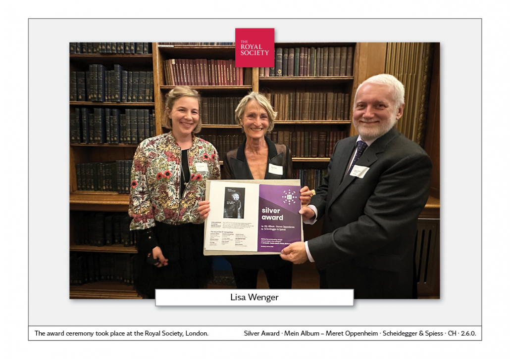
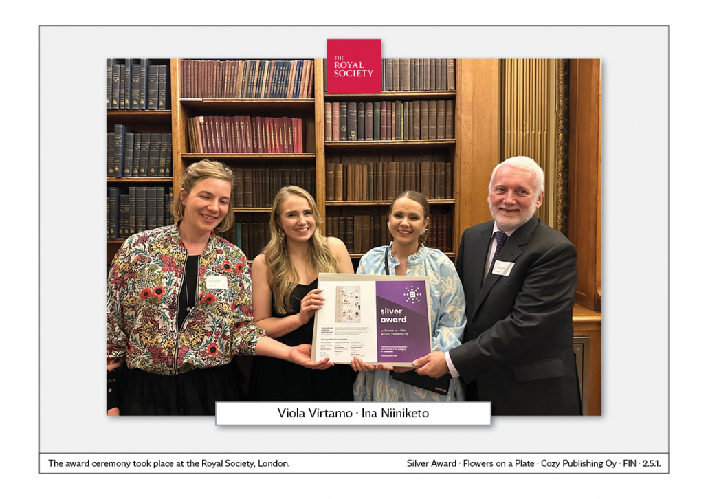
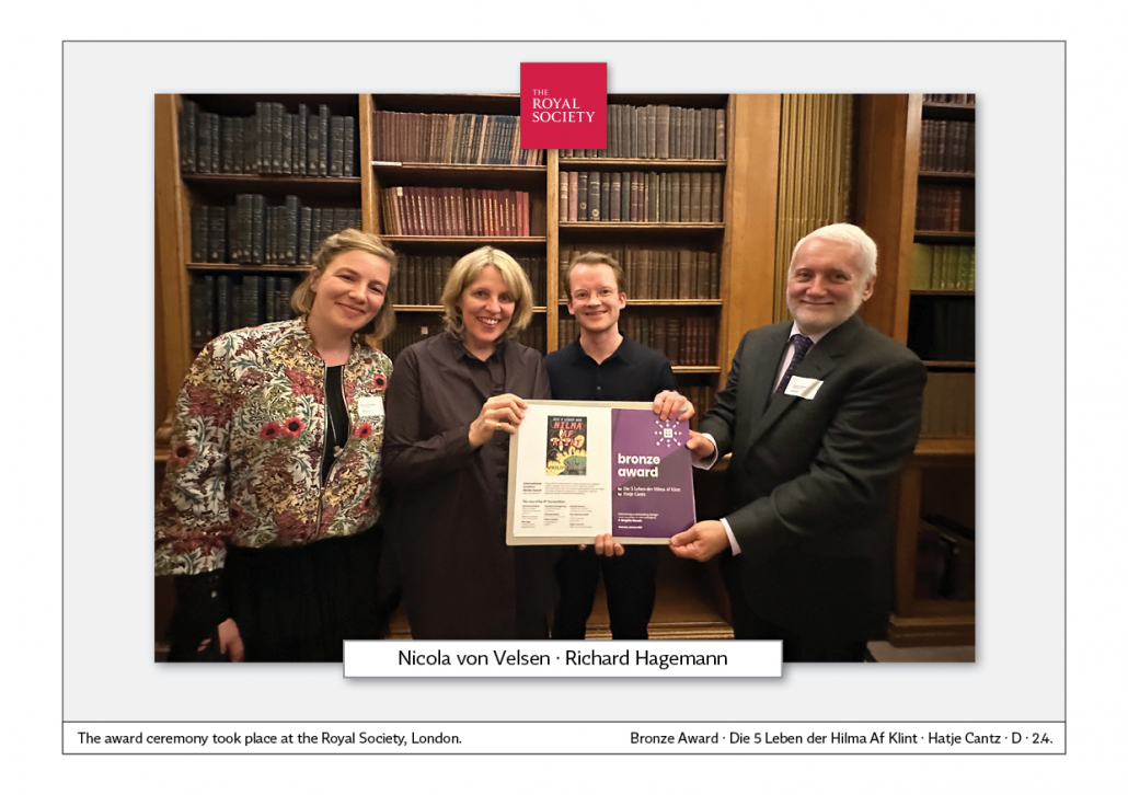
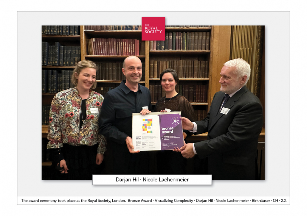
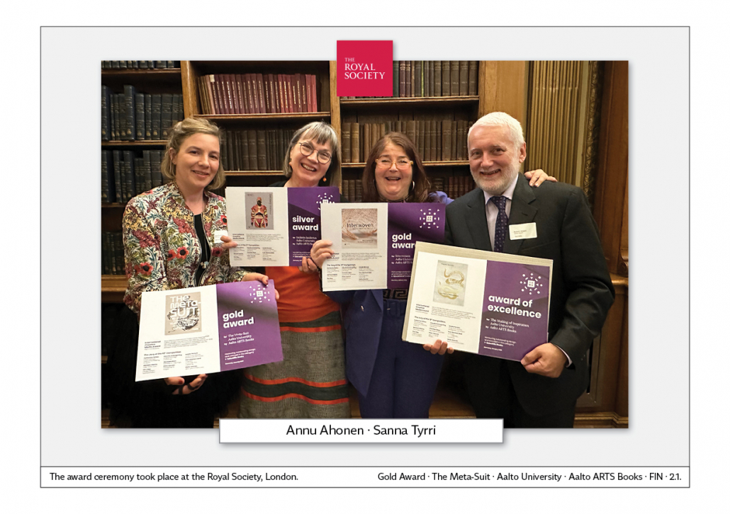
2.0. The award ceremony London
There is a dinner and award ceremony for the winners in the book category. The event is organised by our cooperation partner MGIP – Motovun Group of International Publishers. It always takes place on the eve of the London Book Fair. Here are examples from 2022. The event took place at the Royal Society.
2.0. Presse-Information
Ergebnisse des 15. ICMA-Award
Anzahl der Einreichungen
407 Arbeiten aus 21 Ländern wurden zum 15. ICMA-Award eingereicht. In den vergangenen Jahren gab es immer um die 400 Einreichungen. Die Kontinuität ist somit gegeben und man sieht, dass der Wettbewerb international gut etabliert ist.
Aus diesen Ländern kamen die Einreichungen
Die Einreichungen aus 21 Ländern zeigen, dass der ICMA Award international sehr gut etabliert ist.
Die Teilnehmer kamen aus diesen Ländern:
Nord- und Südamerika: USA, Brasilien
Europa: Österreich, Belgien, Dänemark, Färöer Inseln, Frankreich, Deutschland, Griechenland, Ungarn, Italien, Niederlande, Luxemburg, Polen, Rumänien, Schweiz, Vereinigtes Königreich
Asien und Ozeanien: Australien, China, Japan, Hongkong, Indien
Dabei ist der Bereich für Custom Medien nach wie vor sehr stark von Einreichungen aus Deutschland, Österreich, der Schweiz, Luxemburg und den Niederlanden geprägt.
Custom-Media-Kategorie
Print bleibt wichtig: Ein großer Teil der Custom-Media-Einreichungen sind in den Print-Kategorien. Nach wie vor genießt Print eine hohe Wertschätzung bei Firmen und Lesern. Es geht bei Unternehmens-Kommunikation ja nicht nur um die bloße Nachricht, sondern die Präsentation – Format, Seitenanzahl, Papierwahl, Typografie, Anmutung – wird vom Leser unbewusst wahrgenommen und spielt eine große Rolle bei der Imagebildung eines Unternehmens.
Impact als neue Kategorie: In dieser neuen Kategorie werden Arbeiten ausgezeichnet, bei denen die Wirkung – der Impact – nachgewiesen wurde. Das geschieht zum Beispiel durch Leserbefragungen, Auflagensteigerungen, höhere Nutzungsfrequenz auf Websites usw.
Mitarbeiter und Mitarbeiterinnen im Zentrum: Wie schon in den letzten Jahren werden Mitarbeiter ins Zentrum gerückt, ihre Meinung und Expertise ist gefragt. Um große Themen in einer Publikation darzustellen, werden Mitarbeiterinnen und Mitarbeiter eingebunden und ausführlich vorgestellt.
Lange Coverstorys: Es gibt einen Trend zu längeren Coverstorys. Sie können über acht bis zehn Seiten laufen. Durch Gliederung des Textes, Infografiken und Schaubilder werden Themen vertieft dargestellt. Das gilt für Employee-Medien und Kundenmagazine gleichermaßen.
Weniger visual Storytelling, weniger Infografiken: Vor einigen Jahren gab es einen starken Trend zu doppelseitigen Infografiken und zu mehrseitigem visual Storytelling. Man wendet sich heute doch wieder mehr dem Text zu und entsprechend ruhiger werden die Layouts insgesamt.
Klare Schwerpunkte durch Typografie: Die Überschriften haben klare Aussagen, meist folgt eine mehrzeilige Unterzeile oder ein größer gesetzter Vorspann. Dieser Einstieg in den Artikel wird mit mehr Weißraum versehen als in früheren Jahren. Die Headline-Typografie ist stets modern. Man folgt den aktuellen Trends. Strenge Corporate-Identity-Regeln gehören bei der Wahl der Schrift der Vergangenheit an, denn eine Identity ist meist auf viele Jahre angelegt und daher eher unbeweglich.
Fotografie spielt eine große Rolle: Es sind überwiegend Porträtfotos von Mitarbeitern, die optimal fotografisch dargestellt werden. Die klassische Industrie-Fotografie mit Arbeitern im Blaumann und im industriellen Umfeld sind eher selten geworden. Wenn Mitarbeiter im Arbeitsumfeld gezeigt werden, haben die Fotos ein hohes gestalterisches Niveau. Die Aufnahmen wirken authentisch.
Buch-Kategorie
Die Buchgestaltung wird von unterschiedlichen Faktoren beeinflusst. Das sind die Langzeit-Trends:
1. Bessere technische Möglichkeiten: Druckmaschinen erlauben immer mehr Druckveredelungen. Es gibt immer neue Einbandmaterialien für die exklusive Buchausstattung. Der klassische Buchumschlag ist auf dem Rückzug. Man sieht stattdessen öfter Einbände mit Folien-Kaschierungen oder Leinen-Einbände, auf die ein Label mit dem Buchtitel platziert wird. Schuber sind nach wie vor selten. Sie signalisieren, dass ein Buch besonders wertvoll ist. Oft wird eine abgeschlossene Serie in einem Schuber zusammengefasst.
2. Immer mehr neue Schriften: Durch Google Fonts und andere Anbieter von kostenlosen Schriften gibt es immer mehr Auswahl. Es gibt auch einen großen Markt unabhängiger Schrift-Entwerfer, die unverwechselbare, zeitgemäße und sehr gut lesbare Schriften auf den Markt bringen.
3. Trend zu edlerem Gesamtbild: In den meisten Buch-Kategorien des Wettbewerbs werden die Bücher größer, haben mehr Seiten und eine bessere Ausstattung, wie zum Beispiel einen farbigen Buchschnitt.
4. Mehr Format-Varianten: Es gibt mehr und mehr Format-Varianten, denn es werden immer neue Themen für Bücher gefunden, deren Konzept auch im Format zum Ausdruck kommt. Es gibt durchaus Kinderbücher im Format DIN A 3. Dem gegenüber gibt es Buchreihen, die kleiner sind als DIN A 5.
5. Papier und Einband: Der Trend zu mattem Papier oder Naturpapier setzt sich im deutschen Sprachraum fort. Es wirkt natürlich und umweltfreundlich. International betrachtet gibt es viele Bücher mit seidenmattem Papier. Bücher mit Hochglanz-Papier sind dagegen sehr selten geworden. Die Erkenntnis setzt sich durch: Die Reflexe von glänzendem Papier stören beim Lesen. Der Buchrücken ist gerade, abgerundete Buchrücken sind auf dem Rückzug. Die Schweizer Broschur und der offene Buchrücken ist nach wie vor selten zu sehen. Diese Gestaltung findet man eher bei Büchern von Künstlern oder über Künstler.
Graphic-Design-Kategorie
Einreichungen aus 11 Ländern: China, Japan, Hongkong, Australien, USA, Brasilien, Ungarn, Griechenland, Rumänien, Dänemark, Deutschland. Das zeigt, wie gut der ICMA-Award international etabliert ist. Spannend zu sehen, wie der internationale Austausch von Ideen stilprägend wirkt.
Internationaler Stil: Die Preisträger haben einen internationalen Stil. Ein Logo, das in Europa gestaltet wurde, kann auch auf einem anderen Kontinent verstanden und eingesetzt werden.
International erfolgreiche Designer und Agenturen: Ein Designer aus Ungarn entwirft ein Logo für ein Start-Up in New Mexico. Das ist keine Seltenheit, denn in einer globalisierten Wirtschaft ist der Austausch kreativer Ideen selbstverständlich.
Ausgefeilte Corporate Identitys: Die Bandbreite der Medien und Gegenstände, die in einer Identity berücksichtigt werden müssen, wird immer größer. Papier, Bildschirm, Mobile-Phone, Fahrzeuge, Gebäude-Fassaden, Flaggen, Kugelschreiber, Giveaways … die Aufzählung lässt sich endlos weiterführen. Das bedeutet, dass auch in Zukunft professionelle Designer und spezialisierte Agenturen auf diesem Gebiet gebraucht werden. Es geht immer um Design aus einem Guss. Da darf man als Unternehmen nicht auf zufällige Weiterentwicklung setzen.
Zeitschriften-Kategorie
1. Gegenläufige Trends: Ruhiges Layout und lange Artikel und demgegenüber überbordendes Layout und kurze Artikel – diese beiden Richtungen stehen sich scheinbar unversöhnlich gegenüber. Lange Artikel findet man bei Kunst, Architektur und Design, bei Wissenschafts-Themen, Geschichte, Politik. Kürzere Artikel bei Reise und Fotografie, Lifestyle und Fun.
2. Ruhiges Layout liegt im Trend: Zeitschriften mit einem ruhigen Layout und wenigen Spalten haben in den letzten Jahren an Boden gewonnen. Ein zweispaltiges Layout mit einer mittig platzierten Schiebespalte liegt derzeit besonders im Trend.
3. Mehrseitige Artikel, Gliederung durch Zitate: Artikel haben mehr Seiten als noch vor wenigen Jahren, sie werden eher durch Zitate als durch andere Auflockerungen gegliedert. Kleine Infografiken, Faktenboxen, hervorgehobene Zahlen – all diese Auflockerungs-Elemente sind bei Reise-Magazinen anzutreffen.
4. Illustrationen auf hohem Niveau, wissenschaftlich exakt: Bei wissenschaftlichen Zeitschriften, sowie Zeitschriften zum Thema Geschichte sind fotorealistische Illustrationen häufiger zu sehen.
5. Trend zu Illustrationen: Der Trend, Themen durch eigens angefertigte Illustrationen visuell zu präsentieren, hält weiterhin an. Illustratoren sind heute mehr gefragt denn je.
6. Cover und Coverstory: Das Motiv und die Farbigkeit des Covers sollte im Innern bei der Coverstory aufgegriffen werden. Dadurch hebt sich die wichtigste Geschichte des Hefts von den anderen Seiten ab. Die Coverstory kann im ersten Drittel stehen, bei der Hälfte oder auch im letzten Drittel des Hefts.
Partner
Motovun Group of International Publishers ist ein weltweiter Verband von Buchverlagen. Zu ihm gehören mehr als 80 Verlage weltweit. Viele Mitgliedsverlage nehmen am ICMA-Award für Bücher teil. Der ICMA-Award ist ebenfalls Mitglied der Motovun Group. Website Motovungroup.
Mehr Informationen über die ausgezeichneten Arbeiten werden im Laufe des Januar auf dieser Website platziert.
Kontakt
International Editorial-Design & Research-Forum
Norbert Küpper
Gutenbergstr. 4
40670 Meerbusch
Germany
Email: nkuepper@icma-award.com
Phone: +49 21 59 91 16 15
2.0. Press release
Results of the 15th ICMA Award
Number of submissions
407 entries from 21 countries were submitted for the 15th ICMA Award. In previous years, there were always around 400 submissions. There is therefore continuity and it is clear that the competition is well established internationally.
The submissions came from these countries
The entries from 21 countries show that the ICMA Award is very well established internationally, with participants coming from the following countries:
North and South America: USA, Brazil
Europe: Austria, Belgium, Denmark, Faroe Islands, France, Germany, Greece, Hungary, Italy, Netherlands, Luxembourg, Poland, Romania, Switzerland, United Kingdom
Asia and Oceania: Australia, China, Japan, Hong Kong, India
The custom media category continues to be strongly characterised by submissions from Germany, Austria, Switzerland, Luxembourg and the Netherlands.
Custom media category
Print remains important: A large proportion of custom media submissions are in the print categories. Print continues to be held in high esteem by companies and readers. After all, corporate communication is not just about the message, but the presentation – format, number of pages, choice of paper, typography, look and feel – is subconsciously perceived by the reader and plays a major role in building a company’s image.
Impact as a new category: This new category recognises work that has been proven to have an impact. This is achieved, for example, through reader surveys, increased circulation, higher frequency of use on websites, etc.
Employees at the centre: As in previous years, employees will take centre stage and their opinions and expertise will be in demand. In order to present major topics in a publication, employees are involved and presented in detail.
Long cover stories: There is a trend towards longer cover stories. They can run for eight to ten pages. Topics are presented in greater depth by structuring the text, using infographics and diagrams. This applies equally to employee media and customer magazines.
Less visual storytelling, fewer infographics: A few years ago, there was a strong trend towards double-page infographics and multi-page visual storytelling. Today, however, people are turning more to text again and layouts are becoming correspondingly calmer overall.
Clear focus through typography: The headlines have clear statements, usually followed by a multi-line subline or a larger lead-in. This introduction to the article is provided with more white space than in previous years. The headline typography is always modern. Current trends are followed. Strict corporate identity rules are a thing of the past when it comes to the choice of typeface, as an identity is usually designed to last for many years and is therefore rather inflexible.
Photography plays a major role: it is mainly portrait photos of employees that are presented in the best possible photographic way. Classic industrial photography with workers in overalls and in an industrial environment has become rather rare. When employees are shown in a working environment, the photos are of a high artistic standard. The photos have an authentic look.
Book category
Book design is influenced by various factors. These are the long-term trends:
1. better technical possibilities: Printing machines allow more and more print finishes. There are always new cover materials for exclusive book design. The classic book cover is on the decline. Instead, bindings with foil lamination or linen covers on which a label with the book title is placed are becoming more common. Slipcases are still rare. They signalise that a book is particularly valuable. A complete series is often summarised in a slipcase.
2. more and more new fonts: With Google Fonts and other providers of free fonts, there is more and more choice. There is also a large market of independent font designers who bring distinctive, contemporary and highly legible fonts to the market.
3. trend towards a more refined overall look: In most of the book categories in the competition, books are becoming larger, have more pages and better features, such as coloured edges.
4. more format variants: There are more and more format variants, as new themes are constantly being found for books whose concept is also expressed in the format. There are certainly children’s books in DIN A 3 format, but there are also book series that are smaller than DIN A 5.
5. Paper and binding: The trend towards matt paper or uncoated paper is continuing in the German-speaking world. It looks natural and environmentally friendly. Internationally, there are many books with semi-gloss paper. Books with glossy paper, on the other hand, have become very rare. The realisation is gaining ground: The reflections of glossy paper are distracting when reading. The spine is straight, rounded spines are on the decline. The Swiss brochure and the open spine are still rarely seen. This design is more likely to be found in books by artists or about artists.
Graphic design category
Entries from 11 countries: China, Japan, Hong Kong, Australia, USA, Brazil, Hungary, Greece, Romania, Denmark, Germany. This shows how well established the ICMA Award is internationally. It’s exciting to see how the international exchange of ideas shapes style.
International style: The award winners have an international style. A logo that was designed in Europe can also be understood and used on another continent.
Internationally successful designers and agencies: A designer from Hungary creates a logo for a start-up in New Mexico. This is not uncommon, as the exchange of creative ideas is a matter of course in a globalised economy.
Sophisticated corporate identities: The range of media and objects that need to be taken into account in an identity is growing all the time. Paper, screens, mobile phones, vehicles, building facades, flags, pens, giveaways … the list goes on and on. This means that professional designers and specialised agencies will continue to be needed in this field in the future. It’s always about design from a single mould. As a company, you can’t rely on random further development.
Magazine category
1. opposing trends: calm layout and long articles and, on the other hand, exuberant layout and short articles – these two directions are seemingly irreconcilable. Long articles can be found in art, architecture and design, science topics, history and politics. Shorter articles on travel and photography, lifestyle and fun.
2. calm layout is the trend: Magazines with a calm layout and few columns have gained ground in recent years. A two-column layout with a sliding column in the centre is particularly popular at the moment.
3. multi-page articles, organised by quotes: Articles have more pages than they did a few years ago, they are structured by quotes rather than by other break-ups. Small infographics, fact boxes, emphasised figures – all these break-up elements can be found in travel magazines.
4. illustrations at a high level, scientifically accurate: photorealistic illustrations are more common in scientific and history magazines.
5. trend towards illustrations: The trend of presenting topics visually through custom-made illustrations continues. Illustrators are more in demand today than ever before.
6. cover and cover story: The motif and colour scheme of the cover should be picked up on inside the cover story. This makes the most important story of the magazine stand out from the other pages. The cover story can be in the first third, halfway through or even in the last third of the magazine.
Partner
The Motovun Group of International Publishers is a worldwide association of book publishers. It includes more than 80 publishers worldwide. Many member publishers take part in the ICMA Award for books. The ICMA Award is also a member of the Motovun Group.
More information about the award-winning works will be placed on this website in the course of January.
Contact
International Editorial Design & Research Forum
Norbert Küpper
Gutenbergstr. 4
40670 Meerbusch
Germany
Email: nkuepper@icma-award.com
Phone: +49 21 59 91 16 15
2.03. Children‘s and young people books

 auto
autoPublisher: Rotopol · D
Original publication: l’ecole des loisirs, Paris · FR
ICMA Award: Gold
Jury statement
Lively and appealing illustrations, great colours, emotional mood.
–
Lebendige und sympathische Illustrationen, großartige Farbigkeit, emotionale Stimmung.

 auto
autoPublisher: Thames & Hudson · UK
ICMA Award: Silver
Jury statement
Great double pages with fold-out elements, lively scenes, beautiful atmosphere and colours.
–
Tolle Doppelseiten mit Aufklapp-Elementen, lebendige Szenerien, schöne Stimmung und Farbigkeit.

 auto
autoPublisher: Føroya Lærarafelags · FO
ICMA Award: Bronze
Jury statement
A unique visual language, a sympathetically reduced illustration style in black and white.
–
Unverwechselbare Bildsprache, sympathisch reduzierter Illustrationsstil in Schwarzweiß.

 auto
autoPublisher: Bohem Press
ICMA Award: Bronze
Jury statement
The supermarket as a topic with relevance to society. Beautiful illustration style, matching colours. Endpapers illustrated to match the theme
–
Der Supermarkt als Thema mit gesellschaftlicher Relevanz. Schöner Illustrationsstil, passende Farbigkeit. Vorsatzpaper passend zum Thema illustriert.

 auto
autoPublisher: Midas Verlag · D
Original publication: Frances Lincoln Quarto Publishing, London · UK
ICMA Award: Award of Excellence
Jury statement
Important topic, exciting signal colour, unique illustration style.
–
Wichtiges Thema, spannende Signalfarbe, unverwechselbarer Illustrationsstil.

2.03.1. Guidebooks, non-fiction books for children

 auto
autoPublisher: Monterosa-Verlag · D
ICMA Award: Gold
Jury statement
Outstanding design and content. Various printing and illustration techniques. Very good book structure. Special didactic concept.
–
Gestalterich und inhaltlich herausragend. Verschiedene Druck- und Illustrationstechniken. Buchstruktur sehr gut. Besonderes didaktisches Konzept.

 auto
autoPublisher: Gerstenberg · D
Original publication: Dein Hund · Elelna Bulay 2022
ICMA Award: Silver
Jury statement
Especially great: the cover. Great illustration - the dog looks at you. The book stands out thanks to the combination of non-fiction and narrative literature. Great illustrations. The structure and navigation through sections in black and white and colour.
–
Besonders großartig: das Cover. Tolle Illustration – der Hund schaut einen an. Das Buch fällt auf durch die Kombination aus Sachbuch und erzählender Literatur. Tolle Illustrationen. Gliederung und Navigation durch Abschnitte in Schwarzweiß und Farbe.

 auto
autoPublisher: Moritz Verlg · D
Original publication: Editions Maison Georges · FR
ICMA Award: Award of Excellence
Jury statement
Stylish book with a unique aesthetic. Consistent design and colour concept. Thematically well structured.
Stylisches Buch mit ganz eigener Ästhetik. Konsistentes Design- und Farbkonzept. Thematisch gut strukturiert.

 auto
autoPublisher: Gerstanberg · D
Original publication: Bloomsbury London · UK
ICMA Award: Award of Excellence
Jury statement
Lots of knowledge for young readers. Practical teaching, step-by-step illustrations serve as instructions. The connection to nature is didactically well prepared.
Viel Wissen für junge Leserinnen und Leser. Praktische Vermittlung, Step-by-Step-Illustrationen dienen als Anleitungen. Verbundung zur Natur wird didaktisch gut aufbereitet.

 auto
autoPublisher: La Martinière Jeunesse
ICMA Award: Award of Excellence
Jury statement
Beautiful and clear illustrations, large format, very elaborate and easy-to-use fold-out elements.
Schöne und klare Illustrationen, großes Format, sehr aufwändige und gut handhabbare Aufklapp-Elemente.

 auto
autoPublisher: La Martinière Jeunesse · FR
ICMA Award: Award of Excellence
Jury statement
Artistic design, very special in connection with the theme. A great object for bibliophiles. Very well thought-out cut-outs.
Künstlerische Gestaltung, im Zusammenhang mit dem Thema sehr besonders. Tolles Objekt für Bibliophile. Sehr gut durchdachte Ausstanzungen.


2.04. Graphic Novels

 auto
autoPublisher: Ventil Verlag UG · D
ICMA Award: Gold
Jury statement
Great concept: song comics. The variety of illustration styles is particularly appealing. Successful cover: it makes you want to listen to the music. Overall: an inspiring book.
Tolles Konzept: Songcomics. Die Unterschiedlichkeit der Illustrations-Stile ist besonders reizvoll. Gelungenes Cover: Es macht Lustauf die Musik. Insgesamt: Ein inspirierendes Buch.


 auto
autoPublisher: Carlsen Verlag · D
ICMA Award: Gold
Jury statement
Monumental work, impressive research. Translation of contemporary history into contemporary comic novel form. Strong cover. Impressive black and white illustrations.
Monumentales Werk, beeindruckende Recherche. Übertragung von Zeitgeschichte in zeitgemäße Comic-Romanform. Starkes Cover. Beeindruckende Schwarzweiß-Illustrationen.


 auto
autoPublisher: JaJa Verlag · D
ICMA Award: Silver
Jury statement
Beautifully unique drawing style. Picturesque, special colours and texture. Exciting composition and distinctive panel borders. A particularly positive feature: Absence of outlines
Wunderschöner einzigartiger Zeichenstil. Malerische, besondere Farbigkeit und Haptik. Spannende Komposition und unverwechselbare Panelbegrenzungen. Das fällt besonders positiv auf: Abwesenheit von Outlines.

 auto
autoPublisher: Reprodukt
ICMA Award: Bronze
Jury statement
Pleasant texture due to the cover. Great colours, varied panel layout. Exciting use of line and outline. Unmistakable element: the illustrations break out of the panels right up to the edge of the paper.
Angenehme Haptik durch den Umschlag . Tolle Farbigkeit,, abwechslungsreiche Panelufteilung. Spannende Verwendung von Linie und Outline. Unverwechselbars Element: Ausbruch der Illustrationen aus den Panels bis zum Papierrand.


2.05.0. Guides and non-fiction


2.05.1. Cookbooks

 auto
autoPublisher: Éditions du Chêne · FR
ICMA Award: Gold
Jury statement
Practice-orientated content concept. Good navigation. Explanatory illustrations very well embedded. Very well photographed. Exemplary use of the additional colour red in the typography.
Praxisorientiertes inhaltliches Konzept. Gute Navigation. Erklärende Illustrationen sehr gut eingebettet. Sehr gut fotografiert. Beispielhafter Einsatz der Zusatzfarbe Rot in der Typografie.

 auto
autoPublisher: feigfotodesign · D
ICMA Award: Silver
Jury statement
Exciting concept: mix of dialect, regional studies and recipes. Calre photographs. Harmonious colour concept. Useful highlight: three ribbon markers to mark recipes.
Spannendes Konzept: Mix aus Dialekt, Landeskunde und Rezepten. Kalre Fotografien. Stimmiges Farbkonzept. Sinnvolles Highlight: Drei Lesebändchen, um Rezepte zu markieren.


 auto
autoPublisher: Roli Books · IND
ICMA Award: Silver
Jury statement
Coherent overall concept. Colourful, bright chapter start pages structure the book very well. Reportage photos provide an excellent introduction. Clear design of the recipes, great recipe photos.
Stimmiges Gesamtkonzept. Farbenfrohe Kapitel-Startseiten gliedern das Buch sehr gut. Reportagefotos bilden einen hervorragenden Einstieg. Klare Gestaltung der Rezepte, tolle Rezept-Fotos.


2.06.0. Art books · books about or by artists

 auto
autoPublisher: Museum of Fine Arts Boston · USA
ICMA Award: Gold
Jury statement
The book opens up access to the epoch. A juxtaposition of painting and photography – a new perspective opens up a new level in painting. From detail to the whole and back. Change of perspective.
Das Buch eröffnet einen Zugang zur damaligen Epoche. Gegenüberstellung von Malerei und Fotografie – neuer Blick eröffnet neue Ebene in der Malerei. Vom Detail ins Ganze und zurück. Perspektivwechsel.

 auto
autoPublisher: Tijdsbeeld and Van Gogh Museum
ICMA Award: Silver
Jury statement
A beautiful and surprising comparison of two artists. Effect through interplay and contrasts. Harmonious combination of text and image. Consistent, clear layout.
Schöne und überraschende Gegenüberstellung zweier Künstler. Wirkung durch Zusammenspiel und Kontraste. Harmonische Kombination von Text und Bild. Konsequentes, übersichtliches Layout

 auto
autoPublisher: Sandstein Verlag
Original publication:
ICMA Award: Silver
Jury statement
Cover: The name is divided in half at the top and bottom and continued in the book cut. Exciting cover design.
Inside: The artworks are given plenty of space, as they often run over one or two pages. The layout is in two columns. Striking: References to works of art in the book are emphasised with two lines in square brackets.
Overall: Modern book design, very well adapted to the artist and his works.
Cover: Der Name wird oben und unten halbiert und im Buchschnitt fortgesetzt. Spannende Covergestaltung.
Innen: Die Kunstwerke erhalten viel Platz, denn sie werden oft über eine oder zwei Seiten geführt. Das Layout ist zweispaltig angelegt. Auffällig: Verweise auf Kunstwerke im Buch werden mit zweizeiligen Hervorhebungen in eckigen Klammern gemacht.
Insgesamt: Moderne Buchgstaltung, sehr gut auf den Künstler und seine Werke abgestimmt.

 auto
autoPublisher: Edition Lammerhuber
ICMA Award: Bronze
Jury statement
Beautiful cover. The printed endpaper leads from the cover to the inside of the book. Exciting book format. Good-working close-ups, surprising insights and interesting imagery.
Schönes Cover. Das bedruckte Vorsatzpapier führt vom Cover zum Buchinnern. Spannendes Buchformat. Gut wirkende Nahaufnahmen, überraschende Einblicke und interessane Bildsprache.


 auto
autoPublisher: Mercatorfonds · B
ICMA Award: Award of Excellence
Jury statement
Beautiful cover with red embossed typography. The white space and individual pages give the artwork a strong impact. Very clearly organised exhibition, high-quality presentation.
Schönes Cover mit roter Prägung der Typografie. Die Kunstwekre wirken stark durch Weißraum und Einzelseiten. Sehr übersichtliche Werkschau, wertige Aufmachung.

 auto
autoPublisher: Glockenbach Verlag
ICMA Award: Award of Excellence
Jury statement
The book introduces the Leipzig stage designer Axel Pfefferkorn. Good navigation through monochrome double pages. Drawings, sketches and plans show how stage sets are created. Colour and black and white photos illustrate how the actors bring a world to life. The book also presents the complexity of the profession of ‘stage designer’.
Das Buch stellt den Leipziger Bühnenbildner Axel Pfefferkorn vor. Gute Navigation durch monochrom gestaltete Doppelseiten. Zeichnungen, Skizzen, Pläne zeigen, wie Bühnenbilder entstehen. Farb- und Schwarzweiß-Fotos illustrieren, wie die Schauspieler darin eine Welt lebendig werden lassen. Das Werkbuch präsentiert auch die Vielschichtigkeit des Berufsbilds “Bühnenbildner”.


 auto
autoPublisher: Kulturmaschinen Verlag
ICMA Award: Award of Excellence
Jury statement
The book consists primarily of poems. Works of art are also included. The poems are presented in German on the left-hand pages and in English on the right-hand pages.
Special effect: QR codes link to YouTube, where the poems are read aloud.
Useful format, clear and well-organised layout.
Das Buch besteht in erster Linie aus Gedichten. Kunstwerke kommen hinzu. Die Gedichte werden auf linken Seiten in deutscher, auf rechten in englischer Sprache präsentiert.
Besonderer Effekt: QR-Codes verweisen auf Youtube, wo die Gedichte vorgelesen werden.
Handliches Format, klares und übersichtliches Layout.

2.06.1. Art books · Art, Architecture, Design

 auto
autoPublisher: Hirmer Verlag
ICMA Award: Gold
Jury statement
Well-prepared encyclopaedic volume. Clear and functional design grid, long informative captions.
Innovative: footnotes are placed in marginal columns.
Red highlighting in headings and subheadings provides a very good contrast to the black typography.
Fundiert aufbereiteter enzyklopädischer Band. Klares und funktionales Gestaltungsraster, lange informative Bildunterschriften.
Innovativ: Fußnoten werden in Marginalspalten untergebracht.
Rote Hervorhebungen bei Überschriften und Zwischenzeilen bilden sehr guten Kontrast zum Schwarz der Typografie.

 auto
autoPublisher: 5 Continents Editions
ICMA Award: Gold
Jury statement
Excellent photography didactics, first-class execution, good typography, all in all a very high-quality book.
Restrained cover design that gives an idea of what follows inside the book. Very clear layout, as texts and illustrations are presented on separate pages.
Exzellente Fotografie-Didaktik, erstklassige ausfäührung, gute Typografie, insgesamt sehr wertiges Buch.
Zurückhaltend gestaltetes Cover, das erahnen läßt, was im Innern des Buches folgt. Sehr klares Layout, weil Texte und Abbildungen auf getrennten Seiten präsentiert werden.

 auto
autoPublisher: Hirmer Verlag
ICMA Award: Gold
Jury statement
The cover is a special eye-catcher. The design and illustrations are innovative and appealing. Special structure with pink pages, with the paper colour changing from dark to light. All-round innovative, inspiring book design.
Das Cover als besonderer Eyecatcher. Design und Illustrationen sind innovativ und gestalterisch ansprechend. Besondere Gliederung durch rosa Seiten, wobei die Farbe von dunkel zu hell changiert. Rundum innovatives, inspirierendes Buchdesign.

 auto
autoPublisher: Sandstein Verlag
ICMA Award: Gold
Jury statement
Cover: The text runs like a film. Portrait photos of actors introduce the theme. The cover signals modernity and dynamism.
Inside: 408 pages about film: posters, scene photos, sketches and explanatory texts are arranged into a complete work of art.
Very good reader guidance thanks to chapter headings placed on edge at the sides. Very well thought-out typography for the entire book.
Exciting contrast of matt and glossy paper.
Overall: Yes, film can be presented very well between book covers.
Cover: Der Text läuft wie ein Film vorbei. Portraitfotos von Schauspielern führen in das thema an. Das Cover signalisiert Modernität und Dynamik.
408 Seiten über Film: Plakate, Szenenefotos, Skizzen und erläuternde Texte werden zu einem Gesamtkunstwerk arrangiert.
Sehr gute Leserführung durch seitlich hochkant platzierte Kapitelüberschriften. Sehr gut durchdachte Typografie für das gesamte Buch.
Spannender Kontrast von mattem und glänzendem Papier.
Insgedamt: Ja, man kann Film sehr gut zwischen Buchdeckeln präsentieren.


 auto
autoPublisher: Hirmer Verlag
ICMA Award: Gold
Jury statement
Cover: cover photo and seal as eye-catchers. Particularly minimalist cover without text.
Inside: Endpaper introduces the contents with sketches. Photographs are shown to good effect.
Cremerosa as a striking underlay to texts, otherwise classically elegant layout.
Cover: Einbandfoto und Siegel als Eyecatcher. Besonders reduziertes Cover ohne Text.
Innen: Vorsatzpapier führt mit Skizzen in den Inhalt ein. Fotografien kommen gut zur Wirkung.
Cremerosa als Unterlegung von Texten auffallend, ansonsten klassisch edel layoutet.

 auto
autoPublisher: Mercatorfonds · B
ICMA Award: Silver
Jury statement
Cover: Softcover haptically very well chosen and matching the content.
Clear typography, good structuring of the text by means of intermediate lines. Very functional: text flow is not interrupted by illustrations.
Reproductions of historical photos harmonise with the illustrated artworks.
Cover: Softcover haptisch sehr gut gewählt und passend zum Inhalt.
Klare Typografie, gute Gliederung in den Texten durch Zwischenzeilen. Sehr funktional: Textfluss wird durch Abbildungen nicht unterbrochen.
Reproduktionen historischer Fotos harmonieren im Wechsel mit den abgebildeten Kunstwerken.

 auto
autoPublisher: Museum of Fine Arts Boston · USA
ICMA Award: Silver
Jury statement
Harmonious overall appearance, pleasant feel, handy format, successful colour compositions. Good legibility.
Harmonisches Gesamtbild, angenehme Haptik, handliches Format, gelungene Farbkompositionen. Gute Lesbarkeit.

 auto
autoPublisher: M Books · D
Design: Bucharchitektur Kathrin Schmuck
ICMA Award: Bronze
Jury statement
Innovative concept and design well presented. Good combination of plans, drawings and photographs. Choice of paper matches the theme and is successful. Use of two languages – German and English – very well managed in terms of design.
Innovatives Konzept und gut präsentierter Entwurf. Gute Kombination von Plänen, Zeichnungen und Fotos. Die Wahl des Papiers passt zum Thema und ist gelungen. Die Verwendung von zwei Sprachen – Deutsch und Englisch – ist gestalterisch sehr gut umgesetzt.

 auto
autoPublisher: Mercatorfonds ·B
ICMA Award: Bronze
Jury statement
Hardcover with a feel that matches the theme. Handy book format. Good print quality. Classic layout. Great compilation of artworks and photographs, varied layout.
Hardcover mit Haptik, die zum Thema passt. Handliches Buchformat. Gute Druckqualität. Klassisches Layout. Tolle Zusammenstellung der Kunstwerke und Fotografien, abwechslungsreich layoutet.

 auto
autoPublisher: Museum of Fine Arts Boston · USA
ICMA Award: Award of Excellence
Jury statement
Colours and design very well matched to the works of art. Illustrations very well staged. Classic realisation, very effective. Very good insight into this period of Dutch art.
Farben und Design sehr gut auf die Kunstwerke abgestimmt. Abbildungen sehr gut inszeniert. Klassische Umsetzung, sehr wirkungsvoll. Sehr guter Einblick in diese Epoche niederländischer Kunst.

 auto
autoPublisher: Wienand Verlag, Köln · D
Kaspar Kraemer Architekten · D
Design: Bucharchitektur \ Kathrin Schmuck
ICMA Award: Award of Excellence
Jury statement
Impressive portfolio, with a varied layout despite its large size. Good colour concept. Interesting mix of photos, sketchbook drawings and models.
Beeindruckendes Portfolio, trotz großem Umfang abwechslungsreich layoutet. Gutes Farbkonzept. Interessanter Mix aus Fotos, Skizzenbuch-Zeichnungen und Modellen.


2.07. Photo books

 auto
autoPublisher: Edition Lammerhuber · A
ICMA Award: Gold
Jury statement
The book is slightly smaller than DIN A 3 and has a landscape format. It is a leporello, hand-bound. You can put the book up and enjoy a photo exhibition. One side has the photos, the other the text.
All in all: Prisma is a book object with excellent photographs
Das Buch ist etwas kleiner als DIN A 3 und hat ein Querformat. Es ist ein Leporello, handgebunden. Man kann das Buch aufstellen und so eine Foto-Ausstellung genießen. Die eine Seite hat die Fotos, die andere die Texte.
Insgesamt: Prisma ist ein Buch-Objekt mit hervorragenden Fotografien.


 auto
autoPublisher: Edition Lammerhuber · A
ICMA Award: Gold
Jury statement
Combination of colour and black and white photos. In addition to photos of performances, there are also many shots that give the viewer a glimpse behind the scenes. Outstanding photography, varied imagery, lively scenes. Clear, consistent design with large picture formats.
Kombination aus Farb- und Schwarzweiß-Fotos. Neben Fotos von Aufführungen gibt es auch viele Aufnahmen, die die Betrachter hinter die Kulissen blicken lassen. Herausragende Fotografie, abwechslungsreiche Bildsprache, lebendige Szenen. Klare durchgängie Gestaltung mit großen Bildformaten.


 auto
autoPublisher: Sandstein Verlag · D
ICMA Award: Silver
Jury statement
A complete work, as 100 photographers from 100 years are presented with their work on 600 pages.
The red colour and typography of the cover make it unmistakable.
The silk-matt paper of the inner section is well chosen, as it is not too thick so that the book does not become too bulky.
Each photographer portrait is introduced with a text printed on a pastel background. Clear reader guidance. The names of the photographers are always printed vertically in a distinctive typography that is also used on the cover.
Ein Gesamtwerk, denn auf 600 Seiten werden 100 Fotografinnen und Fotografen aus 100 Jahren mit ihren Arbeiten vorgestellt.
Das Cover ist durch die Farbe Rot und die Typografie unverwecheselbar.
Das seidenmatte Papier des Innenteils ist gut gewählt, denn es ist nicht zu dick, damit das Buch nicht zu voluminös wird.
Jedes Fotografen-Portrait wird mit einem Text eingeleitet, der auf einem Pastell-Untergrund gedruckt wird. Klare Leserführung. Die Namen der Fotografen stehen immer senkrecht in einer unverwechselbaren Typografie, die auch schon auf dem Cover benutzt wird.


 auto
autoPublisher: Papadakis Publishers · UK
ICMA Award: Bronze
Jury statement
Excellent macro shots, very good printing and finishing. Bright colours, strong effect.
Hervorragende Makroaufnahmen, Druck und Verarbeitung sehr gut. Leuchtende Farben, starke Wirkung.


2.07.1 Photo books photo reports

 auto
autoPublisher: Edition Lammerhuber · A
ICMA Award: Gold
Jury statement
Insight into the reality of a country. Stunning photographs, up close and personal. A great reportage book with fascinating colours.
Einblick in die Realität eines Landes. Berührende Fotografien, nah dran. Ein großartiger Reportageband mit faszinierenden Farben.


 auto
autoPublisher: Kulturalis Ltd. · UK
ICMA Award: Silver
About the book
A collection of unique photographs from the Purépecha region of Michoacán, Mexico, which present a world that rebels against the changes of history in a constant desire not to disappear.
Jury statement
The black and white shots have a documentary and often dramatic effect, as the cover shows. No tourist highlights are shown, but rather everyday scenes that give an insight into the situation of the locals.
Die Schwarzweiß-Aufnahmen wirken dokumentarisch und oft auch dramatisch, wie das Cover zeigt. Es werden keine touristischen Highlights gezeigt, sondern Alltagsszenen, die Einblick in die Situation der Einheimischen geben.


 auto
autoPublisher: Edition Bildperlen · D
ICMA Award: Silver
Jury statement
Clear, calm layout that surrounds the black and white photos with sufficient white space. Particularly dramatic shots are enlarged. All in all: very good documentary photojournalism.
Klares, ruhiges Layout, dass die Schwarzweiß-Fotos mit genügend Weißraum umgibt. Besonders dramatische Aufnahmen werden größer eingesetzt. Insgesamt: Sehr guter dokumentarischer Fotojournalismus.


 auto
autoPublisher: Éditions de La Martinière · FR
ICMA Award: Bronze Award
Jury statement
Precise photographs. The book is of high quality and does honour to the subject. The beauty of the craftsmanship is conveyed very well.
Präzise Fotografien. Das Buch ist wertig, es wird dem Thema gerecht. Die Schönheit des Handwerks wird sehr gut transportiert.

2.07.2. Photobooks Travel

 auto
autoPublisher: Éditions du Chêne · FR
ICMA Award: Gold
Jury statement
The book provides an overview of train routes in Asia, North and South America and Oceania. The characteristic locomotives or carriages are shown in illustrations. Maps show the train route and a timeline shows individual stops. A perfect book all round. Beautiful realisation, great design, great concept, outstanding photos.
Das Buch gibt einen Überblick über Zugstrecken in Asien, Nord- und Südamerika und Ozeanien. In Illustrationen werden die jeweils charakgeritsichen Lokomotiven oder Waggons gezeigt. Landkarten zeigen die Zugstrecke, eine Zeitschiene einzelne Haltepunkte. Ein rundum perfektes Buch. Wunderschöne Umsetzung, tolle Gestaltung, großartiges Konzept, herausragende Fotos.

 auto
autoPublisher: atverlag · A
ICMA Award: Bronze
Jury statement
Hikes in the Swiss Alps are presented. Short texts, reduced maps show the routes. Very clear design. The information under the heading is a highlight: Time, kilometres, differences in altitude, level. The photographs of the mountains form the centrepiece of the book. Very good book design, choice of paper, typography.
Es werden Wanderungen in den Schweizer Alpen vorgestellt. Kurze Texte, reduzierte Landkarten zeigen die Routen. Sehr übersichtliche Gestaltung. Ein Highlight sind die Angaben unter der Überschrift: Zeitangabe, km, Höhenunterschiede, Level. Den Schwerpunkt des Buches bilden die Fotografien der Bergwelt. Sehr gutes Buchdesign, Papierwahl, Typografie.

 auto
autoPublisher: Batsford · UK
ICMA Award: Award of Excellence
Jury statement
The theme of the book is lake water pools around the world. A lake pool is shown on each double page, accompanied by a text with further explanations. Good concept, very good realisation.
Thema des Buches sind Seewasser-Pools rund um den Erdball. Auf jeder Doppelseite wird ein Seepool gezeigt, der von einem Text mit weiteren Erläuterungen begleitet wird. Gutes Konzept, sehr gute Umsetzung.

2.08. Book series

 auto
autoPublisher: Verlag Friedrich Oetinger GmbH
ICMA Award: Bronze
Jury statement
Very good idea: knowledge transfer for children presented in an age-appropriate way. The beaver as narrator is a good idea. Colourful, full of facts - a well thought-out concept.
Sehr gute Idee: Wissensvermittlung für Kinder altersgerecht präsentiert. Der Biber als Erzähler ist eine gute Idee. Farbenfroh, faktenreich – ein durchdachtes Konzept.


2.09. Corporate books

 auto
autoPublisher: Passaport AG · CH
ICMA Award: Gold
Jury statement
The journey through time through historic hotels in Switzerland is rich in facts and excellently illustrated.
Facts: A timeline reveals when the hotel was built and which historical events or changes of ownership have taken place. A map shows the location of the hotel and tips for excursions are given. The number of rooms and contact details with QR code round off the facts.
Photography: The hotels are shown from the outside and there are always views from rooms of the hotels to the outside. Interior views with sometimes surprising details and perspectives show each of the hotels presented from its best side.
Die Zeitreise durch historische Hotels der Schweiz ist sehr faktenreich und herausragend bebildert.
Fakten: Eine Zeitschiene verrät, wann das Hotel errichtet wurde und welche historischen Ereignisse oder Besitzerwechsel stattgefunden haben. Eine Landkarte zeigt die Lage des Hotels und es werden Ausflugstipps gegeben. Zimmeranzahl und Kontakdaten mit QR-Code runden die Angaben der Fakten ab.
Fotografie: Die Hotels werden von außen gezeigt und es werden immer wieder Ausblicke aus Räumen der Hotels nach draußen gegeben.
Innenansichten mit manchmal überraschenden Details und Perspektiven zeigen jedes der vorgestellten Hotels von seiner besten Seite.


 auto
autoPublisher: Mugele‘s · I
ICMA Award: Silver
Jury statement
High-quality and modern look, good documentation. Exciting colour combination of blue and brass. Packaging and presentation very well done, very lovingly made overall.
Wertige und moderne Anmutung, gute Dokumentation. Spannende Farbkombination blau und messing. Verpackung und Aufmachung sehr gelungen, insgesamt sehr liebevoll gemacht.


 auto
autoPublisher: Baugenossenschaft wohnen & mehr · CH
ICMA Award: Silver
Jury statement
Typography, colour and layout very well done. Informative structure, clearly organised. Good material, good haptics. Overall: modern understatement.
Typogtafie, Farbe und Layout sehr gelungen. Informativ aufgebaut, übersichtlich. Gutes Material, gute Haptik. Insgesamt: Modernes Understatement.

 auto
autoPublisher: Callwey Verlag · D
ICMA Award: Bronze
Jury statement
Super cover with sophisticated finishing. Solidly designed and photographed. Typographically unmistakable solution.
Super Cover mit aufwändiger Veredelung. Solide gestaltet und fotografiert. Typografisch unverwechselbar gelöst.


 auto
autoPublisher: feco-feederle GmbH
ICMA Award: Award of Excellence
Jury statement
Clear concept, good cover with glossy typography on a black background. Practical design, lively layout, consistent colour scheme.
Klares Konzept, gutes Cover mit der glänzenden Typo auf schwarzem Grund. Zweckmäßige Gestaltung, lebhaftes Layout, konsistente Farbgebung.

 auto
autoPublisher: Rotary Club Hameln · D
ICMA Award: Award of Excellence
Jury statement
Elaborate project. Clear design and preparation of historical documents, which are reproduced in their original form.
Aufwändiges Projekt. Klare Gestaltung und Aufbereitung historischer Dokumente, die im Original abgebildet werden.

2.10. Concept · Innovation

 auto
autoPublisher: Schüren Verlag · D
ICMA Award: Silver
Jury statement
The book systematically presents cinemas in the provinces. The recordings come from 13 of Germany’s 16 federal states. The city states of Hamburg, Bremen and Berlin are excluded, as the book is about the provinces.
One exterior shot and two interior shots are always shown. Sometimes a detailed picture is added.
A very good idea, great research, well-chosen album format. Very appealing overall.
Im Buch werden Kinos in der Provinz systematisch dargestellt. Die Aufnahmen stammen aus 13 der 16 Bundesländer Deutschlands. Die Stadtstaaten Hamburg, Bremen, Berlin werden ausgenommen, denn es geht ja um die Provinz.
Es wird immer eine Ausßenauf ahme und zwei Innenaufnahmen gezeigt. Manchmal wird noch ein Detailbild hinzugefügt.
Eine sehr gute Idee, tolle Recherche, gut gewähltes Album-Format. Insgesamt sehr ansprechend.

2.11. General literature

 auto
autoPublisher: Greven Verlag · D
ICMA Award: Gold
Jury statement
Excellent cover design, outstanding typography on the pages inside. Red and black as an effective colour contrast. The colour, illustration and typography of the cover are systematically continued inside. Distinctive minimalist style.
Hervorragende Covergestaltung, hervorragende Typografie im Innenteil. Rot-Schwarz als wirkungsvoller Farbkontrast. Farbe, Illustration und Typografie des Covers werden im Innern systematisch fortgesetzt. Unverwechselbarkeit durch minimalistischen Stil.

 auto
autoPublisher: mareverlag GmbH & Co. oHG
ICMA Award: Silver
Jury statement
High-quality bibliophile series with an appealing mix of materials. The slipcase significantly increases the value and makes each book in the series something special. Very good themed cover design. Classics. Printing, paper, binding, typography: absolutely perfect.
Bibliophil hochwertig gestaltete Reihe mit ansprechendem Materialmix. Der Schuber erhöht deutlich die Wertigkeit und macht jedes Buch der Reihe zu etwas Besonderem. Sehr gute themenbezogene Covergestaltung. Klassiker. Druck, Papier, Einband, Typografie: absolut überzeugend.
 auto
autoPublisher: mareverlag GmbH & Co. oHG
Original publication: Uitgeverij Unieboek · Het Sprectrum bv. · NL
ICMA Award: Award of Excellence
Jury statement
Cover: Haptically and visually exciting, as the print is on the linen cover.
Inside: Exciting mix of texts, documentary photos and maps. Very reduced use of colour, as only black and blue are used. Some texts are printed in blue, but are still very easy to read.
Cover: Haptisch und visuell spannend, denn der Druck erfolgt auf den Leinen-Einband.
Innenteil: Spannende Mischung aus Texten, dokumentarischen Fotos und Landkarten. Sehr stark reduzierte Farbigkeit, denn es wird nur Schwarz und Blau eingesetzt. Manche Texte sind blau gedruckt, trotzdem sehr gute Lesbarkeit.
2.14. Book cover

 auto
autoPublisher: Bonnevoice Hörbuchverlag · D
ICMA Award: Award of Excellence
Jury statement
The newspaper Falter writes about the book: ‘Part homage, part life story, part who’s-who collection of anecdotes, part portrait of a contemporary witness, part portrait of friendship and definitely a bombshell declaration of love to an incomparable 96-year-old. Grandiose!’
It is undoubtedly a very personal story. That’s why the handwritten title in white lettering on a red background is entirely appropriate for the subject.
Where does the title of the book come from? Quite simply: when you ask her how she’s doing, she says: ‘Fine. If not today, then tomorrow.’
Die Zeitung Falter schreibt über das Buch: „Teils Hommage, teils Lebensgeschichte, teils Who’s-who-Anekdotensammlung, teils Zeitzeuginnen-, teils Freundschaftsporträt und ganz sicher eine Bomben-Liebeserklärung an eine unvergleichliche 96-Jährige. Grandios!“
Es ist zweifellos eine ganz persönliche Geschichte. Darum ist der handgeschriebene Titel in weißer Schrift auf rotem Grund dem Thema ganz angemessen.
Woher kommt der Titel des Buches? Ganz einfach: Wenn man sie fragt, wie es ihr geht, sagt sie: „Gut. Wenn nicht heute, dann morgen.“
 auto
autoPublisher: Geparden Verlag · CH
ICMA Award: Award of Excellence
Jury statement
The three book covers shown here do not form a series. They are simply examples of Geparden Verlag’s cover design. What makes the covers distinctive? There is always a photo underneath that matches the theme of the book. A white frame sets the photo apart from the background. The author’s name is always at the top, the book title in the visual centre, with the lines placed asymmetrically. At the bottom right is always the logo of Geparden Verlag - a predator behind an open book. Overall: perfection through reduction.
Die drei hier gezeigten Buchcover bilden keine Serie. Es sind einfach nur exemplarische Beispiele für die Covergestaltung des Geparden Verlags. Was macht die Cover unverwechselbar? Es wird immer ein Foto unterlegt, das zum Thema des Buches passt. Ein weißer Rahmen hebt das Foto vom Untergrund ab. Der Autorenname steht immer oben, der Buchtitel in der optischen Mitte, wobei die Zeilen asymmetrisch platziert werden. Unten rechts ist immer das Logo des Geparden Verlags – ein Raubtier hinter einem aufgeschlagenen Buch. Insgesamt: Perfektion durch Reduktion.
2.15. Book typography, layout

 auto
autoPublisher: SIVK · NL
ICMA Award: Bronze
Jury statement
The format, typography, colours and feel make the book unmistakable. Dots in different sizes as a consistent design concept. A variety of colours in a richly varied layout.
Format, Typografie, Farben und Haptik machen das Buch unverwechselbar. Punkte in unterschiedlichen Größen als durchgehendes gestalterisches Konzept. Vielfältige Farben im variantenreichen Layout.


2.16. Book illustration

 auto
autoPublisher: viction:ary · HKN
ICMA Award: Gold
Jury statement
Varied anthology. High-quality design of the book with gold edging and hardcover. Very good choice of paper. Endpapers designed like a kaleidoscope. Versatile illustrations. Overall: content and design harmonise perfectly.
Abwechslungsreiche Anthologie. Hochwertige Ausstattung des Buches mit Goldschnitt und Hardcover. Sehr gute Papierwahl. Vorsatzpapier wie ein Kaleidoskop gestaltet. vielseitige Illustrationen. Insgesamt: Inhalt und Gestaltung spielen ausgezeichnet zusammen.

 auto
autoPublisher: seigensha · JP
ICMA Award: Bronze
Jury statement
This typical Japanese book in a handy format impresses with its feel and content. The texts at the beginning and end are printed on a slightly heavier white paper, while the illustrations are printed on a slightly tinted paper. The reduced, unpretentious design gives the pictures a striking impact.
Das typisch japanische Buch in handlichem Format besticht durch Haptik und Inhalt. Am Anfang und am Ende stehen Texte auf einem etwas schwereren weißen Papier, die Illustrationen sind auf einem leicht getönten Papier gedruckt. Die reduzierte, schlichte Gestaltung läßt die Bilder besonders stark wirken.

 auto
autoPublisher: NZ studio · Nancy Zhang · D
ICMA Award: Award of Excellence
Jury statement
Stringent layout with full-page illustrations and playful use of Chinese characters. Matching colour scheme runs through all illustrations.
Stringentes Layout durch ganzseitige Illustrationen und Spiel mit chinesischen Schriftzeichen. Passende Farbgebung zieht sich durch alle Illustrationen.

2.17. Book Design

 auto
autoPublisher: Edition Lammerhuber · A
ICMA Award: Award of Excellence
Jury statement
The book design is particularly striking: soft cover with open spine, dark uncoated paper, very good print of the photographs.
All in all: Innovative and very well crafted. The jury says: Great.
Die Buch-Ausstattung ist besonders auffallend: Softcover mit offenem Buchrücken, dunkles Nautrpapier, sehr guter Druck der Fotografien.
Insgeamt: Innovativ und handwerklich sehr gut umgesetzt. Die Jury meint: Großartig.

